Themes
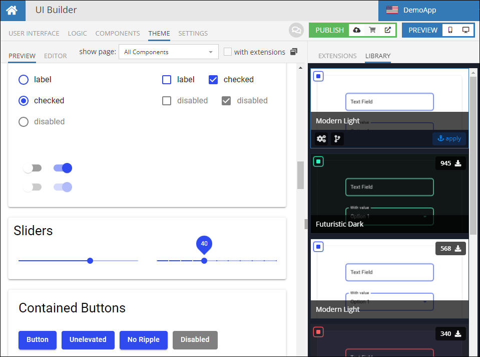
While Extensions are used to style individual components, UI Builder Themes provide a way to apply styles and a consistent look and feel to the entire application. To have the first hand experience with Themes, switch to the THEME tab, make sure the LIBRARY sub-tab on the right is selected. The Library panel lists available themes. When you click one, it is used by the page selected in the PREVIEW tab:
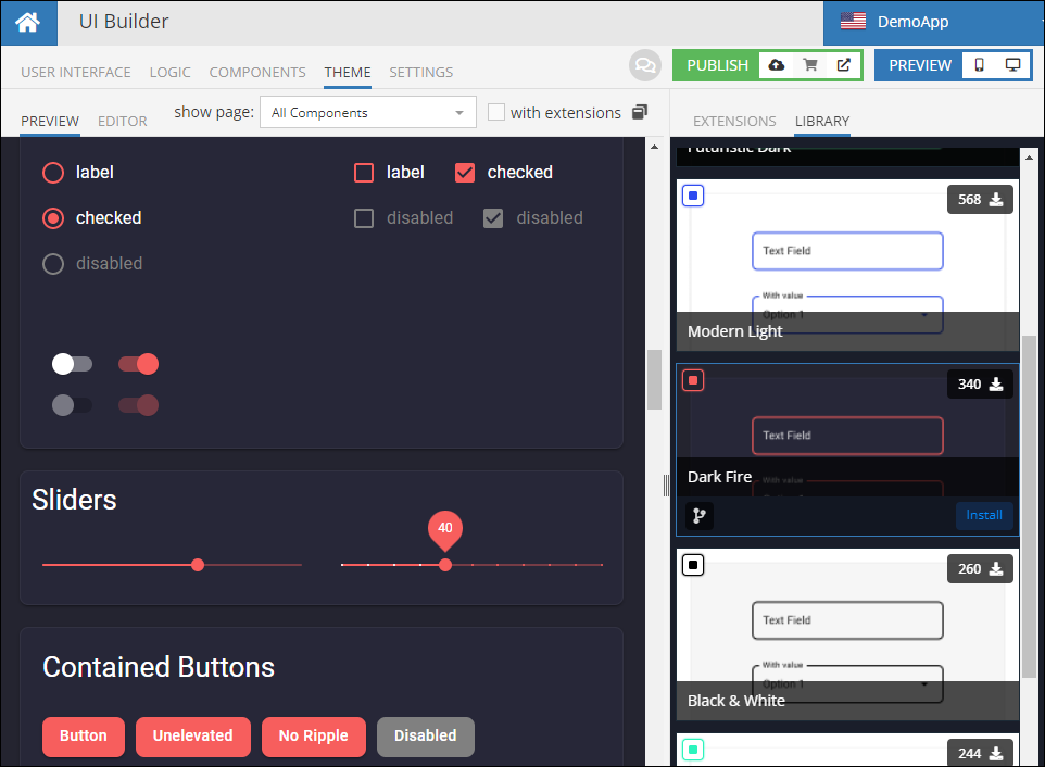
Below is another example of the same preview page, but with a different theme:
Installing a Theme
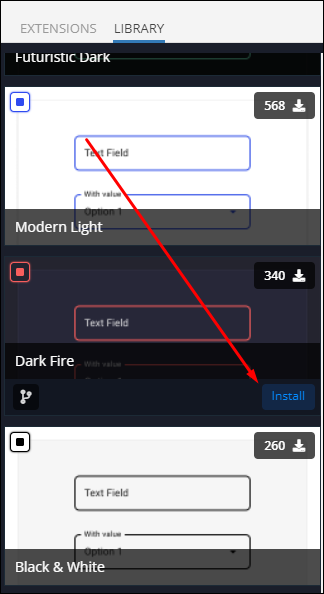
To install a theme from the library for your application, click the Install button. The button appears when you hover the mouse pointer over a theme:
Once a theme is installed, all pages and components therein will use the theme styles.
Important
An installed theme applies only to the UI container where it is installed.
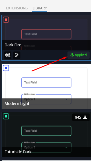
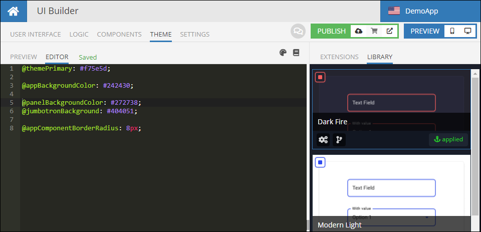
Once a theme is installed, it is marked with the applied tag as shown below:
It is possible to have more than one theme installed for an application, but only one can be applied to be the current one.
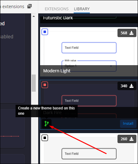
Copy a Theme
You can create a copy of any of the library themes using the fork icon located in the lower left corner of a theme tile. This functionality is useful if you plan to create your own customized theme which is based on a theme from the library. A custom theme can be used for your application and/or can be submitted to the Backendless Marketplace.
Editing a Theme
All installed themes, including the current one, can be edited. To edit a theme, simply click it in the library - you will see the theme configuration in the EDITOR tab:
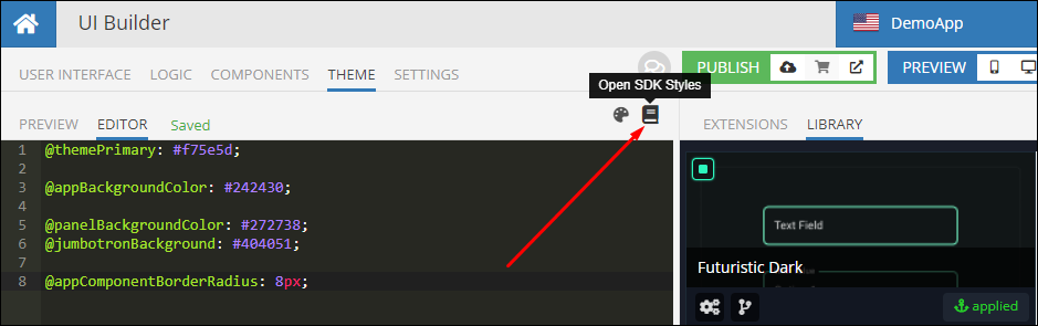
Since a theme applies to the entire application, it should establish a consistent look and feel that applies to all application's pages and components. This becomes possible due to all standard UI components in Backendless using CSS classes from the Backendless UI SDK. A listing of all CSS classes and variables is available in the EDITOR section in in Backendless Console. Click the Open SDK Styles icon to see the complete set of available LESS variables and CSS styles of the SDK:
When customizing or creating a new theme, you should use the variables and styles from the provided UI SDK Styles listing.