Overview
The Button component is a fundamental element for creating interactive user interfaces. Buttons are used to trigger actions or events within your application, such as submitting a form, navigating to another page, or executing custom functions. This component allows you to customize the button's appearance, including text, color, size, and icon placement, to align with your application's design and functionality.
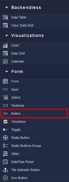
Locating the Button component in the toolbar: