Configuration
Settings
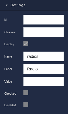
where:
| Argument | Description |
|---|---|
Id |
Represents the unique identifier of the component. You can use this identifier to refer to this component when building your logic. |
Classes |
Allows applying custom CSS classes to the component. CSS classes define styles that can be used to control the appearance and formatting of the component. Refer to the Extensions topic for more information. |
Display |
Changes the visibility of the component in the application. The value of this property can be changed programmatically by using the Visibility Logic handler, refer to the Data Binding topic for more information. |
Name |
Specifies the name of the radio button group to which this radio button belongs. Radio buttons with the same name are treated as a group, and only one option within the group can be selected at a time. The value of this property can be changed programmatically by using the Name Logic handler, refer to the Data Binding topic for more information. |
Label |
Allows you to specify the text that appears on the Radio Button. The label should be clear and concise, describing the action the Radio Button performs. The value of this property can be changed programmatically by using the Label Logic handler, refer to the Data Binding topic for more information. |
Value |
Allows you to assign a specific value to the radio button. This value can be used to identify the selected option or store data associated with it. The value of this property can be changed programmatically by using the Visibility Logic handler, refer to the Data Binding topic for more information. |
Checked |
When this parameter is enabled (checked), the Radio Button will be selected by default when the user loads the form or interface containing it. This means that when the user views the Radio Button, it will already be marked as "checked" or "ticked." This parameter is often used when you want to pre-select certain options or settings in a form or when you want to present a default choice to the user. However, users can typically interact with Radio Buttons to change their state, even if they are initially checked. The value of this property can be changed programmatically by using the Checked Value Logic handler, refer to the Data Binding topic for more information. |
Disabled |
Disables the component in the application. The value of this property can be changed programmatically by using the the Disabled State Logic handler, refer to the Data Binding topic for more information. |
Flex
With Flex settings, you can control how components within a container are positioned, aligned, and distributed.
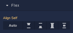
| Icon |
Description |
|---|---|
 |
Default alignment of the component. |
 |
Aligns the component to the start of its container. |
 |
Aligns the component to the end of its container. |
 |
Stretches to occupy all available space. |
 |
Centers the component within its container. |
Dimension
Margin
Both positive and negative values can be utilized within the Margin settings.
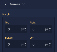
where:
| Argument | Description |
|---|---|
Top |
Defines the space between the top edge of the component and the element above it. In case there is no element above the component, then the top border of the parent container will be used for margin spacing. Increasing the top margin value will create additional space above the component. Available measurement units are: px, %, vh. |
Right |
Controls the space between the right edge of the component and the element to its right. If there is no element to the right of the component, then the right border of the parent container will be used for margin spacing. Adjusting the right margin value increases or decreases the space on the right side of the component. Available measurement units are: px, %, vw. |
Bottom |
Determines the space between the bottom edge of the component and the element below it. In case there is no element below the component, then the bottom border of the parent container will be used for margin spacing. Increasing the bottom margin value adds space below the component. Available measurement units are: px, %, vh. |
Left |
Sets the space between the left edge of the component and the element to its left. If there is no element to the left of the component, then the left border of the parent container will be used for margin spacing. Modifying the left margin value changes the space on the left side of the component. Available measurement units are: px, %, vw. |
Typography
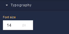
where:
| Argument | Description |
|---|---|
Font size |
Increases or decreases the font size of the text in the Radio Button. Available measurement units are: px, em, rem, %. |