Configuration
Settings
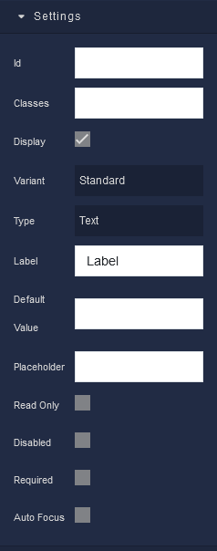
where:
| Argument | Description |
|---|---|
Id |
Represents the unique identifier of the component. You can use this identifier to refer to this component when building your logic. |
Classes |
Allows applying custom CSS classes to the component. CSS classes define styles that can be used to control the appearance and formatting of the component. Refer to the Extensions topic for more information. |
Display |
Changes the visibility of the component in the application. The value of this property can be changed programmatically by using the Visibility Logic handler, refer to the Data Binding topic for more information. |
Variant |
Determines the visual style of the input component. Available options are:Standard - A classic input style.Filled - The input field is filled with a background color.Outlined - The input field is outlined, providing a clean and minimalistic appearance. |
Type |
Defines the type of data that the input component is designed to accept. It offers several options:Text - Suitable for general text input.Password - Specifically for password entry, it hides the entered characters for security.Email - Designed for email addresses, it often includes validation for proper email format.Number - Intended for numeric input, such as quantities or numerical values. |
Label |
Allows you to include a label associated with the input field. Labels provide context and clarity to users by describing the purpose of the input field. The value of this property can be changed programmatically by using the Label Logic handler, refer to the Data Binding topic for more information. |
Default Value |
Sets a default value for the input field. When the page loads, the input field will contain this pre-filled value. This can be useful for forms and search bars, among other use cases. The value of this property can be changed programmatically by using the Value Logic handler, refer to the Data Binding topic for more information. |
Placeholder |
Lets you provide a hint or example text that appears within the input field. It serves as guidance to users, indicating what kind of input is expected. The value of this property can be changed programmatically by using the Placeholder Logic handler, refer to the Data Binding topic for more information. |
Read Only |
Prevents users from editing or modifying the input field's content. It is useful when you want to display information that users can view but not alter. |
Disabled |
Renders the input field inactive. Users cannot interact with or input data into a disabled input field. It is commonly used to indicate that an input is not applicable in a specific context. The value of this property can be changed programmatically by using the Disabled State Logic handler, refer to the Data Binding topic for more information. |
Required |
Makes the input field mandatory. Users must provide input in this field before submitting a form or taking certain actions. It ensures that essential information is not omitted. The value of this property can be changed programmatically by using the Required State Logic handler, refer to the Data Binding topic for more information. |
Auto Focus |
When selected, the input field will receive focus automatically when the page or form loads. This is helpful when you want to streamline the user experience by directing attention to a specific input field. |
Flex
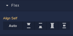
| Icon |
Description |
|---|---|
 |
Default alignment of the component. |
 |
Aligns the component to the start of its container. |
 |
Aligns the component to the end of its container. |
 |
Stretches to occupy all available space. |
 |
Centers the component within its container. |
Dimension
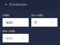
where:
| Argument | Description |
|---|---|
Width |
Controls the width of the component. Available measurement units are: px, %, vw. |
Min Width |
Prevents the component from changing its width below the specified baseline value. Available measurement units are: px, %, vw. |
Max Width |
Prevents the component from changing its width above the specified baseline value. Available measurement units are: px, %, vw. |
Margin
Both positive and negative values can be utilized within the Margin settings.
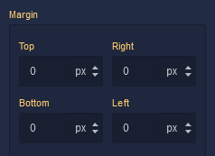
where:
| Argument | Description |
|---|---|
Top |
Defines the space between the top edge of the component and the element above it. In case there is no element above the component, then the top border of the parent container will be used for margin spacing. Increasing the top margin value will create additional space above the component. Available measurement units are: px, %, vh. |
Right |
Controls the space between the right edge of the component and the element to its right. If there is no element to the right of the component, then the right border of the parent container will be used for margin spacing. Adjusting the right margin value increases or decreases the space on the right side of the component. Available measurement units are: px, %, vw. |
Bottom |
Determines the space between the bottom edge of the component and the element below it. In case there is no element below the component, then the bottom border of the parent container will be used for margin spacing. Increasing the bottom margin value adds space below the component. Available measurement units are: px, %, vh. |
Left |
Sets the space between the left edge of the component and the element to its left. If there is no element to the left of the component, then the left border of the parent container will be used for margin spacing. Modifying the left margin value changes the space on the left side of the component. Available measurement units are: px, %, vw. |
Typography
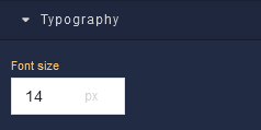
where:
| Argument | Description |
|---|---|
Font size |
Increases or decreases the font size of the text in the component. Available measurement units are: px, em, rem, %. |