Configuration
Settings
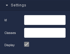
where:
| Argument | Description |
|---|---|
Id |
Represents the unique identifier for the component. You can use this identifier to refer to this component when building your logic. |
Classes |
Allows applying custom CSS classes to the Paragraph component. CSS classes define styles that can be used to control the appearance and formatting of the Paragraph component. Refer to the Extensions topic for more information. |
Display |
Changes the visibility of the component in the application. The value of this property can be changed programmatically by using the Visibility Logic handler, refer to the Data Binding topic for more information. |
General
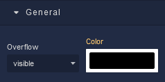
where:
| Argument | Description |
|---|---|
Overflow |
Determines how content should be displayed when it exceeds the available space within the defined boundaries of the component. Available options are:visible - Content that overflows the component's boundaries will be fully visible, potentially extending beyond the component's edges and overlapping other elements. Default setting.hidden - Content that exceeds the component's boundaries will be clipped and hidden. It won't be visible outside the defined area of the component.scroll - If content overflows, a scroll bar will be added to the component, allowing users to scroll and view the hidden content.auto - The browser automatically adds a scroll bar to the component if the content overflows. If the content doesn't overflow, no scroll bar will be added. |
Color |
Identifies the color of the content in the Paragraph. |
Background
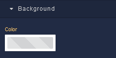
where:
| Argument | Description |
|---|---|
Color |
Sets the background color for the Paragraph component. |
Flex
With Flex settings, you can control how components within a container are positioned, aligned, and distributed.
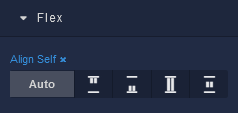
| Icon |
Description |
|---|---|
 |
Default alignment of the element. |
 |
Aligns to the start of its container. |
 |
Aligns to the end of its container. |
 |
Stretches to occupy all available space. |
 |
Centers within its container. |
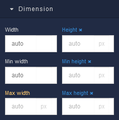
Dimension
where:
| Argument | Description |
|---|---|
Width |
Controls the width of the component. Available measurement units are: px, %, vw. |
Height |
Controls the height of the component. Available measurement units are: px, %, vh. |
Min Width |
Prevents the component from changing its width below the specified baseline value. Available measurement units are: px, %, vw. |
Min Height |
Prevents the component from changing its height below the specified baseline value. Available measurement units are: px, %, vh. |
Max Width |
Prevents the component from changing its width above the specified baseline value. Available measurement units are: px, %, vw. |
Max Height |
Prevents the component from changing its height above the specified baseline value. Available measurement units are: px, %, vh. |
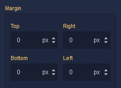
Margin
Both positive and negative values can be utilized within the Margin settings.
where:
| Argument | Description |
|---|---|
Top |
Defines the space between the top edge of the Paragraph component and the element above it. In case there is no element above the component, then the top border of the parent container will be used for margin spacing. Increasing the top margin value will create additional space above the Paragraph. Available measurement units are: px, %, vh. |
Right |
Controls the space between the right edge of the Paragraph component and the element to its right. If there is no element to the right of the component, then the right border of the parent container will be used for margin spacing. Adjusting the right margin value increases or decreases the space on the right side of the Paragraph. Available measurement units are: px, %, vw. |
Bottom |
Determines the space between the bottom edge of the Paragraph component and the element below it. In case there is no element below the component, then the bottom border of the parent container will be used for margin spacing. Increasing the bottom margin value adds space below the Paragraph. Available measurement units are: px, %, vh. |
Left |
Sets the space between the left edge of the Paragraph component and the element to its left. If there is no element to the left of the component, then the left border of the parent container will be used for margin spacing. Modifying the left margin value changes the space on the left side of the Paragraph. Available measurement units are: px, %, vw. |
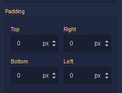
Padding
Allows controlling the internal spacing between the content of the Paragraph component and its internal boundaries.
where:
| Argument | Description |
|---|---|
Top |
Increases or decreases the spacing between the content and the top edge of the component. Available measurement units are: px, %, vh. |
Right |
Sets the spacing between the content and the right edge of the component. Available measurement units are: px, %, vw. |
Bottom |
Changes the spacing between the content and the bottom edge of the component. Available measurement units are: px, %, vh. |
Left |
Defines the spacing between the content and the left edge of the component. Available measurement units are: px, %, vw. |
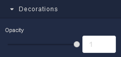
Decorations
where:
| Argument | Description |
|---|---|
Opacity |
Represents the opacity level of the Paragraph component. |
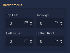
Border radius
where:
| Argument | Description |
|---|---|
Top Left |
Specifies the radius of the rounded corner at the top left of the Paragraph component. Use this parameter to control the curvature of the corner at the top left corner of the component's border. Available measurement units are: px, %. |
Top Right |
Specifies the radius of the rounded corner at the top right of the Paragraph component. Adjust this parameter to determine the curvature of the corner at the top right corner of the component's border. Available measurement units are: px, %. |
Bottom Left |
Determines the radius of the rounded corner at the bottom left of the Paragraph component. Modify this parameter to define the curvature of the corner at the bottom left corner of the component's border. Available measurement units are: px, %. |
Bottom Right |
Sets the radius of the rounded corner at the bottom right of the Paragraph component. Use this parameter to specify the curvature of the corner at the bottom right corner of the component's border. Available measurement units are: px, %. |
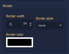
Border
where:
| Argument | Description |
|---|---|
Border Width |
Specifies the width of the border. |
Border style |
Represents the style of the component's border. Available measurement units are: px, em.solid - This option sets the border of the Paragraph component to a solid, continuous line, creating a straightforward and distinct visual separation.dotted - Selecting this option applies a dotted border style to the Paragraph component, resulting in a series of evenly spaced dots forming the border.dashed - The dashed border style creates a border composed of dashed lines, adding a stylish and slightly more dynamic visual element to the Paragraph component.double - Choosing this option gives the Paragraph component a double border, creating a bold and distinctive border with two parallel lines.groove - This border style applies a three-dimensional "groove" effect to the Paragraph component, giving it a carved appearance that makes it seem embedded into the surrounding content.ridge - The ridge border style creates a three-dimensional "ridge" effect, making the border of the Paragraph component appear raised and standing out from the background.inset - Selecting this option gives the border of the Paragraph component an "inset" effect, creating the illusion that the component is pressed into the page.outset - The outset border style creates a raised "outset" effect for the border of the Paragraph component, making it seem elevated from the background. |
Border color |
Identifies the color of the border. |
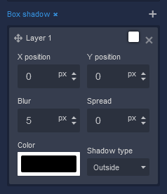
Box Shadow
where:
| Argument | Description |
|---|---|
X position |
This parameter controls the horizontal offset of the shadow cast by the Paragraph component. Positive values move the shadow to the right, while negative values move it to the left. Adjusting the X position allows you to control the direction of the shadow's horizontal displacement. Available measurement units are: px, %. |
Y position |
The Y position parameter determines the vertical offset of the shadow cast by the Paragraph component. Positive values move the shadow downward, while negative values move it upward. By adjusting the Y position, you can control the shadow's vertical displacement. Available measurement units are: px, %. |
Blur |
Adjusting the blur parameter controls the amount of blurring applied to the shadow of the Paragraph component. Higher values create a more diffused and softer shadow appearance, while lower values produce a sharper and crisper shadow. Available measurement units are: px. |
Spread |
The spread parameter allows you to control the size of the shadow cast by the Paragraph component. Increasing the spread value extends the shadow's size, while decreasing it makes the shadow more compact. This parameter affects the overall size of the shadow, not just its blur. Available measurement units are: px. |
Color |
This parameter defines the color of the shadow cast by the Paragraph component. You can choose a specific color using color values, such as hexadecimal, RGB, or HSLA colors. The color of the shadow significantly impacts the visual effect, allowing you to create subtle or dramatic contrasts with the background. |
Shadow type |
Allows specifying whether the shadow should be cast outside or inside the component. By selecting outside, the shadow will appear on the outer edges of the component, creating a sense of depth. Conversely, choosing inside will render the shadow within the component's boundaries, providing a unique visual effect. |