Overview
The DateTime Picker component provides a user-friendly way to input date and time values in your web application. It allows users to select a date and time from a calendar-style interface, making date and time selection precise and convenient. You can configure the DateTime Picker to display either date, time, or both, and format it according to your application's requirements. This component is valuable for tasks like setting appointments, scheduling events, or inputting birthdates.
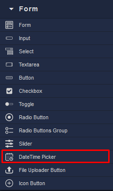
Locating the DateTime Picker component in the toolbar: