Configuration
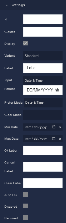
Settings
where:
| Argument | Description |
|---|---|
Id |
Represents the unique identifier of the component. You can use this identifier to refer to this component when building your logic. |
Classes |
Allows applying custom CSS classes to the component. CSS classes define styles that can be used to control the appearance and formatting of the component. Refer to the Extensions topic for more information. |
Display |
Changes the visibility of the component in the application. The value of this property can be changed programmatically by using the Visibility Logic handler, refer to the Data Binding topic for more information. |
Variant |
Allows you to choose the visual style of the component. Available options are:Standard - A standard style of the component.Filled - A solid, filled component.Outlined - A component with an outline. |
Label |
Provides a descriptive label for the component. This label is displayed in the picker, providing context to users. The value of this property can be changed programmatically by using the Label Logic handler, refer to the Data Binding topic for more information. |
Input Format |
Determines the format in which date and time information is displayed and accepted. Available options are:Custom Format - Allows you to specify a custom format for date and time input.Date & Time - Displays and accepts both date and time input.Date - Displays and accepts date input only.Time - Displays and accepts time input only. |
Picker Mode |
Sets the mode of the DateTime Picker, specifying what type of input is allowed. Available options include:Date & Time - Allows users to select both date and time.Date Only - Restricts input to date selection only.Time Only - Restricts input to time selection only. |
Clock Mode |
Specifies the clock format for time selection. Available options include:12 - Uses a 12-hour clock format (AM/PM).24 - Uses a 24-hour clock format (00:00-23:59). |
Min Date |
Sets a minimum allowable date for selection in the DateTime Picker. Dates earlier than the specified minimum date cannot be selected. The value of this property can be changed programmatically by using the Minimum Date Logic handler, refer to the Data Binding topic for more information. |
Max Date |
Sets a maximum allowable date for selection in the DateTime Picker. Dates later than the specified maximum date cannot be selected. The value of this property can be changed programmatically by using the Maximum Date Logic handler, refer to the Data Binding topic for more information. |
Ok Label |
Customizes the label text for the "OK" button that confirms the date and time selection. |
Cancel Label |
Customizes the label text for the "Cancel" button, which cancels the date and time selection. |
Clear Label |
Customizes the label text for a button that clears the selected date and time. |
Auto OK |
When enabled, the DateTime Picker automatically confirms the selection without requiring users to click an "OK" button explicitly. |
Disabled |
When enabled, makes the DateTime Picker component non-interactive, preventing users from making selections. |
Required |
When enabled, it indicates that the DateTime Picker field must be filled out before submitting a form. It prompts users to provide a valid date and time selection. The value of this property can be changed programmatically by using the Required State Logic handler, refer to the Data Binding topic for more information. |
Flex
With Flex settings, you can control how components within a container are positioned, aligned, and distributed.
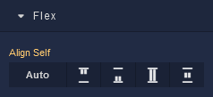
| Icon |
Description |
|---|---|
 |
Default alignment of the component. |
 |
Aligns the component to the start of its container. |
 |
Aligns the component to the end of its container. |
 |
Stretches to occupy all available space. |
 |
Centers the component within its container. |
Dimensions
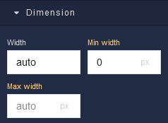
where:
| Argument | Description |
|---|---|
Width |
Controls the width of the component. Available measurement units are: px, %, vw. |
Min Width |
Prevents the component from changing its width below the specified baseline value. Available measurement units are: px, %, vw. |
Max Width |
Prevents the component from changing its width above the specified baseline value. Available measurement units are: px, %, vw. |
Margin
Both positive and negative values can be utilized within the Margin settings.
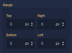
where:
| Argument | Description |
|---|---|
Top |
Defines the space between the top edge of the component and the element above it. In case there is no element above the component, then the top border of the parent container will be used for margin spacing. Increasing the top margin value will create additional space above the component. Available measurement units are: px, %, vh. |
Right |
Controls the space between the right edge of the component and the element to its right. If there is no element to the right of the component, then the right border of the parent container will be used for margin spacing. Adjusting the right margin value increases or decreases the space on the right side of the Text. Available measurement units are: px, %, vw. |
Bottom |
Determines the space between the bottom edge of the component and the element below it. In case there is no element below the component, then the bottom border of the parent container will be used for margin spacing. Increasing the bottom margin value adds space below the component. Available measurement units are: px, %, vh. |
Left |
Sets the space between the left edge of the component and the element to its left. If there is no element to the left of the component, then the left border of the parent container will be used for margin spacing. Modifying the left margin value changes the space on the left side of the component. Available measurement units are: px, %, vw. |