Configuration
Settings
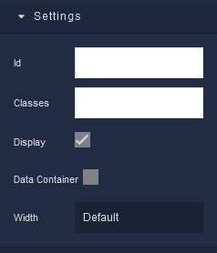
where:
| Argument | Description |
|---|---|
Id |
Represents the unique identifier for the component. You can use this identifier to refer to this component when building your logic. |
Classes |
Allows applying custom CSS classes to the Cell component. CSS classes define styles that can be used to control the appearance and formatting of the Cell component. Refer to the Extensions topic for more information. |
Display |
Changes the visibility of the component in the application. The value of this property can be changed programmatically by using the Visibility Logic handler, refer to the Data Binding topic for more information. |
Data Container |
This feature enables the use of the component as a data storage mechanism, similar to Page Data. When new data is assigned to the component, only the component itself is re-rendered. The applicability of this parameter is extensive, as it allows data storage without the need to re-render the entire page, as is the case with Page Data. |
Width |
Offers a range of options to precisely control the horizontal space occupied by the Cell within its parent container. Available options are: Default, Full Width, Half Width, 1/12, 2/12, 3/12, 4/12, 5/12, 6/12, 7/12, 8/12, 9/12, 10/12, 11/12. |
Background
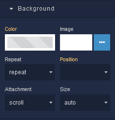
where:
| Argument | Description |
|---|---|
Color |
Represents the background color for the component. |
Image |
Sets a background image for the Cell element. The image must be selected from the Backendless Cloud. |
Repeat |
Defines how the background image specified in the Image parameter should be repeated across the Cell container. Available options are:repeat - The background image is tiled both horizontally and vertically to cover the container's entire area.repeat-x - The background image is tiled only horizontally, repeating along the x-axis.repeat-y - The background image is tiled only vertically, repeating along the y-axis.no-repeat - The background image is not repeated and appears only once. |
Position |
Sets the initial position of the background image specified in the Image parameter. It determines where the top left corner of the background image will be placed within the Cell. Options include various combinations of horizontal (left, center, right) and vertical (top, center, bottom) alignment. |
Attachment |
Defines whether the background image specified in the Image parameter should scroll along with the content or remain fixed as the content is scrolled. Available options are:scroll - The background image scrolls along with the content.fixed - The background image remains fixed within the Cell as content is scrolled.local - The background image's scrolling behavior is determined by its parent element. |
Size |
Controls how the background image specified in the Image parameter should be sized within the Cell. Available options are:auto - The background image is displayed at its original size.cover - The background image is scaled to cover the entire Cell, potentially cropping parts of the image.contain - The background image is scaled to fit within the Cell while maintaining its aspect ratio. |
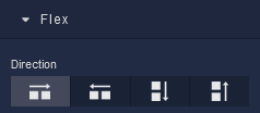
Flex
With Flex settings, you can control how components within a container are positioned, aligned, and distributed.
| Icon |
Description |
|---|---|
 |
Sets the child elements or content to be arranged horizontally along the main axis, from left to right. This is the default direction. |
 |
Arranges the child elements or content horizontally along the main axis, but in reverse order, from right to left. |
 |
Stacks the child elements or content vertically along the main axis, from top to bottom. |
 |
Stacks the child elements or content vertically along the main axis, but in reverse order, from bottom to top. |
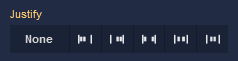
Justify
| Icon |
Description |
|---|---|
 |
Selecting None will not apply any specific justification to the content within the Cell. It will maintain its default alignment. |
 |
Choosing Start will align the content to the start of the main axis. In a left-to-right language context, this will place the content at the left edge. |
 |
Opting for End will align the content to the end of the main axis. In a left-to-right context, this will position the content at the right edge. |
 |
The Space between option evenly distributes the space between the content items along the main axis. The first item will be at the start and the last item will be at the end, with equal spacing in between. |
 |
Selecting Space around distributes space evenly around the content items, including at the start and end. This creates a balanced space between each item. |
 |
Choosing Center will center-align the content along the main axis, resulting in equal space before and after the content. |
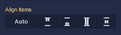
Align Items
| Icon |
Description |
|---|---|
 |
Default alignment of the element. |
 |
Aligns to the start of its container. |
 |
Aligns to the end of its container. |
 |
Stretches to occupy all available space. |
 |
Centers within its container. |
Additional options
where:
| Argument | Description |
|---|---|
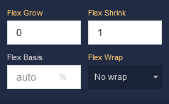
Flex Grow |
Determines how much the cell's content can grow in relation to other cells within the same container. For example, a value of 2 will allow the cell to grow twice as much as a cell with a value of 1. |
Flex Shrink |
Controls how much the cell's content can shrink if the available space in the container is limited. For instance, a value of 2 will shrink the cell's content twice as much as a cell with a value of 1. |
Flex Basis |
Sets the initial size of the cell's content before the available space is distributed among other cells. You can provide a specific length value, such as pixels (px) or a percentage (%). |
Flex Wrap |
Defines whether the cells should be wrapped to the next line or not when the available space is not sufficient. Available options are:No Wrap - Cells will remain on the same line, even if it means they overflow the container.Wrap - Cells will wrap to the next line if there's not enough space.Wrap Reverse - Similar to Wrap, but cells will wrap in reverse order. |
Dimension
where:
| Argument | Description |
|---|---|
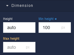
Height |
Controls the height of the component. Available measurement units are: px, %, vh. |
Min Height |
Prevents the component from changing its height below the specified baseline value. Available measurement units are: px, %, vh. |
Max Height |
Prevents the component from changing its height above the specified baseline value. Available measurement units are: px, %, vh. |
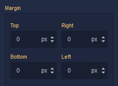
Margin
Both positive and negative values can be utilized within the Margin settings.
where:
| Argument | Description |
|---|---|
Top |
Defines the space between the top edge of the component and the element above it. In case there is no element above the component, then the top border of the parent container will be used for margin spacing. Increasing the top margin value will create additional space above the component. Available measurement units are: px, %, vh. |
Right |
Controls the space between the right edge of the component and the element to its right. If there is no element to the right of the component, then the right border of the parent container will be used for margin spacing. Adjusting the right margin value increases or decreases the space on the right side of the component. Available measurement units are: px, %, vw. |
Bottom |
Determines the space between the bottom edge of the component and the element below it. In case there is no element below the component, then the bottom border of the parent container will be used for margin spacing. Increasing the bottom margin value adds space below the component. Available measurement units are: px, %, vh. |
Left |
Sets the space between the left edge of the component and the element to its left. If there is no element to the left of the component, then the left border of the parent container will be used for margin spacing. Modifying the left margin value changes the space on the left side of the component. Available measurement units are: px, %, vw. |
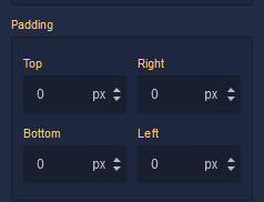
Padding
Allows controlling the internal spacing between the content of the component and its internal boundaries.
where:
| Argument | Description |
|---|---|
Top |
Increases or decreases the spacing between the content and the top edge of the component. Available measurement units are: px, %, vh. |
Right |
Sets the spacing between the content and the right edge of the component. Available measurement units are: px, %, vw. |
Bottom |
Changes the spacing between the content and the bottom edge of the component. Available measurement units are: px, %, vh. |
Left |
Defines the spacing between the content and the left edge of the component. Available measurement units are: px, %, vw. |