Overview
The Divider component, is a fundamental element that helps organize and structure the layout of your application's user interface. Acting as a visual separator between different sections or content blocks, the Divider enhances the overall design clarity and user experience. With flexible customization options, you can adjust its appearance to match your app's style, including line thickness, color, and alignment. By adding Dividers to your UI design, you can create a visually appealing and well-organized interface, making it easier for users to navigate and comprehend the content within your application.
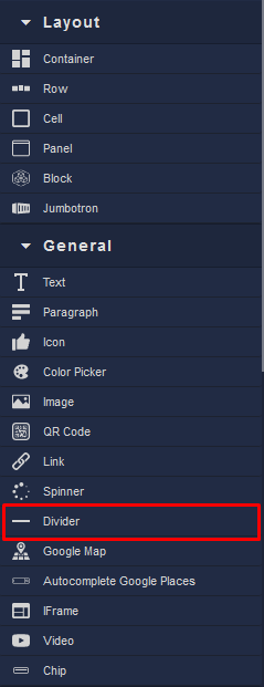
Locating the Divider component in the toolbar: