Configuration
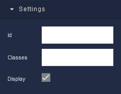
Settings
where:
| Argument | Description |
|---|---|
Id |
Represents the unique identifier of the component. You can use this identifier to refer to this component when building your logic. |
Classes |
Allows applying custom CSS classes to the Divider component. CSS classes define styles that can be used to control the appearance and formatting of the Divider component. Refer to the Extensions topic for more information. |
Display |
Changes the visibility of the component in the application. The value of this property can be changed programmatically by using the Visibility Logic handler, refer to the Data Binding topic for more information. |
Dimension
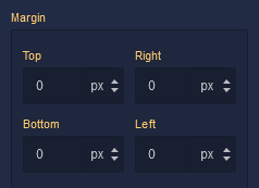
Margin
Both positive and negative values can be utilized within the Margin settings.
where:
| Argument | Description |
|---|---|
Top |
Defines the space between the top edge of the Divider component and the element above it. In case there is no element above the component, then the top border of the parent container will be used for margin spacing. Increasing the top margin value will create additional space above the Divider. Available measurement units are: px, %, vh. |
Right |
Controls the space between the right edge of the Divider component and the element to its right. If there is no element to the right of the component, then the right border of the parent container will be used for margin spacing. Adjusting the right margin value increases or decreases the space on the right side of the Divider. Available measurement units are: px, %, vw. |
Bottom |
Determines the space between the bottom edge of the Divider component and the element below it. In case there is no element below the component, then the bottom border of the parent container will be used for margin spacing. Increasing the bottom margin value adds space below the Divider. Available measurement units are: px, %, vh. |
Left |
Sets the space between the left edge of the Divider component and the element to its left. If there is no element to the left of the component, then the left border of the parent container will be used for margin spacing. Modifying the left margin value changes the space on the left side of the Divider. Available measurement units are: px, %, vw. |
Decorations
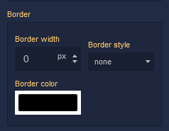
Border
where:
| Argument | Description |
|---|---|
Border Width |
Specifies the width of the border. |
Border style |
Represents the style of the component's border. Available measurement units are: px, em.solid - This option sets the border of the Divider component to a solid, continuous line, creating a straightforward and distinct visual separation.dotted - Selecting this option applies a dotted border style to the Divider component, resulting in a series of evenly spaced dots forming the border.dashed - The dashed border style creates a border composed of dashed lines, adding a stylish and slightly more dynamic visual element to the Divider component.double - Choosing this option gives the Divider component a double border, creating a bold and distinctive border with two parallel lines.groove - This border style applies a three-dimensional "groove" effect to the Divider component, giving it a carved appearance that makes it seem embedded into the surrounding content.ridge - The ridge border style creates a three-dimensional "ridge" effect, making the border of the Divider component appear raised and standing out from the background.inset - Selecting this option gives the border of the Divider component an "inset" effect, creating the illusion that the component is pressed into the page.outset - The outset border style creates a raised "outset" effect for the border of the Divider component, making it seem elevated from the background. |
Border color |
Identifies the color of the border. |