Overview
The Chip component allows you to create visually appealing and interactive elements that represent various types of information. Chips are often used to display tags, categories, or short text snippets in a compact format. You can customize the appearance and behavior of the Chip component, making it a versatile tool for enhancing user interfaces.
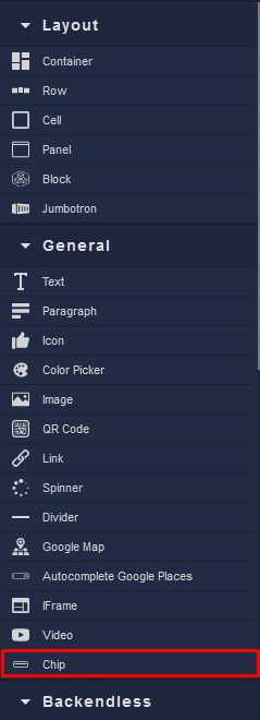
Locating the Chip component in the toolbar: