Layout Components
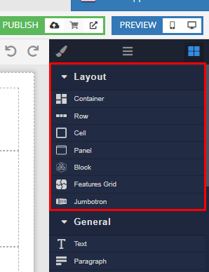
Layout Components are designed to assist you with achieving a visual structure, or the layout for your page. The most versatile layout components are Container and Block. You can find all layout components in the Layout section of the component Toolbox:
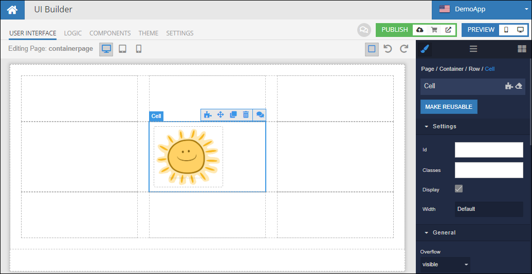
Each layout component can contain other child components and has its rules for positioning the children. For example, Container enforces a grid-like structure with one or more rows, each row containing one or more cells. The cells may contain other components:
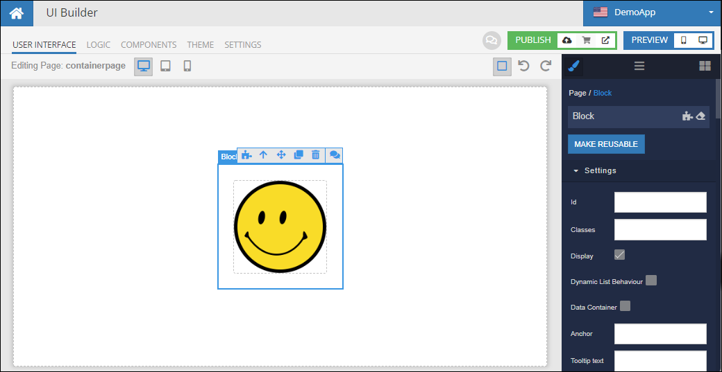
The Block component implements the Flexbox layout which provides a more efficient way to lay out, align and distribute space among the child components even when their size is unknown and/or dynamic (thus the word "Flex"). For example, the Block component makes it simple to center content on a page: