Extensions
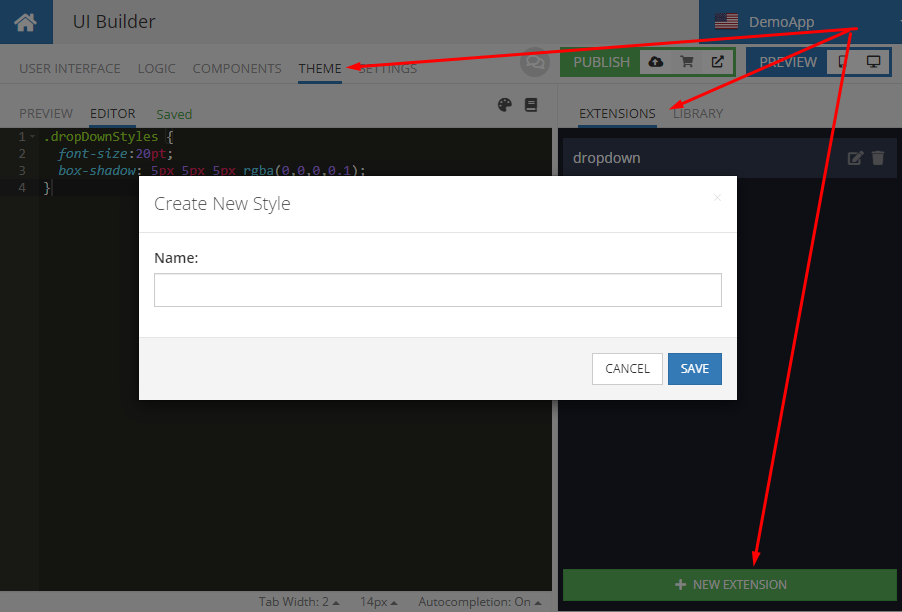
While Themes are used to apply a consistent look and feel for all components in an application, extensions provide a way to introduce more localized customizations. An extension is a collection of CSS classes that can be applied to the components in an application. The same class can be reused between different components. Styles in extensions always override the styles from the theme. To create an extension, switch to the THEME tab, click the EXTENSIONS sub-tab on the right side of the interface and click the + NEW EXTENSION button. Enter the name for your extension in the Create New Style popup:
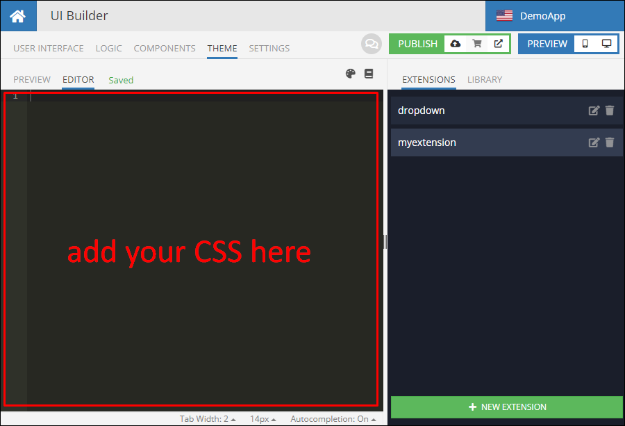
The name of an extension is arbitrary. It is recommended to assign a logical name for the styles you plan to put into the extension. When an extension is created, UI Builder opens the editor where you can add CSS styles for your extension.
It is completely up to you how to structure the extensions. You can have multiple extensions with multiple CSS classes defined in them or a single extension. It is recommended to have multiple separate extensions with CSS classes grouped by their logical purpose. Classes defined in the extensions can be used with any of the UI components that have the Classes property.
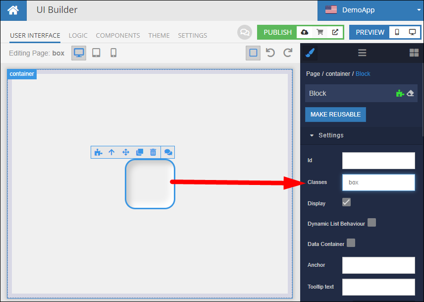
The Classes property can accept multiple class names, they must be separated by comma.
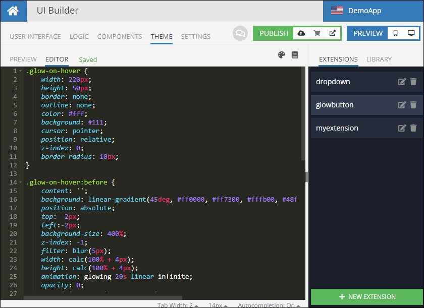
You can preview your pages with the changes made in extensions using the PREVIEW tab. Consider the following extension content:
.glow-on-hover {
    width: 220px;
    height: 50px;
    border: none;
    outline: none;
    color: #fff;
    background: #111;
    cursor: pointer;
    position: relative;
    z-index: 0;
    border-radius: 10px;
}

.glow-on-hover:before {
    content: '';
    background: linear-gradient(45deg, #ff0000, #ff7300, #fffb00, #48ff00, #00ffd5, #002bff, #7a00ff, #ff00c8, #ff0000);
    position: absolute;
    top: -2px;
    left:-2px;
    background-size: 400%;
    z-index: -1;
    filter: blur(5px);
    width: calc(100% + 4px);
    height: calc(100% + 4px);
    animation: glowing 20s linear infinite;
    opacity: 0;
    transition: opacity .3s ease-in-out;
    border-radius: 10px;
}

.glow-on-hover:active {
    color: #000
}

.glow-on-hover:active:after {
    background: transparent;
}

.glow-on-hover:hover:before {
    opacity: 1;
}

.glow-on-hover:after {
    z-index: -1;
    content: '';
    position: absolute;
    width: 100%;
    height: 100%;
    background: #111;
    left: 0;
    top: 0;
    border-radius: 10px;
}

@keyframes glowing {
    0% { background-position: 0 0; }
    50% { background-position: 400% 0; }
    100% { background-position: 0 0; }
}

.bl-button.bl-button--contained:not(.bl-button--disabled) {
    background: none !important;
}
The same content is shown in the screenshot below:
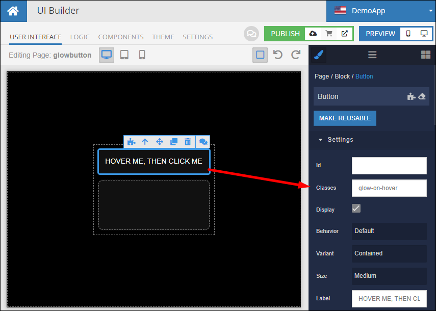
The extension includes a glowing effect on hover and click that can be applied to any UI component. Suppose a page contains Button and Block components. Both components have the glow-on-hover class (which is a class in the extension) specified in the Classes property:
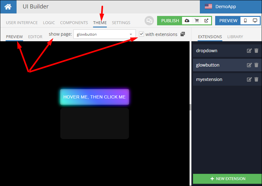
To preview the extension (and the effect), you can either open the page in preview (see the icons in the PREVIEW section in the upper right corner), or, alternatively, switch to the THEME tab and select the PREVIEW sub-tab. Make sure to select your page from the drop-down list and click the with extensions checkbox:
The example above also features the @keyframes CSS "at rule" that enables animation.