Page Editor
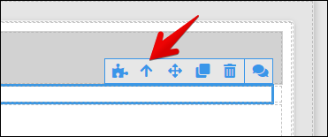
The Page Editor is an element of UI Builder where you can create layouts of your pages by placing components from the Toolbox. To place a component onto the page, simply drag it from the Toolbox into the page canvas. When a component is placed on canvas, you can edit its visual styles, properties and logic. When component is selected, the editor displays a blue border around it as well as component management panel (items 2-7 in the list below):
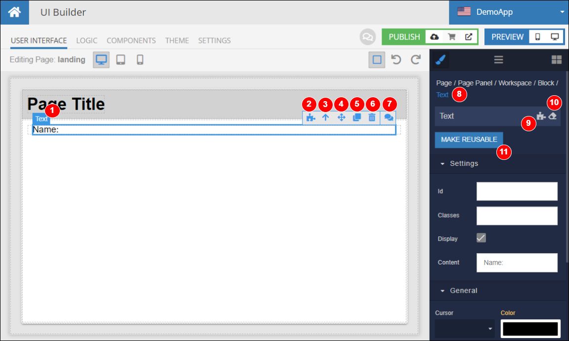
Where:
- Name of the selected component - is shown when you move the mouse pointer over a component.
- Opens component's Logic.
- Navigates up to the next component in the component's path/hierarchy. The path is displayed as breadcrumbs in item 8 of this list.
- Moves the component (through dragging) to another position on the page. Requires clicking and dragging.
- Creates a copy of the component with all its visual settings but without logic.
- Deletes the component (there is no deletion confirmation, but you can always undo the deletion as long as the Backendless Console has been been reloaded or browser closed/reopened).
- Opens a discussion panel for the component. Use the discussion to provide feedback about the component and its features. Do not post support questions, the proper way to get technical support is by using the Backendless support forum.
- Displays a path to the current component as breadcrumbs. The path is built from the current component's hierarchy. Every path element in the breadcrumbs is clickable. Clicking a path element selects the corresponding component.
- Logic icon - clicking the icon opens the Logic section for the component. This is the same as item 2 in this list. The icon turns green when the component has any logic.
- Drops default styles - every component from the Toolbox comes with some pre-configured settings and styles such as width, height, margins or padding. Clicking this icon removes all pre-configured styles for the component.
- Makes the component reusable. Reusable components can be placed on multiple pages and reuse the styling and logic.
Component Placement
To add a component to the page, drag it from the Toolbox into the page canvas. Final placement of the component is subject to several rules and conditions:
- UI Components added directly to the page are placed vertically, top to bottom.
- A UI component added to a "Layout" type of component such as Container or Block are subject to the configuration of the Layout component.
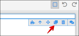
Component can be replicated by clicking the copy icon in the component management panel:
Component Hierarchy
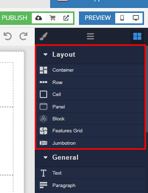
All components on a page create page's component hierarchy tree. The root of the tree is the page itself. Some of the components allow other components to be placed inside of them. These are called the Layout Components. You can see them in the Layout section of the Toolbox:
A hierarchy is possible since some components may contain other components. For example a Block component may contain any other component, including other Blocks. You can see the component hierarchy of your page, by clicking the Component Tree icon:
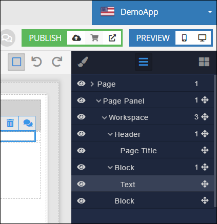
You can collapse and expand the nodes of the tree. Every element in the tree can be hidden from the display in the editor by using the "eye" icon on the left. The "cross-arrow" icon on the right can be used to move a component to another location in the tree. When you move a component to another location in the tree/hierarchy, all component's children are moved as well. Clicking an item/component in the tree, selects the component in the editor. Notice some nodes in the tree use component names (Page, Block and Text) while others use more meaningful names (Page Panel, Workspace, Header, Page Title). This happens when a component is assigned an Id in the Style Manager.
When a component is selected in the editor, the Style Manager tab shows the path from the hierarchy of the component as breadcrumbs:
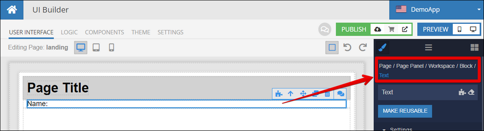
Clicking any of the elements in the breadcrumbs path selects the component. Additionally, you can navigate up the hierarchy by clicking the arrow button in the component management controls: