Configuration
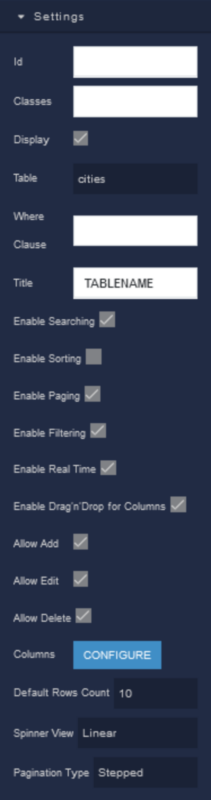
Settings
where:
| Argument | Description |
|---|---|
Id |
Represents the unique identifier for the component. You can use this identifier to refer to this component when building your logic. |
Classes |
Allows applying custom CSS classes to the component. CSS classes define styles that can be used to control the appearance and formatting of the component. Refer to the Extensions topic for more information. |
Display |
Changes the visibility of the component in the application. The value of this property can be changed programmatically by using the Visibility Logic handler, refer to the Data Binding topic for more information. |
Table |
Specifies the data source or table from which the Data Table component retrieves and displays data. You can select an existing table from Backendless to populate the component with relevant data. The value of this property can be changed programmatically by using the Table Name Logic handler, refer to the Data Binding topic for more information. |
Where Clause |
Allows you to specify conditions that filter the data displayed in the Data Table. You can define rules that determine which records from the data source should be included in the table based on specific criteria. The value of this property can be changed programmatically by using the Where Clause Logic handler, refer to the Data Binding topic for more information. |
Title |
Sets a title or header for the Data Table. This title is displayed above the table and provides a brief description of the data or its purpose. The value of this property can be changed programmatically by using the Title Logic handler, refer to the Data Binding topic for more information. |
Enable Searching |
When enabled, adds a search bar to the Data Table, allowing users to search for specific data within the table. This feature simplifies data retrieval, particularly when dealing with large datasets. The value of this property can be changed programmatically by using the Search Enabled Logic handler, refer to the Data Binding topic for more information. |
Enable Sorting |
When enabled, users can click the column headers to sort the data in ascending or descending order. This provides users with flexibility in organizing the data as per their preferences. The value of this property can be changed programmatically by using the Sorting Enabled Logic handler, refer to the Data Binding topic for more information. |
Enable Paging |
Divides the data into pages, with a set number of rows displayed per page. Users can navigate between pages to view different segments of data. This is useful for managing large datasets without overwhelming the user. The value of this property can be changed programmatically by using the Paging Control Logic handler, refer to the Data Binding topic for more information. |
Enable Filtering |
Allows users to apply filters to the data displayed in the Data Table. Filters are typically based on specific criteria or conditions, allowing users to refine their view of the data. The value of this property can be changed programmatically by using the Filtering Enabled Logic handler, refer to the Data Binding topic for more information. |
Enable Real Time |
Ensures that the Data Table updates in real-time when changes occur in the data source. This is particularly useful when working with dynamic datasets that frequently change. The value of this property can be changed programmatically by using the Real Time Control Logic handler, refer to the Data Binding topic for more information. |
Enable Drag'n'Drop for Columns |
When enabled, users can rearrange the order of columns in the Data Table by dragging and dropping them. |
Allow Add |
Permits users to add new rows or records to the Data Table. This is useful for scenarios where users need to input or append data directly within the table. |
Allow Edit |
Determines whether users can edit the content within the Data Table component. This parameter provides control over whether users can make modifications to the data displayed in the table directly through the UI. |
Allow Delete |
Allows users to delete rows or records from the Data Table. |
Columns |
Allows you to define and configure the columns displayed in the Data Table. |
Default Rows Count |
Determine the initial number of rows displayed in the Data Table when it loads. |
Spinner View |
Defines the style of the loading spinner or indicator displayed while the Data Table is loading or updating. Available options are:Overlay - Represents a loading spinner that appears as an overlay on top of the table's content when data is being loaded or processed. Linear - Represents a loading spinner that appears linearly on top of the table, usually as a horizontal or vertical bar. |
Pagination Type |
Determines how pagination is presented to users. You can choose between Normal pagination, which displays page numbers, and Stepped pagination, which may use a step-based approach. |
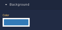
Background
where:
| Argument | Description |
|---|---|
Color |
Sets the background color for the component. |
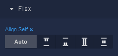
Flex
With Flex settings, you can control how components within a container are positioned, aligned, and distributed.
| Icon |
Description |
|---|---|
 |
Default alignment of the element. |
 |
Aligns to the start of its container. |
 |
Aligns to the end of its container. |
 |
Stretches to occupy all available space. |
 |
Centers within its container. |
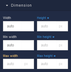
Dimension
where:
| Argument | Description |
|---|---|
Width |
Controls the width of the component. Available measurement units are: px, %, vw. |
Height |
Controls the height of the component. Available measurement units are: px, %, vh. |
Min Width |
Prevents the component from changing its width below the specified baseline value. Available measurement units are: px, %, vw. |
Min Height |
Prevents the component from changing its height below the specified baseline value. Available measurement units are: px, %, vh. |
Max Width |
Prevents the component from changing its width above the specified baseline value. Available measurement units are: px, %, vw. |
Max Height |
Prevents the component from changing its height above the specified baseline value. Available measurement units are: px, %, vh. |
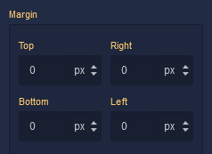
Margin
Both positive and negative values can be utilized within the Margin settings.
where:
| Argument | Description |
|---|---|
Top |
Defines the space between the top edge of the component and the element above it. In case there is no element above the component, then the top border of the parent container will be used for margin spacing. Increasing the top margin value will create additional space above the component. Available measurement units are: px, %, vh. |
Right |
Controls the space between the right edge of the component and the element to its right. If there is no element to the right of the component, then the right border of the parent container will be used for margin spacing. Adjusting the right margin value increases or decreases the space on the right side of the Text. Available measurement units are: px, %, vw. |
Bottom |
Determines the space between the bottom edge of the component and the element below it. In case there is no element below the component, then the bottom border of the parent container will be used for margin spacing. Increasing the bottom margin value adds space below the component. Available measurement units are: px, %, vh. |
Left |
Sets the space between the left edge of the component and the element to its left. If there is no element to the left of the component, then the left border of the parent container will be used for margin spacing. Modifying the left margin value changes the space on the left side of the component. Available measurement units are: px, %, vw. |
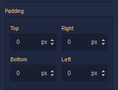
Padding
Allows controlling the internal spacing between the content of the component and its internal boundaries.
where:
| Argument | Description |
|---|---|
Top |
Increases or decreases the spacing between the content and the top edge of the component. Available measurement units are: px, %, vh. |
Right |
Sets the spacing between the content and the right edge of the component. Available measurement units are: px, %, vw. |
Bottom |
Changes the spacing between the content and the bottom edge of the component. Available measurement units are: px, %, vh. |
Left |
Defines the spacing between the content and the left edge of the component. Available measurement units are: px, %, vw. |
Decorations
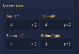
Border Radius
where:
| Argument | Description |
|---|---|
Top Left |
Specifies the radius of the rounded corner at the top left of the component. Use this parameter to control the curvature of the corner at the top left corner of the component's border. Available measurement units are: px, %. |
Top Right |
Specifies the radius of the rounded corner at the top right of the component. Adjust this parameter to determine the curvature of the corner at the top right corner of the component's border. Available measurement units are: px, %. |
Bottom Left |
Determines the radius of the rounded corner at the bottom left of the component. Modify this parameter to define the curvature of the corner at the bottom left corner of the component's border. Available measurement units are: px, %. |
Bottom Right |
Sets the radius of the rounded corner at the bottom right of the component. Use this parameter to specify the curvature of the corner at the bottom right corner of the component's border. Available measurement units are: px, %. |
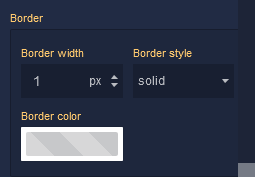
Border
where:
| Argument | Description |
|---|---|
Border Width |
Specifies the width of the border. |
Border style |
Represents the style of the component's border. Available measurement units are: px, em.solid - This option sets the border of the component to a solid, continuous line, creating a straightforward and distinct visual separation.dotted - Selecting this option applies a dotted border style to the component, resulting in a series of evenly spaced dots forming the border.dashed - The dashed border style creates a border composed of dashed lines, adding a stylish and slightly more dynamic visual element to the component.double - Choosing this option gives the component a double border, creating a bold and distinctive border with two parallel lines.groove - This border style applies a three-dimensional "groove" effect to the component, giving it a carved appearance that makes it seem embedded into the surrounding content.ridge - The ridge border style creates a three-dimensional "ridge" effect, making the border of the component appear raised and standing out from the background.inset - Selecting this option gives the border of the component an "inset" effect, creating the illusion that the component is pressed into the page.outset - The outset border style creates a raised "outset" effect for the border of the component, making it seem elevated from the background. |
Border color |
Identifies the color of the border. |
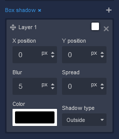
Box Shadow
where:
| Argument | Description |
|---|---|
X position |
This parameter controls the horizontal offset of the shadow cast by the component. Positive values move the shadow to the right, while negative values move it to the left. Adjusting the X position allows you to control the direction of the shadow's horizontal displacement. Available measurement units are: px, %. |
Y position |
The Y position parameter determines the vertical offset of the shadow cast by the component. Positive values move the shadow downward, while negative values move it upward. By adjusting the Y position, you can control the shadow's vertical displacement. Available measurement units are: px, %. |
Blur |
Adjusting the blur parameter controls the amount of blurring applied to the shadow of the component. Higher values create a more diffused and softer shadow appearance, while lower values produce a sharper and crisper shadow. Available measurement units are: px. |
Spread |
The spread parameter allows you to control the size of the shadow cast by the component. Increasing the spread value extends the shadow's size, while decreasing it makes the shadow more compact. This parameter affects the overall size of the shadow, not just its blur. Available measurement units are: px. |
Color |
This parameter defines the color of the shadow cast by the component. You can choose a specific color using color values, such as hexadecimal, RGB, or HSLA colors. The color of the shadow significantly impacts the visual effect, allowing you to create subtle or dramatic contrasts with the background. |
Shadow type |
Allows specifying whether the shadow should be cast outside or inside the component. By selecting outside, the shadow will appear on the outer edges of the component, creating a sense of depth. Conversely, choosing inside will render the shadow within the component's boundaries, providing a unique visual effect. |