Measurement Units
In the realm of UI component design, precision is paramount. To achieve cohesive and visually pleasing user interfaces across a multitude of devices and screen sizes, a diverse array of measurement units come into play. These measurement units serve as the foundational building blocks for specifying properties like font sizes, dimensions, margins, paddings, and more. By comprehensively understanding and effectively utilizing these measurement units, you can tailor the appearance and behavior of your app elements to seamlessly cater to both technical and non-technical users. Let's delve into the spectrum of measurement units that empower you to craft UIs that are as precise as they are visually engaging.
- Pixels (px):
Pixels are the fundamental units of digital display. They represent individual dots on a screen and provide precise control over dimensions and spacing. Using pixels ensures exactness in component sizing and positioning, making them particularly useful when consistency across different devices is crucial. - Points (pt):
Points are another unit for measuring font sizes and dimensions. While they are similar to pixels, points are commonly used in typography. They are particularly valuable for maintaining consistent text legibility across various devices and resolutions. - EM:
EM is a relative unit that is typically relative to the font size of the parent element. It allows components to scale proportionally when the font size changes. EMs are advantageous for creating designs that are responsive and adapt well to changes in user preferences. - REM:
Root EM (REM) is similar to EM but is relative to the root element's font size, providing a more stable reference point for responsive designs. This prevents unexpected cascading effects that can occur with nested EM units. - Percent (%):
Percentage values are versatile and relative units that enable components to adapt to their parent container's dimensions. They are especially useful for designing layouts that need to scale proportionally to the available space. - Viewport Units (vw, vh, vmin, vmax):
Viewport units are relative to the size of the browser viewport. They are particularly effective for responsive designs, allowing components to adjust based on the available screen real estate. "vw" represents 1% of the viewport width, "vh" represents 1% of the viewport height, "vmin" is the smaller of the two, and "vmax" is the larger. - Absolute Units (in, cm, mm, pt, pc):
These units are commonly used for printing purposes and offer consistent physical measurements across different devices. "in" represents inches, "cm" represents centimeters, "mm" represents millimeters, "pt" represents points, and "pc" represents picas.
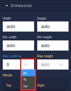
In UI Builder you can find these measurement units in component editor panel. For example, the screenshot below illustrates the use of measurement units for component's dimensions: