Configuration
Settings
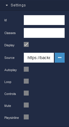
where:
| Argument | Description |
|---|---|
Id |
Represents the unique identifier of the component. You can use this identifier to refer to this component when building your logic. |
Classes |
Allows applying custom CSS classes to the Video component. CSS classes define styles that can be used to control the appearance and formatting of the Video component. Refer to the Extensions topic for more information. |
Display |
Changes the visibility of the component in the application. The value of this property can be changed programmatically by using the Visibility Logic handler, refer to the Data Binding topic for more information. |
Source |
The Source parameter allows you to specify the location of the video file that the Video component will display. You can provide a URL to a file stored in the Backendless Cloud, or an external URL to a video on YouTube or Vimeo. This parameter enables you to seamlessly integrate your chosen video content into the user interface, enhancing the overall user experience. The value of this property can be changed programmatically by using the Source URL Logic handler, refer to the Data Binding topic for more information. |
Autoplay |
Determines whether the video will automatically start playing when the app loads. Enabling this option ensures that the video begins playing as soon as the component becomes visible to the user. This feature is particularly useful for creating engaging and attention-grabbing content that captures the user's interest right away. The value of this property can be changed programmatically by using the Autoplay Logic handler, refer to the Data Binding topic for more information. |
Loop |
When the Loop parameter is enabled, the video will continuously replay once it reaches the end. This can be beneficial for creating looping animations, backgrounds, or any other scenario where you want the video to restart automatically after completion. This feature is particularly useful for creating engaging and attention-grabbing content that captures the user's interest right away. The value of this property can be changed programmatically by using the Loop Logic handler, refer to the Data Binding topic for more information. |
Controls |
The Controls parameter gives you control over the visibility of playback controls for the video. Enabling this option will display standard video controls such as play, pause, volume adjustment, and a timeline scrubber. Disabling controls provides a more streamlined and unobtrusive video display. The value of this property can be changed programmatically by using the Controls Logic handler, refer to the Data Binding topic for more information. |
Mute |
Determines whether the video's audio is muted by default. Enabling this option ensures that the video plays without sound, which can be useful in scenarios where you want the visual content without the accompanying audio. The value of this property can be changed programmatically by using the Mute Logic handler, refer to the Data Binding topic for more information. |
Plays in line |
Controls whether the video will play directly within the designated area of the component or if it will open in full-screen mode when a user interacts with it. When this option is enabled, the video will play within the component itself, maintaining the visual context of the surrounding content. This is especially useful when you want to provide a seamless viewing experience without disrupting the layout and flow of your app's interface. |
General
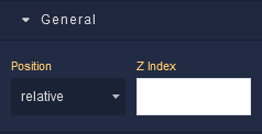
where:
| Argument | Description |
|---|---|
Position |
Determines the positioning behavior of the Video component within its parent container. Available options are:default - This option uses the default positioning behavior, which usually means that the Video component will follow the normal document flow and be positioned based on its place in the layout. When this option is selected, Position settings do not affect the position of the element.relative - Allows you to position the Video component relative to its normal position(default position) within the document flow. You can then use properties like top, bottom, left, and right to offset the component from its original position. These properties are available in the Position section of the component configuration.absolute - Positions the component absolutely within its closest positioned ancestor (a parent element with a position value other than fixed). You can use properties like top, bottom, left, and right to specify the exact position. These properties are available in the Position section of the component.fixed - Positions the Video component relative to the viewport. It remains fixed even when the user scrolls the page. This is commonly used for elements that you want to stay in a specific position while the rest of the content scrolls.sticky - Makes the Video component behave like "relative" within its parent container until it reaches a specific scroll position. Then, it becomes "fixed" and stays in that position until the user scrolls past it. |
Z Index |
Determines the vertical stacking order of the Video component relative to other components on the same screen. Components with higher Z Index values will appear above components with lower values, effectively controlling their overlapping arrangement. This allows you to control the visual hierarchy of components, ensuring that certain elements appear in front of or behind others, providing flexibility in designing the user interface of your application. |
Dimension
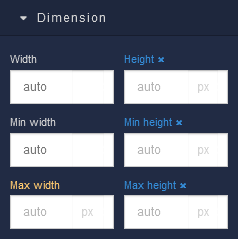
where:
| Argument | Description |
|---|---|
Width |
Controls the width of the component. Available measurement units are: px, %, vw. |
Height |
Controls the height of the component. Available measurement units are: px, %, vh. |
Min Width |
Prevents the component from changing its width below the specified baseline value. Available measurement units are: px, %, vw. |
Min Height |
Prevents the component from changing its height below the specified baseline value. Available measurement units are: px, %, vh. |
Max Width |
Prevents the component from changing its width above the specified baseline value. Available measurement units are: px, %, vw. |
Max Height |
Prevents the component from changing its height above the specified baseline value. Available measurement units are: px, %, vh. |
Margin
Both positive and negative values can be utilized within the Margin settings.
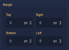
where:
| Argument | Description |
|---|---|
Top |
Defines the space between the top edge of the Video component and the element above it. In case there is no element above the component, then the top border of the parent container will be used for margin spacing. Increasing the top margin value will create additional space above the Video. Available measurement units are: px, %, vh. |
Right |
Controls the space between the right edge of the Video component and the element to its right. If there is no element to the right of the component, then the right border of the parent container will be used for margin spacing. Adjusting the right margin value increases or decreases the space on the right side of the Video. Available measurement units are: px, %, vw. |
Bottom |
Determines the space between the bottom edge of the Video component and the element below it. In case there is no element below the component, then the bottom border of the parent container will be used for margin spacing. Increasing the bottom margin value adds space below the Video. Available measurement units are: px, %, vh. |
Left |
Sets the space between the left edge of the Video component and the element to its left. If there is no element to the left of the component, then the left border of the parent container will be used for margin spacing. Modifying the left margin value changes the space on the left side of the Video. Available measurement units are: px, %, vw. |
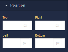
Position
where:
| Argument | Description |
|---|---|
Top |
Defines the vertical position of the Video element relative to its containing element. Available measurement units are: px, %, vh. |
Right |
Governs the horizontal positioning of the Video element relative to the left edge of its parent container. Available measurement units are: px, %, vw. |
Left |
Defines the horizontal positioning of the Video element relative to the right edge of its parent container. Available measurement units are: px, %, vw. |
Bottom |
Controls the vertical position of the Video component from the bottom edge of its containing element. Available measurement units are: px, %, vh. |
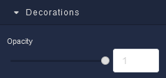
Decorations
where:
| Argument | Description |
|---|---|
Opacity |
Represents the opacity level of the Video component. |