Overview
The Icon Button component combines a visual icon with an interactive button, providing an intuitive way to trigger actions or navigate within your application. Icon buttons are often used for actions like saving, deleting, printing, or toggling features. You can choose from a library of icons, assign click actions, and customize the button's appearance. Icon Buttons enhance the user experience by making key functions easily accessible through recognizable symbols.
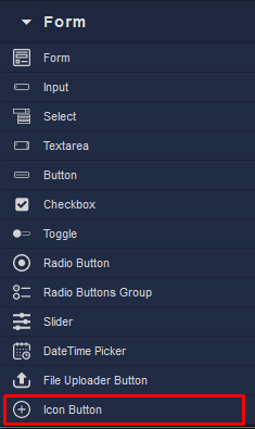
Locating the Icon Button component in the toolbar: