Overview
The Icon component is a dynamic element that enables you to easily incorporate visual symbols, glyphs, or vector icons into your application interfaces. Icons often represent actions, objects, or concepts, providing users with intuitive visual cues and enhancing the overall user experience. With the Icon component, you have the flexibility to select from a wide range of pre-defined icons or upload your custom icons. You can also style the icons by adjusting attributes like size, color, and alignment to seamlessly integrate them into your design. This component empowers you to create visually appealing and interactive user interfaces by leveraging the power of icons to communicate information and functionality effectively.
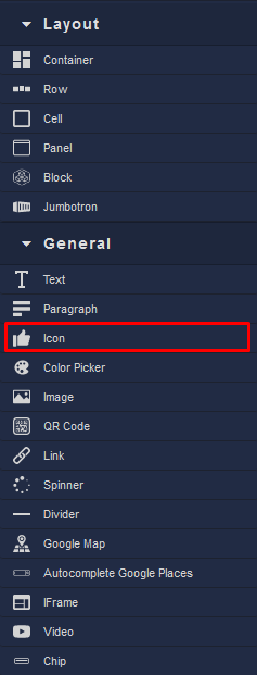
Locating the Icon component in the toolbar: