Configuration
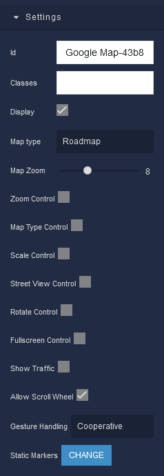
Settings
where:
| Argument | Description |
|---|---|
Id |
Represents the unique identifier for the component. You can use this identifier to refer to this component when building your logic. |
Classes |
Allows applying custom CSS classes to the Google Map component. CSS classes define styles that can be used to control the appearance and formatting of the component. Refer to the Extensions topic for more information. |
Display |
Changes the visibility of the component in the application. The value of this property can be changed programmatically by using the Visibility Logic handler, refer to the Data Binding topic for more information. |
Map Type |
Allows selecting the desired map type to display. The value of this property can be changed programmatically by using the Map Type Logic handler, refer to the Data Binding topic for more information. Available options are:Roadmap - Displays a standard street map.Satellite - Shows satellite images of the selected area.Hybrid - Combines satellite images with street maps.Terrain - Displays topographical information, such as elevation contours. |
Zoom Control |
Sets the initial zoom level of the map for an optimal view of the area. The value of this property can be changed programmatically by using the Zoom Control Logic handler, refer to the Data Binding topic for more information. |
Map Type Control |
Changes the visibility of zoom controls, allowing users to adjust the map's zoom level. The value of this property can be changed programmatically by using the Map Type Control Logic handler, refer to the Data Binding topic for more information. |
Scale Control |
Displays a scale bar on the map, showing the relationship between distance on the map and actual ground distance. The value of this property can be changed programmatically by using the Scale Control Logic handler, refer to the Data Binding topic for more information. |
Street View Control |
Enables or disables the Street View functionality on the map. The value of this property can be changed programmatically by using the Street View Logic handler, refer to the Data Binding topic for more information. |
Rotate Control |
Shows or hides the map's rotate control, allowing users to rotate the view. The value of this property can be changed programmatically by using the Rotate Control Logic handler, refer to the Data Binding topic for more information. |
Fullscreen Control |
Enables the control that allows users to view the map in full screen mode. The value of this property can be changed programmatically by using the Fullscreen Control Logic handler, refer to the Data Binding topic for more information. |
Show Traffic |
Displays real-time traffic information on the map for improved navigation. The value of this property can be changed programmatically by using the Show Traffic Logic handler, refer to the Data Binding topic for more information. |
Allow Scroll Wheel |
Enables or disables the ability for users to zoom in or out using the scroll wheel. The value of this property can be changed programmatically by using the Scroll Wheel Logic handler, refer to the Data Binding topic for more information. |
Gesture Handling |
Allows controlling how map gestures are handled by the user interface. It determines the behavior of various touch and mouse gestures on the map, ensuring intuitive interaction experience for users. The value of this property can be changed programmatically by using the Gesture Logic handler, refer to the Data Binding topic for more information. Available options are:Cooperative - When enabled, the map and other elements on the page cooperate to enable smooth scrolling and interaction.Greedy - Gestures such as panning and zooming will primarily affect the map, and interactions with other elements on the page may be limited or overridden by the map's gestures. This mode is suitable when you want to prioritize map interaction over interactions with other page elements.Auto - Automatically detects the best gesture handling mode based on the user's actions and the context of the interaction. It dynamically adjusts the gesture behavior for optimal user experience.None - When None is selected, gestures are disabled on the map. This mode is useful when you want to prevent user interaction with the map, allowing you to display map data without allowing any gestures. |
Static Markers |
Defines static markers on the map to highlight specific points of interest. Each marker can be customized with its own location, icon, and info window. The value of this property can be changed programmatically by using the Markers Logic handler, refer to the Data Binding topic for more information. |
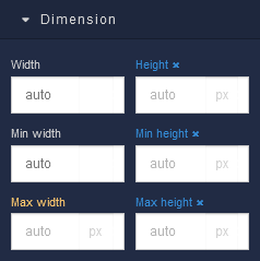
Dimension
where:
| Argument | Description |
|---|---|
Width |
Controls the width of the component. Available measurement units are: px, %, vw. |
Height |
Controls the height of the component. Available measurement units are: px, %, vh. |
Min Width |
Prevents the component from changing its width below the specified baseline value. Available measurement units are: px, %, vw. |
Min Height |
Prevents the component from changing its height below the specified baseline value. Available measurement units are: px, %, vh. |
Max Width |
Prevents the component from changing its width above the specified baseline value. Available measurement units are: px, %, vw. |
Max Height |
Prevents the component from changing its height above the specified baseline value. Available measurement units are: px, %, vh. |
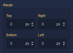
Margin
Both positive and negative values can be utilized within the Margin settings.
where:
| Argument | Description |
|---|---|
Top |
Defines the space between the top edge of the Google Map component and the element above it. In case there is no element above the component, then the top border of the parent container will be used for margin spacing. Increasing the top margin value will create additional space above the Google Map. Available measurement units are: px, %, vh. |
Right |
Controls the space between the right edge of the Google Map component and the element to its right. If there is no element to the right of the component, then the right border of the parent container will be used for margin spacing. Adjusting the right margin value increases or decreases the space on the right side of the Google Map. Available measurement units are: px, %, vw. |
Bottom |
Determines the space between the bottom edge of the Google Map component and the element below it. In case there is no element below the component, then the bottom border of the parent container will be used for margin spacing. Increasing the bottom margin value adds space below the Google Map. Available measurement units are: px, %, vh. |
Left |
Sets the space between the left edge of the Google Map component and the element to its left. If there is no element to the left of the component, then the left border of the parent container will be used for margin spacing. Modifying the left margin value changes the space on the left side of the Google Map. Available measurement units are: px, %, vw. |
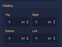
Padding
Allows controlling the internal spacing between the content of the Google Map component and its internal boundaries.
where:
| Argument | Description |
|---|---|
Top |
Increases or decreases the spacing between the content and the top edge of the component. Available measurement units are: px, %, vh. |
Right |
Sets the spacing between the content and the right edge of the component. Available measurement units are: px, %, vw. |
Bottom |
Changes the spacing between the content and the bottom edge of the component. Available measurement units are: px, %, vh. |
Left |
Defines the spacing between the content and the left edge of the component. Available measurement units are: px, %, vw. |