Overview
The Color Picker component is a powerful tool that allows you to easily select and apply colors to various elements within your application interfaces. It provides an intuitive interface for choosing colors by interacting with a color wheel, sliders, or input fields. With the Color Picker component, you can precisely define colors using various color models such as RGB, HEX, and HSL. This component enables you to create visually cohesive and aesthetically pleasing designs by ensuring consistent color schemes and harmonious color combinations. Whether you are customizing text, backgrounds, buttons, or other UI elements, the Color Picker empowers you to achieve the desired visual impact by effortlessly managing and applying colors throughout your project.
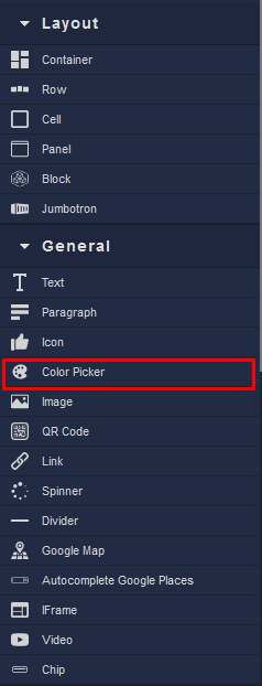
Locating the Color Picker component in the toolbar:
