Configuration
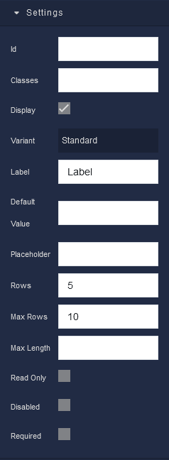
Settings
where:
| Argument | Description |
|---|---|
Id |
Represents the unique identifier of the component. You can use this identifier to refer to this component when building your logic. |
Classes |
Allows applying custom CSS classes to the component. CSS classes define styles that can be used to control the appearance and formatting of the component. Refer to the Extensions topic for more information. |
Display |
Changes the visibility of the component in the application. The value of this property can be changed programmatically by using the Visibility Logic handler, refer to the Data Binding topic for more information. |
Variant |
Allows you to select the visual style of the Textarea component. Available options are:Standard - This is the default style, providing a straightforward text input area.Filled - This style fills the Textarea with a background color, giving it a visually distinct appearance.Outlined - In this style, the Textarea is outlined, offering a clean and minimalistic look. |
Label |
Enables you to add a label to the Textarea, providing context and guidance to users about the type of input expected. Labels enhance the user experience by explaining the purpose of the Textarea. The value of this property can be changed programmatically by using the Label Logic handler, refer to the Data Binding topic for more information. |
Default Value |
Sets a default value for the Textarea. When the page or form loads, the Textarea will contain this pre-filled text. It is useful when you want to provide users with a starting point for their input. The value of this property can be changed programmatically by using the Value Logic handler, refer to the Data Binding topic for more information. |
Placeholder |
Includes a hint or example text within the Textarea. This text appears before users enter their own content and serves as guidance. The value of this property can be changed programmatically by using the Placeholder Logic handler, refer to the Data Binding topic for more information. |
Rows |
Specifies the initial number of visible text lines in the Textarea. It helps determine the initial height of the Textarea box. Users can expand the Textarea by manually entering more lines if needed. |
Max Rows |
Lets you set a maximum limit to the number of text lines that can be displayed. If the user's input exceeds this limit, the Textarea will become scrollable. |
Max Length |
Defines the maximum character limit for the Textarea. When users reach this limit, they can't enter more characters, preventing overly lengthy input. The value of this property can be changed programmatically by using the Max Length Logic handler, refer to the Data Binding topic for more information. |
Read Only |
Restricts users from editing or modifying the content within the Textarea. It is beneficial when you want to display information for reference but not for editing. The value of this property can be changed programmatically by using the Read Only State Logic handler, refer to the Data Binding topic for more information. |
Disabled |
When enabled, the Textarea becomes inactive, and users cannot interact with it. This is often used to indicate that a Textarea is not applicable or accessible in a particular context. The value of this property can be changed programmatically by using the Disabled State Logic handler, refer to the Data Binding topic for more information. |
Required |
Makes the Textarea a mandatory field. Users must provide input in this Textarea before submitting a form or taking specific actions. It ensures that essential information is not left blank. The value of this property can be changed programmatically by using the Required State Logic handler, refer to the Data Binding topic for more information. |
Flex
With Flex settings, you can control how components within a container are positioned, aligned, and distributed.
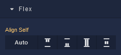
| Icon |
Description |
|---|---|
 |
Default alignment of the component. |
 |
Aligns the component to the start of its container. |
 |
Aligns the component to the end of its container. |
 |
Stretches to occupy all available space. |
 |
Centers the component within its container. |
Dimension
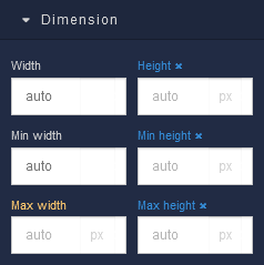
where:
| Argument | Description |
|---|---|
Width |
Controls the width of the component. Available measurement units are: px, %, vw. |
Height |
Controls the height of the component. Available measurement units are: px, %, vh. |
Min Width |
Prevents the component from changing its width below the specified baseline value. Available measurement units are: px, %, vw. |
Min Height |
Prevents the component from changing its height below the specified baseline value. Available measurement units are: px, %, vh. |
Max Width |
Prevents the component from changing its width above the specified baseline value. Available measurement units are: px, %, vw. |
Max Height |
Prevents the component from changing its height above the specified baseline value. Available measurement units are: px, %, vh. |
Margin
Both positive and negative values can be utilized within the Margin settings.
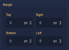
where:
| Argument | Description |
|---|---|
Top |
Defines the space between the top edge of the component and the element above it. In case there is no element above the component, then the top border of the parent container will be used for margin spacing. Increasing the top margin value will create additional space above the component. Available measurement units are: px, %, vh. |
Right |
Controls the space between the right edge of the component and the element to its right. If there is no element to the right of the component, then the right border of the parent container will be used for margin spacing. Adjusting the right margin value increases or decreases the space on the right side of the component. Available measurement units are: px, %, vw. |
Bottom |
Determines the space between the bottom edge of the component and the element below it. In case there is no element below the component, then the bottom border of the parent container will be used for margin spacing. Increasing the bottom margin value adds space below the component. Available measurement units are: px, %, vh. |
Left |
Sets the space between the left edge of the component and the element to its left. If there is no element to the left of the component, then the left border of the parent container will be used for margin spacing. Modifying the left margin value changes the space on the left side of the component. Available measurement units are: px, %, vw. |