Configuration
Settings
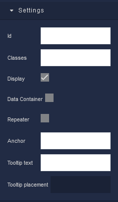
where:
| Argument | Description |
|---|---|
Id |
Represents the unique identifier for the component. You can use this identifier to refer to this component when building your logic. |
Classes |
Allows applying custom CSS classes to the Block component. CSS classes define styles that can be used to control the appearance and formatting of the Block component. Refer to the Extensions topic for more information. |
Display |
Changes the visibility of the component in the application. The value of this property can be changed programmatically by using the Visibility Logic handler, refer to the Data Binding topic for more information. |
Data Container |
This feature enables the use of the component as a data storage mechanism, similar to Page Data. When new data is assigned to the component, only the component itself is re-rendered. The applicability of this parameter is extensive, as it allows data storage without the need to re-render the entire page, as is the case with Page Data. |
Repeater |
Determines whether the contents of the Block should be repeated based on the provided collection of data. When the Block is enabled, the contents of the Block will be duplicated for each record or item in the data source. This functionality is valuable for generating repetitive UI components, with each repetition representing different data entries. Enabling the Repeater allows you to create dynamic and data-driven layouts in your application's user interface. |
Anchor |
Defines how the Block should be anchored within its parent container. This setting influences how the Block's position and size are determined relative to its parent. You must use the unique identifier of the parent component as the input value for this parameter. The value of this property can be changed programmatically by using the Anchor Logic handler, refer to the Data Binding topic for more information. |
Tooltip text |
Provides additional information about the Block that is displayed when a user hovers their cursor over the Block. This feature is useful for offering context or brief explanations about the purpose of the Block. The value of this property can be changed programmatically by using the Tooltip Text Logic handler, refer to the Data Binding topic for more information. |
Tooltip placement |
Determines where the tooltip appears in relation to the Block. You can choose from various options, such as Top, Right, Bottom, and Left. This setting ensures that the tooltip is positioned in a way that does not obstruct the Block's content or other user interface elements. |
General
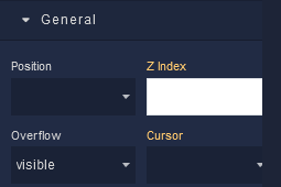
where:
| Argument | Description |
|---|---|
Position |
Determines the positioning behavior of the Block component within its parent container. Available options are:default - This option uses the default positioning behavior, which usually means that the Block component will follow the normal document flow and be positioned based on its place in the layout. When this option is selected, Position settings do not affect the position of the element.relative - Allows you to position the Block component relative to its normal position(default position) within the document flow. You can then use properties like top, bottom, left, and right to offset the component from its original position. These properties are available in the Position section of the component configuration.absolute - Positions the component absolutely within its closest positioned ancestor (a parent element with a position value other than fixed). You can use properties like top, bottom, left, and right to specify the exact position. These properties are available in the Position section of the componentfixed - Positions the Block component relative to the viewport. It remains fixed even when the user scrolls the page. This is commonly used for elements that you want to stay in a specific position while the rest of the content scrolls.sticky - Makes the Block component behave like "relative" within its parent container until it reaches a specific scroll position. Then, it becomes "fixed" and stays in that position until the user scrolls past it. |
Z Index |
Determines the vertical stacking order of the Block component relative to other components on the same screen. Components with higher Z Index values will appear above components with lower values, effectively controlling their overlapping arrangement. This allows you to control the visual hierarchy of components, ensuring that certain elements appear in front of or behind others, providing flexibility in designing the user interface of your application. |
Cursor |
Identifies the cursor type when the mouse is hovered over the Block element. Refer to the Mozilla documentation to see what each cursor looks like. |
Overflow |
Determines how content should be displayed when it exceeds the available space within the defined boundaries of the component. Available options are:visible - Content that overflows the component's boundaries will be fully visible, potentially extending beyond the component's edges and overlapping other elements. Default setting.hidden - Content that exceeds the component's boundaries will be clipped and hidden. It won't be visible outside the defined area of the component.scroll - If content overflows, a scroll bar will be added to the component, allowing users to scroll and view the hidden content.auto - The browser automatically adds a scroll bar to the component if the content overflows. If the content doesn't overflow, no scroll bar will be added. |
Background
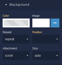
where:
| Argument | Description |
|---|---|
Color |
Represents the background color for the component. |
Image |
Sets a background image for the component. The image must be selected from the Backendless Cloud. |
Repeat |
Defines how the background image specified in the Image parameter should be repeated across the component. Available options are:repeat - The background image is tiled both horizontally and vertically to cover the container's entire area.repeat-x - The background image is tiled only horizontally, repeating along the x-axis.repeat-y - The background image is tiled only vertically, repeating along the y-axis.no-repeat - The background image is not repeated and appears only once. |
Position |
Sets the initial position of the background image specified in the Image parameter. It determines where the top left corner of the background image will be placed within the Block. Options include various combinations of horizontal (left, center, right) and vertical (top, center, bottom) alignment. |
Attachment |
Defines whether the background image specified in the Image parameter should scroll along with the content or remain fixed as the content is scrolled. Available options are:scroll - The background image scrolls along with the content.fixed - The background image remains fixed within the Block as content is scrolled.local - The background image's scrolling behavior is determined by its parent element. |
Size |
Controls how the background image specified in the Image parameter should be sized within the Block. Available options are:auto - The background image is displayed at its original size.cover - The background image is scaled to cover the entire Block, potentially cropping parts of the image.contain - The background image is scaled to fit within the Block while maintaining its aspect ratio. |
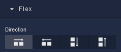
Flex
With Flex settings, you can control how components within a container are positioned, aligned, and distributed.
| Icon |
Description |
|---|---|
 |
Sets the child elements or content to be arranged horizontally along the main axis, from left to right. This is the default direction. |
 |
Arranges the child elements or content horizontally along the main axis, but in reverse order, from right to left. |
 |
Stacks the child elements or content vertically along the main axis, from top to bottom. |
 |
Stacks the child elements or content vertically along the main axis, but in reverse order, from bottom to top. |
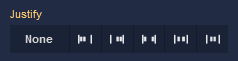
Justify
| Icon |
Description |
|---|---|
 |
Selecting None will not apply any specific justification to the content within the Block. It will maintain its default alignment. |
 |
Choosing Start will align the content to the start of the main axis, this will place the content at the left edge. |
 |
Opting for End will align the content to the end of the main axis, this will position the content at the right edge. |
 |
The Space between option evenly distributes the space between the content items along the main axis. The first item will be at the start and the last item will be at the end, with equal spacing in between. |
 |
Selecting Space around distributes space evenly around the content items, including at the start and end. This creates a balanced space between each item. |
 |
Choosing Center will center-align the content along the main axis, resulting in equal space before and after the content. |
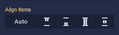
Align Items
| Icon |
Description |
|---|---|
 |
Default alignment of the child elements. |
 |
Aligns child elements to the start of its container. |
 |
Aligns child elements to the end of its container. |
 |
Stretches child elements to occupy all available space. |
 |
Centers child elements within its container. |
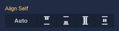
Align Self
| Icon |
Description |
|---|---|
|
Default alignment of the component. |
|
Aligns the Block to the start of its container. |
|
Aligns the Block to the end of its container. |
|
Stretches to occupy all available space. |
|
Centers the Block within its container. |
Additional options
where:
| Argument | Description |
|---|---|
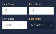
Flex Grow |
Determines how much the Block can grow in relation to other items within the same container. For example, a value of 2 will allow the Block to grow twice as much as a Block with a value of 1. |
Flex Shrink |
Specifies the ability of the Block to shrink if the available space is insufficient to accommodate all the flexible items within the container. For instance, a value of 2 will shrink the Block content twice as much as a Block with a value of 1. |
Flex Basis |
Sets the initial size of the Block before the available space is distributed among other components. You can provide a specific length value, such as pixels (px) or a percentage (%). |
Flex Wrap |
Controls whether the flexible items within the Block should be forced onto a single line or allowed to wrap onto multiple lines. Available options are:No Wrap - All items stay on a single line, potentially causing overflow.Wrap - Items wrap onto multiple lines if needed.Wrap Reverse - Items wrap onto multiple lines in reverse order. |
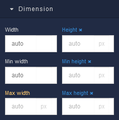
Dimension
where:
| Argument | Description |
|---|---|
Width |
Controls the width of the component. Available measurement units are: px, %, vw. |
Height |
Controls the height of the component. Available measurement units are: px, %, vh. |
Min Width |
Prevents the component from changing its width below the specified baseline value. Available measurement units are: px, %, vw. |
Min Height |
Prevents the component from changing its height below the specified baseline value. Available measurement units are: px, %, vh. |
Max Width |
Prevents the component from changing its width above the specified baseline value. Available measurement units are: px, %, vw. |
Max Height |
Prevents the component from changing its height above the specified baseline value. Available measurement units are: px, %, vh. |
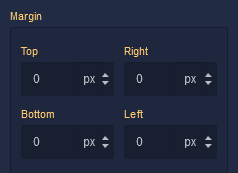
Margin
Both positive and negative values can be utilized within the Margin settings.
where:
| Argument | Description |
|---|---|
Top |
Defines the space between the top edge of the component and the element above it. In case there is no element above the component, then the top border of the parent container will be used for margin spacing. Increasing the top margin value will create additional space above the component. Available measurement units are: px, %, vh. |
Right |
Controls the space between the right edge of the component and the element to its right. If there is no element to the right of the component, then the right border of the parent container will be used for margin spacing. Adjusting the right margin value increases or decreases the space on the right side of the component. Available measurement units are: px, %, vw. |
Bottom |
Determines the space between the bottom edge of the component and the element below it. In case there is no element below the component, then the bottom border of the parent container will be used for margin spacing. Increasing the bottom margin value adds space below the component. Available measurement units are: px, %, vh. |
Left |
Sets the space between the left edge of the component and the element to its left. If there is no element to the left of the component, then the left border of the parent container will be used for margin spacing. Modifying the left margin value changes the space on the left side of the component. Available measurement units are: px, %, vw. |
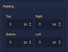
Padding
Allows controlling the internal spacing between the content of the component and its internal boundaries.
where:
| Argument | Description |
|---|---|
Top |
Increases or decreases the spacing between the content and the top edge of the component. Available measurement units are: px, %, vh. |
Right |
Sets the spacing between the content and the right edge of the component. Available measurement units are: px, %, vw. |
Bottom |
Changes the spacing between the content and the bottom edge of the component. Available measurement units are: px, %, vh. |
Left |
Defines the spacing between the content and the left edge of the component. Available measurement units are: px, %, vw. |
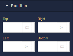
Position
where:
| Argument | Description |
|---|---|
Top |
Defines the vertical position of the component relative to its containing element. Available measurement units are: px, %, vh. |
Right |
Governs the horizontal positioning of the component relative to the left edge of its parent container. Available measurement units are: px, %, vw. |
Left |
Defines the horizontal positioning of the component relative to the right edge of its parent container. Available measurement units are: px, %, vw. |
Bottom |
Controls the vertical position of the component from the bottom edge of its containing element. Available measurement units are: px, %, vh. |
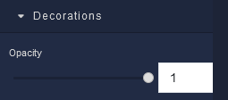
Decorations
where:
| Argument | Description |
|---|---|
Opacity |
Represents the opacity level of the component. |
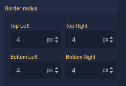
Border Radius
where:
| Argument | Description |
|---|---|
Top Left |
Specifies the radius of the rounded corner at the top left of the component. Use this parameter to control the curvature of the corner at the top left corner of the component's border. Available measurement units are: px, %. |
Top Right |
Specifies the radius of the rounded corner at the top right of the component. Adjust this parameter to determine the curvature of the corner at the top right corner of the component's border. Available measurement units are: px, %. |
Bottom Left |
Determines the radius of the rounded corner at the bottom left of the component. Modify this parameter to define the curvature of the corner at the bottom left corner of the component's border. Available measurement units are: px, %. |
Bottom Right |
Sets the radius of the rounded corner at the bottom right of the component. Use this parameter to specify the curvature of the corner at the bottom right corner of the component's border. Available measurement units are: px, %. |
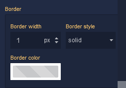
Border
where:
| Argument | Description |
|---|---|
Border Width |
Specifies the width of the border. |
Border style |
Represents the style of the component's border. Available measurement units are: px, em.solid - This option sets the border of the component to a solid, continuous line, creating a straightforward and distinct visual separation.dotted - Selecting this option applies a dotted border style to the component, resulting in a series of evenly spaced dots forming the border.dashed - The dashed border style creates a border composed of dashed lines, adding a stylish and slightly more dynamic visual element to the component.double - Choosing this option gives the component a double border, creating a bold and distinctive border with two parallel lines.groove - This border style applies a three-dimensional "groove" effect to the component, giving it a carved appearance that makes it seem embedded into the surrounding content.ridge - The ridge border style creates a three-dimensional "ridge" effect, making the border of the component appear raised and standing out from the background.inset - Selecting this option gives the border of the component an "inset" effect, creating the illusion that the component is pressed into the page.outset - The outset border style creates a raised "outset" effect for the border of the component, making it seem elevated from the background. |
Border color |
Identifies the color of the border. |
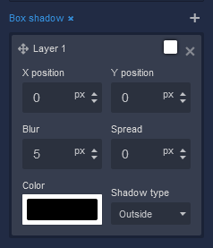
Box Shadow
where:
| Argument | Description |
|---|---|
X position |
This parameter controls the horizontal offset of the shadow cast by the component. Positive values move the shadow to the right, while negative values move it to the left. Adjusting the X position allows you to control the direction of the shadow's horizontal displacement. Available measurement units are: px, %. |
Y position |
The Y position parameter determines the vertical offset of the shadow cast by the component. Positive values move the shadow downward, while negative values move it upward. By adjusting the Y position, you can control the shadow's vertical displacement. Available measurement units are: px, %. |
Blur |
Adjusting the blur parameter controls the amount of blurring applied to the shadow of the component. Higher values create a more diffused and softer shadow appearance, while lower values produce a sharper and crisper shadow. Available measurement units are: px. |
Spread |
The spread parameter allows you to control the size of the shadow cast by the component. Increasing the spread value extends the shadow's size, while decreasing it makes the shadow more compact. This parameter affects the overall size of the shadow, not just its blur. Available measurement units are: px. |
Color |
This parameter defines the color of the shadow cast by the component. You can choose a specific color using color values, such as hexadecimal, RGB, or HSLA colors. The color of the shadow significantly impacts the visual effect, allowing you to create subtle or dramatic contrasts with the background. |
Shadow type |
Allows specifying whether the shadow should be cast outside or inside the component. By selecting outside, the shadow will appear on the outer edges of the component, creating a sense of depth. Conversely, choosing inside will render the shadow within the component's boundaries, providing a unique visual effect. |