About UI Builder
Welcome to Backendless UI Builder - a visual integrated development environment (IDE). Using UI Builder you can design and develop graphical user interfaces (UIs) for mobile and web applications. UIs built with the system can seamlessly integrate with the Backendless backend and use the entire set of functionality supported by the platform. Additionally, you can integrate externally located services. UI Builder apps run in a web browser as Single Page Applications (SPAs) and/or can be packaged to run on mobile devices.
UI Application Anatomy
- A UI Builder application resides in a UI Container.
- A container consists of one or more pages.
- A page consists of UI components and logic.
- One of the pages must be marked as the main page. This is the page that opens up by default when running the UI app.
- Page components create the user interface and are responsible for presenting data to the user and for user-system interaction.
- The logic is responsible for managing the state of the UI, processing data and server integration.
- A container can also have a UI Theme and Extensions. A theme is a collection of styles that dictate the look and feel of the components in all pages of the container. Extensions contain CSS and LESS directives that can be used by the UI components.
- To make a UI application available for users, it must be published. When publishing a UI application, you will be publishing a UI Container.
Editor Structure
The UI Builder consists of five primary sections:
- User Interface - this is where you create and edit the pages of your application. By "editing the pages" we mean positioning the components and creating a layout of a page.
- Logic - a section of the editor where you can compose logic for your pages and components.
- Components - a section where you can create and manage custom and reusable components.
- Theme - this is where you can preview and install a UI Theme for your UI Container and create/edit style extensions.
- Settings - a section where you can configure some runtime settings for your UI application (i.e. UI Container).
Below is a more detailed overview of the User Interface section of the editor:
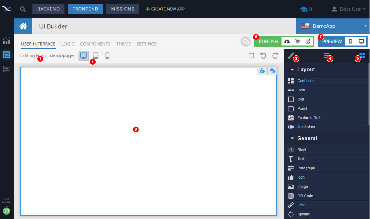
Where:
- Page/Container Manager - when moving the mouse over the Editing Page label displays a panel with a list of UI Containers and the pages in the current container. Use it to create new containers, switch between the containers, create new pages, rename/delete pages and switch between pages.
- Page Mode Switcher - changes the page mode to render as on desktop, tablet or mobile.
- Style Manager (not shown) - displays the style manager for the currently selected component or the page, if the page is selected for editing.
- Component Tree (not shown) - displays a tree with a hierarchy of the components on the page.
- Toolbox (shown) - displays a list of all available components.
- App Publisher - you can publish your app so it becomes available as a web app or a mobile app. Additionally, the app can be published as a blueprint to the Backendless Marketplace.
- Page Preview - preview the current page in a browser or on a mobile device.
- Current Page Canvas - drag and drop the components from the Toolbox onto the page canvas.