 UI Component Recipe")
A snackbar or “toast” element is a message displayed to the user, usually on a temporary basis over a few seconds. It’s great for alerting the user to something without requiring any action. Think of a success message, a confirmation, or an error alert of some kind… very useful.
Backendless and UI Builder is an amazing and powerful platform which allows us to build virtually any kind of web app without having to spend 5 years having to “learn to code”. We are currently in the process of re-building our existing web application (Ubindi) entirely on Backendless. It’s going really well!
So we needed some ‘toast’ elements, and there is already a free Snackbar Custom Component in Backendless Marketplace that can be installed into an application with just a few clicks. However, that one offers limited customization options, so we decided to just build our own snackbar element from scratch, using Codeless logic and CSS.
In this recipe, you’ll learn how to implement simple logic that will transform any element or component in your Backendless application into a snackbar/toast element. In our example, we’ll illustrate by turning a basic ‘paragraph’ component into a ‘toast’ element. The toast is then triggered by invoking a function that’s built entirely using Codeless blocks. No Javascript or anything fancy!
Here we go:
Step 1: Assign a class and data binding to your component
You can choose any kind of component (or container with lots of components, like icons, pictures, text, etc.). In our example, we’ll just take a basic ‘paragraph’ component, drag it into our page, and give it the class toastr. We’ll also add a trigger button which will trigger the toast:
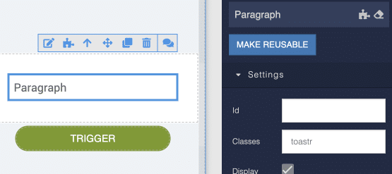
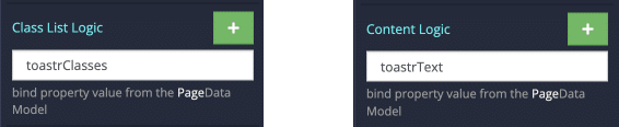
Now, click the logic button (the little “puzzle” icon) for your toast component. We need to do some data binding for the Class List and Content of our component to get values from Page Data. Type in your preferred property names like so:
Step 2: Create a theme extension to define the toast class(es)
Click the ‘Theme’ tab on your front end, and then towards the right, select ‘Extensions’.
Click the green “New Extension” button to create a new extension, you can call it whatever you like (we call ours toastr). You’ll see a blank editor where you can write LESS & CSS code:
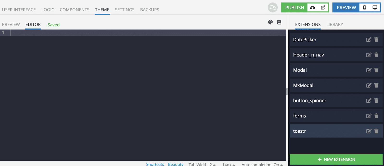
The following is our own style code. You can copy/paste that into your own extension and then customize things according to your preferences:
/* the “toastr” class */

.toastr {
  position: fixed; //position the toast fixed relative to viewport
  left: 50%; // this is the middle of the page, change this as you like

  //center in the page, place it well off screen vertically:
  transform: translateX(-50%);   opacity: 0; // make it invisible
  top: -500px; //position the toast off screen at the top

  /* our animation involves just a simple transition: */
  transition: opacity 500ms ease-in-out, top 500ms ease-in-out;
  z-index: 100; // make sure the toast is in front of everything else!
  background: @themePrimary; // default background color
  border-radius: 8px; // if you want rounded borders
  font-size: 16px;
  color: #ffffff; // text color
  box-shadow: @buttonContainedShadowHover;
  width: 320px;

    /* the “show” subclass reveals the toast element */
    &.show {
      opacity: 1; // show the thing
      top: 30px; // bring it into position
    }

    /* some color subclasses, make as many as you want */
    &.green {
      background: #00ff00;
    }
    &.red {
      background: #ff0000;
    }
  }
To make our toast element appear and then disappear again, we will be assigning and un-assigning CSS classes. To make this happen in our application, we’ll create some (Codeless) logic.
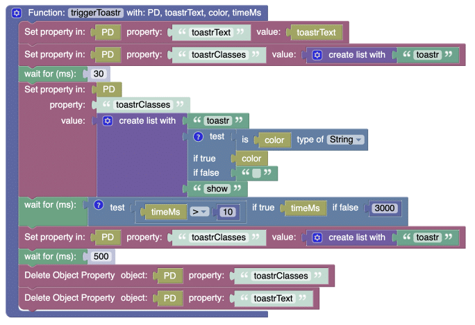
Step 3: Create a custom (global) function to trigger the toast
The following function can be called in any kind of event (like a button click, or an exception being thrown in your error handling – anywhere you want a toast to be shown to the user).
In UI Builder, select the “Trigger” button we dragged in earlier. Click the logic for it and towards the right, click “Functions” to manage your custom (global) functions. Click the green “+” button to create a new function, we’ll call it triggerToast in our example.
Let’s start building the function. Unselect the “with return” (we don’t need it), and give your function 4 input arguments:
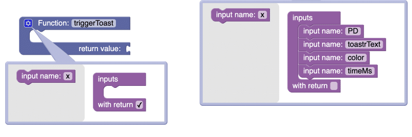
PDwill be connected to Page Data.toastrTextwill take any text as input, it’s the message that will be displayed in the toastcolorwill be an optional input which can take any of the color-related subclasses you created in your toast style extensiontimeMSwill be another optional input which sets the length of time (in msec) that the toast will display
Essentially, our function is going to:
- Assign the
toastrTextas a property to Page Data, with a text value. - Assign the class of
showto your toast, along with any (optional) color class for the background - Wait 3 seconds (or use the
timeMSargument you supply) - Remove the
showandcolorclasses of your toast element and then delete all properties from Page Data.
We will also need a few additional “wait” statements just to make sure CSS transitions are handled properly. Here’s the complete function:
And that’s all there is to it!
Testing the toast
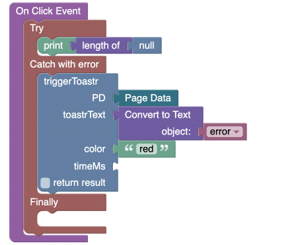
To test out our toast/snackbar element, let’s wire up the “on click” event for our trigger button, in a way that demonstrates how we might use a toast to display an error to the user or even the builder who doesn’t want to inspect things using browser dev tools.
Let’s add a “try/catch” block from the Exceptions menu and try to print the length of null. This will produce an error and trigger the ‘catch’ logic to run. Now in “Catch with error”, select our custom toast trigger function and wire up the error (which is an object we need to convert to text first).
If you created a color subclass of red, you can also supply that to the color input of our triggerToast function, like so:
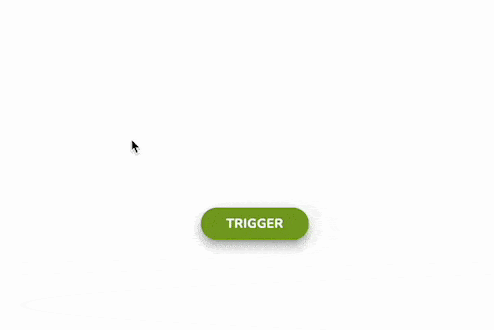
Now we’re ready to test! Preview the page and then click on the “trigger” button – you should see this:
You will probably want to make your toast component reusable so you can use it in multiple pages in your app. We actually put ours inside of yet another reusable component: our navbar/header… this means our toast element is automatically available on every page in our application.
Whenever you need a toast to appear, just bring in your custom trigger function and… done!
The magic of data binding
You may not have noticed, but there is some amazing “magic” going on in our function, having to do with Page Data and data binding.
By connecting Page Data to the function as an argument, whatever happens with that argument inside the function (while it’s running) will be happening with Page Data – in real time.
So with data binding, your toast element will get classes assigned to it, and then get them removed, all in sync with the changes that are happening in Page Data. Magic!
Hopefully, this recipe is helpful. Leave a comment if so!
