How to Install the Snackbar Component
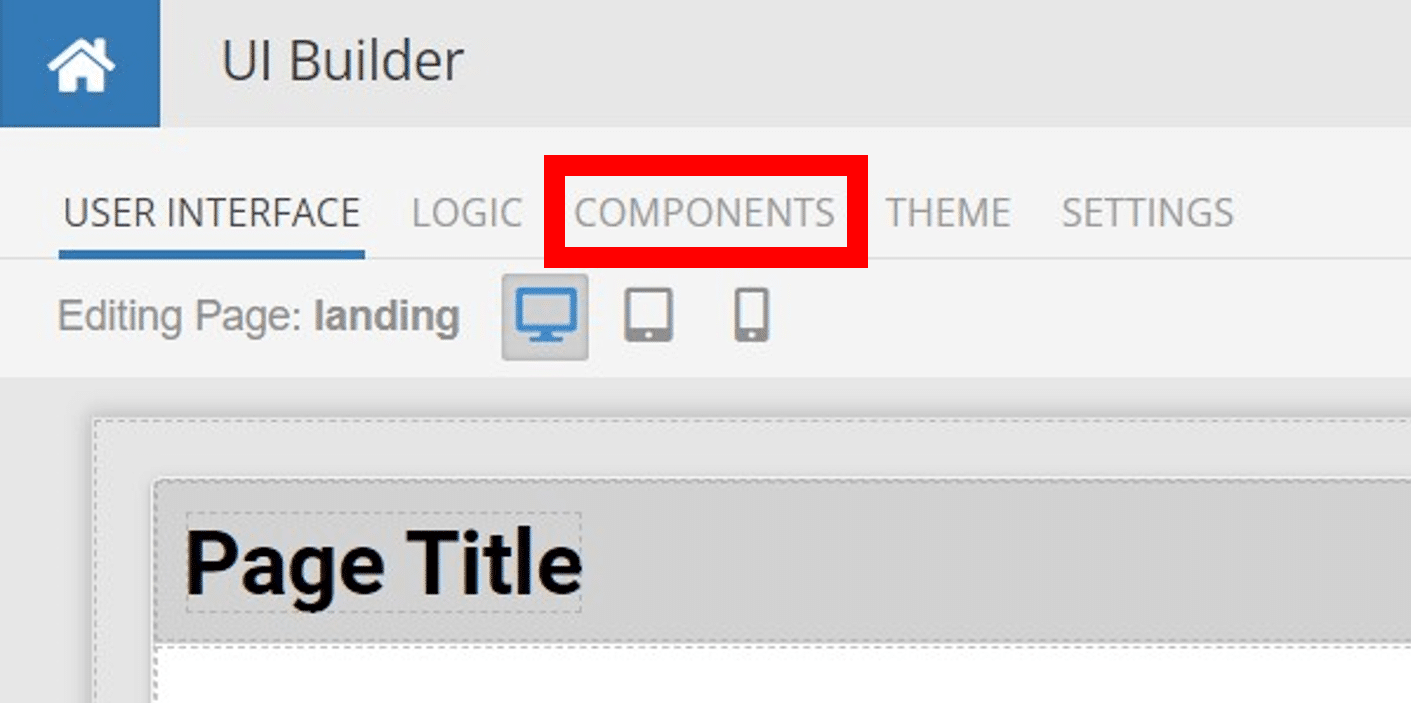
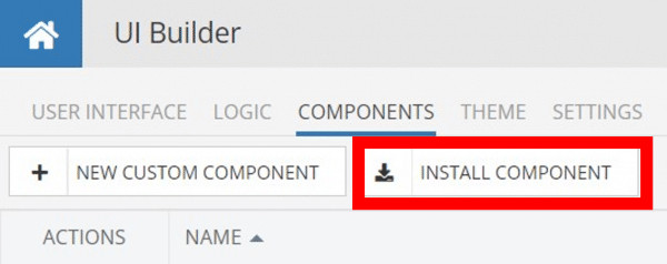
Installing custom components from Backendless Marketplace is super easy. First, in UI Builder, select the Components tab.

There, you will see a button labeled Install Component. This will take you to the library of components available in the Marketplace.
When you click Install Component, you will open a list of available UI Components to install.
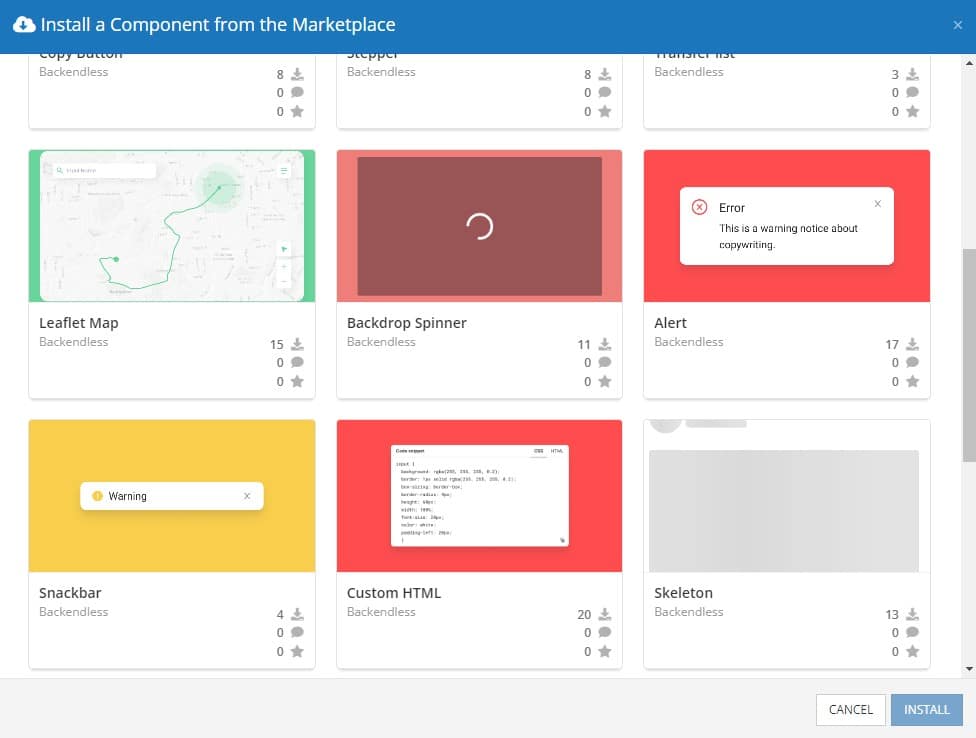
Select the component you want and click Install.
When you return to the User Interface tab, you will see a new section added to your toolkit on the right-hand side called Custom Components.
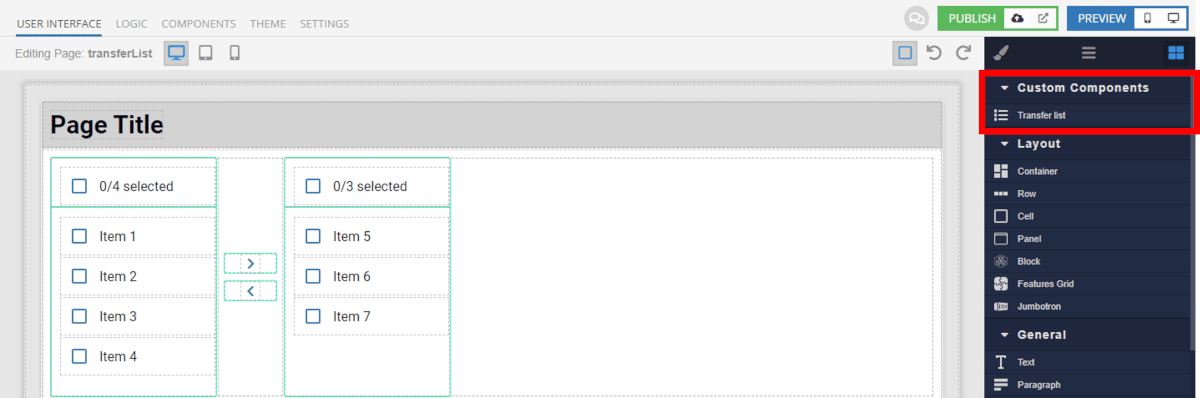
You can then simply drag the component onto your canvas just like any other UI Component.
How the Snackbar Component Works
When added to your app, the Snackbar component offers several basic functions out of the box.
First, you have the ability to set whether the Snackbar will hide automatically or not. If you choose for the item to hide, you can also set the amount of time it will remain visible before hiding.
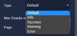
Next, you can choose from one of five different Snackbar types: default, info, success, warning, and error. These each have preset styles that can be easily customized using Extensions.
You can either hard-code the content of the Snackbar, or you can set it using Codeless logic. In order to access the Codeless block for a Snackbar component, you must give the component an ID in UI Builder.
Below you’ll see the logic used for the Snackbar example above.
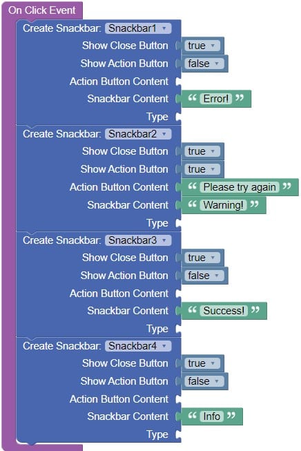
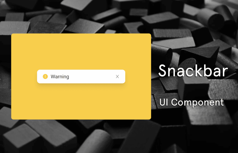
You can choose to include an Action with the Snackbar, as we did with the warning snack in the example. You can also choose to hide the close “x” if you want to ensure the snack stays open until it hides.
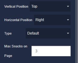
Finally, using the toolkit in UI Builder, you can choose the location of each snack. You can choose both the horizontal alignment (right, center, left) and vertical position (top, center, bottom).
Available Options and What They Mean
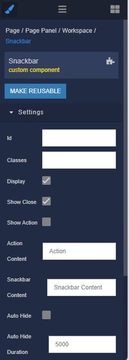
Once you have placed your component, when you select it, you will see all of the available options (properties) for the component in the toolkit area. These are the default settings for the component that you can easily adjust.
Each of the available properties are described in the table below. For more information, such as Theme styles and event handlers, visit the Snackbar GitHub repo.
| Property |
Type |
Default value |
Logic |
Data Binding |
UI Setting |
Description |
| showClose |
checkbox |
true |
|
NO |
YES |
This is a handler that controls visibility of the close button. |
| showAction |
checkbox |
false |
|
NO |
YES |
This is a handler that controls visibility of the action button. |
| actionContent |
text |
‘Action’ |
Action Content Logic |
YES |
YES |
This is a handler to set the text of the action button. |
| snackContent |
text |
‘Snackbar Info’ |
Snackbar Content Logic |
YES |
YES |
This is a handler to set the text of the snackbar. |
| autoHide |
checkbox |
false |
|
NO |
YES |
This is a handler that controls autohiding. |
| autoHideDuration |
number |
5000 |
|
NO |
YES |
This is a handler that sets the time when snackbar will be hidden. |
| verticalPosition |
select
[top, center, bottom] |
‘top’ |
|
NO |
YES |
This is a handler that sets the vertical position of snackbar. |
| horizontalPosition |
select
[right, center, left] |
‘right’ |
|
NO |
YES |
This is a handler that sets the horizontal position of snackbar. |
| type |
select
[default, info, success, warning, error] |
‘default’ |
Type Logic |
YES |
YES |
This is a handler to set the type of the snackbar. |
| maxSnacks |
number |
3 |
|
NO |
YES |
This is a handler to set the number of maximum visible snackbars. |
When you click on the Logic icon or tab for the component, you will see the modifiable event handlers, just as you would with a standard component. However, the main logic for the component – the logic that makes it work – is hidden to protect it from accidentally being broken.
Additionally, in the Logic area, you will also find all available data binding properties.
That’s it! Ready to try it for yourself?
The Snackbar component is one of many custom components available now in Backendless Marketplace, completely free!