Blog

Introducing Backendless Visualizations

by on May 4, 2023
Backendless Visualizations Feature

Visualizing data is a valuable way to glean insights into your data quickly and without the need to hire a data scientist. Backendless Visualizations also make it super easy to share those insights with others.

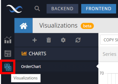
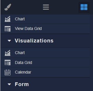
Visualizations are a new feature released as part the Backendless version 7.0. To access Visualizations, navigate to the Frontend and select the Visualizations icon.

Visualizations section of Backendless Console

In this article, we’ll take a deep dive into this feature and the visualization types available in the initial release. Let’s get started.

What are Visualizations?

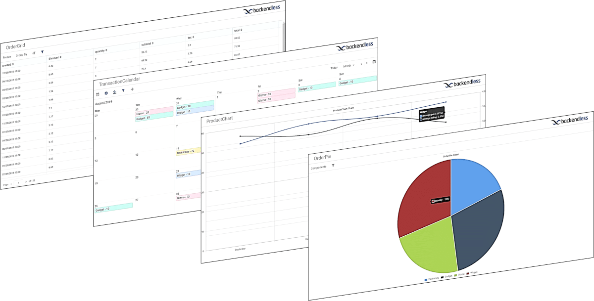
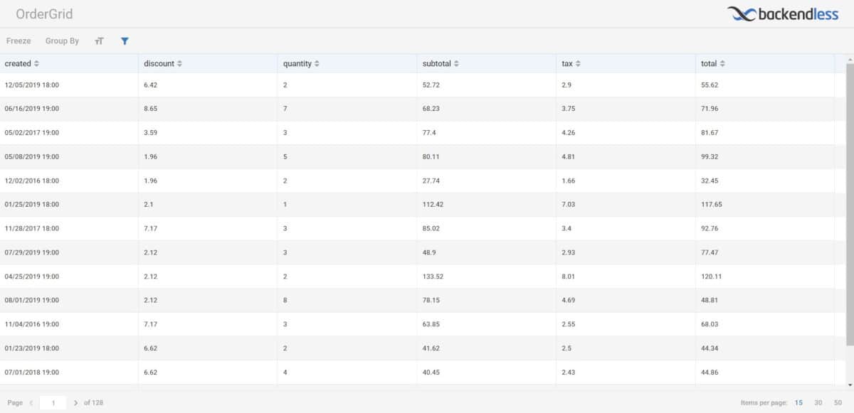
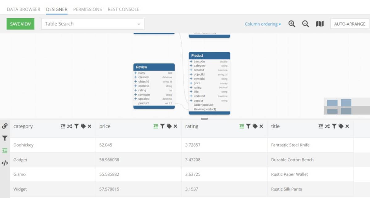
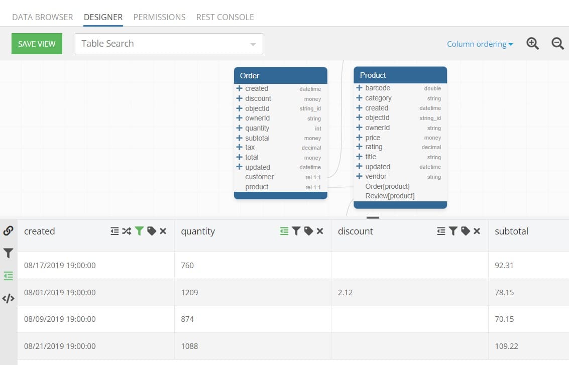
Visualizations in Backendless are an easy way to visualize data stored in your Backendless Database. Many allow you to simply use data tables to build your visualizations, while some allow or require you to use Views that you’ve created.

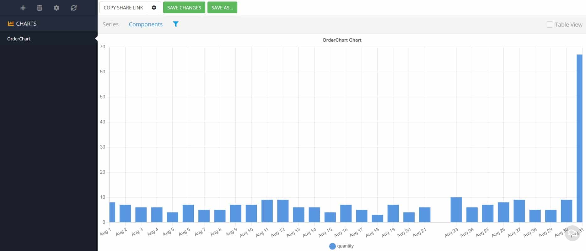
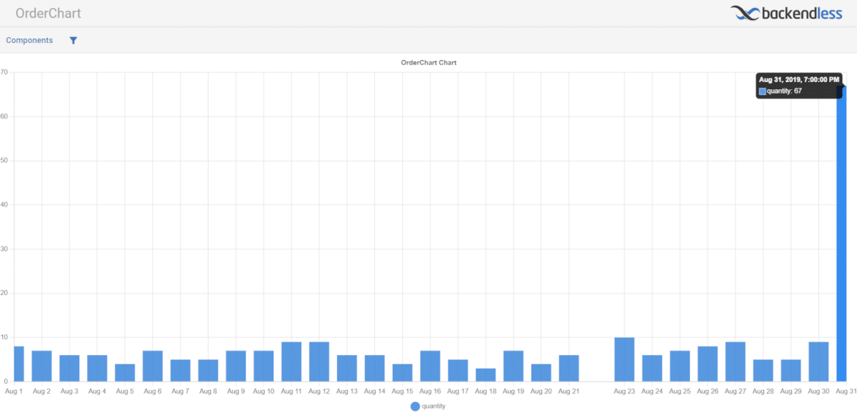
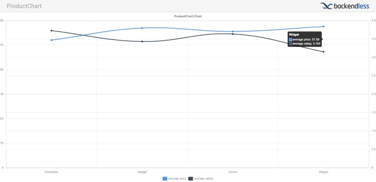
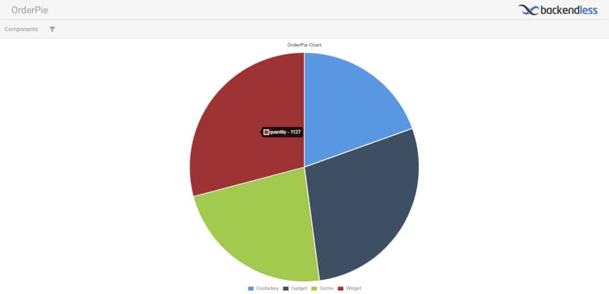
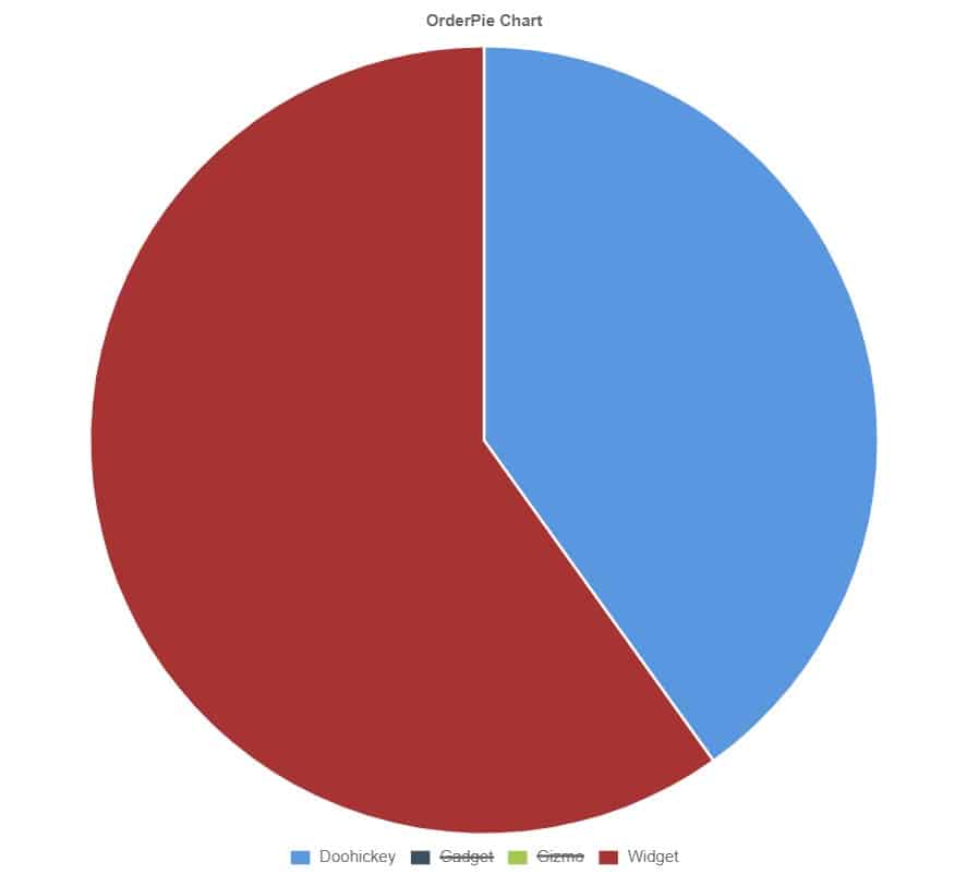
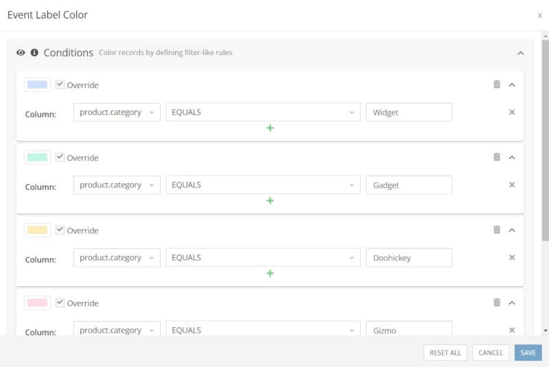
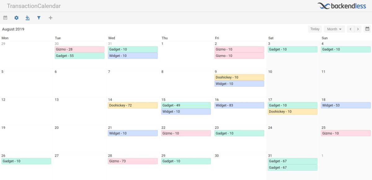
Visualizations come in the form of charts, spreadsheet-style data grids, and calendars. They allow you to display data in a way that is easy to understand visually. You can also include tools to allow the viewer to manipulate the visualization themselves to dig deeper into the data you share.

Visualization Examples

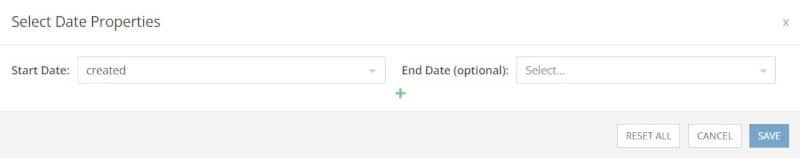
Once you create a visualization, you can easily make adjustments by modifying the choice of data source, such as choosing a different table or column. You can also “Save As” a Visualization to save a new copy, allowing you to preserve the original visualization while creating spin-offs for separate data groups, date ranges, categories, etc.

Sharing Visualizations

Your visualizations can be shared with others, even if you don’t have a published app. Visualizations are a quick and easy way to share data insights without using UI Builder to build a complete page or app.

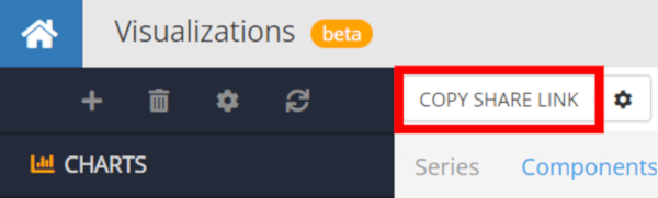
To share a visualization, simply click the Copy Share Link button to copy a link to a live Visualization page.

Share Visualization from Backendless Console

Before you share, however, you might want to setup some restrictions to ensure your data doesn’t fall into the wrong hands. The Visualization settings, next to the `Copy Share Link` button, give you extra control.

Visualizations Share Configuration

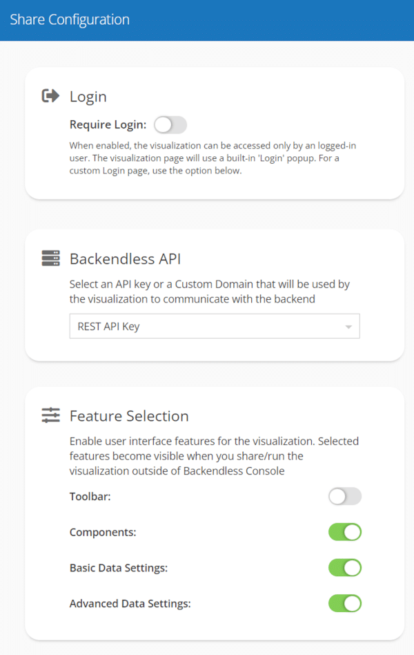
With “Share Configuration”, you can adjust what a person sees when using the share link. First, you can enable a login requirement, meaning that the viewer must login using credentials stored in your app’s Users table in order to view the data. Additional configuration options for the login page are coming soon.

Second, you can choose which API key the Visualization will use to access your database. If you are wanting to track how many users access your Visualization, you may want to create a custom key to enable you to easily identify how much traffic your Visualizations are generating.

Additionally, API keys are mapped to Security Roles in Backendless. So if your Visualization reveals sensitive information, you can ensure that it is only accessible by those with the proper permissions by choosing a restricted API key.

Third, you can adjust the features available on the shared Visualization’s user interface. You can toggle on and off settings such as the Toolbar, Components, Basic Data Settings, and Advanced Data Settings options. Settings available will vary depending on the Visualization type.

Further customization will become available in future updates.

Visualizations in UI Builder

Visualizations that you create can easily be added as components to your UI Builder app as well. A Visualizations section has been added to the UI Builder toolkit, and all of your created Visualizations automatically become available in UI Builder for that app.

Visualizations in UI Builder

Types of Visualizations

At launch, there are three primary types of Visualizations available: Data Grid, Chart, and Calendar. Data Grid is the equivalent of a spreadsheet, with filters and other tools for drilling down into the data.

Charts include three basic chart types in the initial release. These are Time Line (for date-based data), Categories (for viewing data grouped by a certain column), and Pie (for viewing proportions of a whole).

Calendar visualizations are great for viewing data by date on a calendar, such as displaying transactions on a day-by-day basis or displaying meetings or schedules on a calendar.

For the examples in this article, we will be using the CustomersAndOrders sample data set that you may recognize from our Database Training Course.

Data Grid

The Data Grid Visualization is designed to allow for easy sorting and filtering of a data table without needing access to the database itself.

The Data Grid is perfect for both internal users that you don’t wish to grant access to the database itself, or for sharing data with people outside of your organization that you only want to see certain tables and fields.

A shared Data Grid Visualization will look something like this:

Data Grid Visualization Example

As you can see, on the top left corner the viewer has access to tools to drill down into the data and personalize the table view. Let’s look at which each option does:

  • Freeze – Allows the viewer to freeze a given column in place, making it easier to scroll through all columns without losing track.
  • Group By – Allows the viewer to group the data in the table by a chosen column.
  • Adjust Grid Density – Allows the viewer to narrow or widen each row.
  • Set Data Settings – Allows the viewer to filter the data however they see fit.

The viewer can also resize columns and sort columns just as you would any spreadsheet.

Chart

There are three flavors of charts that you can build with the initial launch of Visualizations: Time Line, Categories, and Pie.

Time Line

The Time Line chart visualization lets you explore your data based date and time data. This is a valuable way to identify trends and anomalies that might not be obvious when just looking at the raw data.

For example, we can create a Time Line that shows the quantity of items purchased each day over the course of a month. In this example, the spike at the end of the month tells us we should look closer at that date.

Time Line Bar Chart Example

We can also click the Table View checkbox to view all of the data displayed on this chart.

When you share a Time Line, the viewer will see something like this (will vary depending on your chosen settings):

Bar Chart Time Line Visualization

Categories

The Categories chart type is useful for visualizing grouped data side-by-side. You can easily select a single data column, such as a product category, to compare data from related columns.

For example, let’s look at some product data. Let’s say we have four product categories and we want to see how these categories compare in terms of average price and average product rating.

First, we can create a View in Backendless that aggregates the price and rating columns by the average. Then, we aggregate the entire view to group by category.

Product View in Backendless Console

Be sure to save the View when you’re ready to move to the next step.

Next, we can create a Visualization using the Chart type, select the Categories subtype, and the View that we just created. We set the Categories Field in the Series popup to our category field.

We can add two Series as well – one to show the price (which we can label “average price”) and the other to show the rating (labeled “average rating”).

We put the price axis on the left and the rating axis on the right. The resulting table will look like this:

Product Categories Chart Visualization Example

In this case, we have not given the viewer and settings that they can manipulate, so the chart simply serves to show the data that we choose to show. By doing so, you are able to safely share charts with external parties without fear that they have access to the underlying data.

Pie

The final Chart subtype is the Pie chart. This is a useful visualization for quickly seeing the breakdown of a complete group. For example, we can break down our sales for a given period by the product category purchased during that period.

Let’s take a look at an example. Say we want to see which product categories sold the greatest quantity during a given period of time. This is tricky because the product category is in a different table than the orders themselves, but we can make it happen easily using Views.

First, we create a View of the Order table and we include the category field from the related Product table. We must first filter the data by the date range we want; in this case, we’ll look at the month of August of 2019.

Next, we aggregate the quantity column from the Order table by Sum, then we aggregate the entire View by the product.category field. The resulting View should look like this:

Order View for Pie Chart Visualization

Next, we can create our Visualization. Choose the Chart type and the View we just created. Then, under Series, we set the Sectors field to category and Series #1 to quantity. Here’s what our chart looks like:

Pie Chart Visualization Example in Backendless

Note that with the Pie chart Visualization, you can click on any item in the legend to remove it from the chart. So if you want to compare just two or three of the categories visually, you can easily do so.

Pie Chart Visualization with multiple categories hidden

Calendar

Our final Visualization type is one of the most valuable. The Calendar Visualization is an easy way to view date-based data on a calendar.

We’ll use a simple example here, but there are many ways you can find valuable insights by playing around with Views and filters to see just the right data.

In this example, we’re going to look at all orders with a quantity of 10 or more. If we displayed all orders of any quantity, we would have far too many orders to gain any insights from on a calendar view.

First, we will create a Calendar Visualization using the Order table. Now we need to customize it.

We’ll start by setting the Start Date to the created field from the Order table.

Calendar Select Date Properties

Next, let’s set the label for each transaction using the Event Label Customizer. We’ll have the label display the product category and quantity for each date. Note that we haven’t aggregated the transactions, so there will often be multiple orders in the same category on a given date.

Calendar Event Label Customizer

Now let’s add our filter by showing only orders with a quantity of 10 or more.

Calendar Data Settings

Finally, let’s add some color to our labels to make it easier for us to identify the order category.

Calendar Event Label Color

With that, let’s see what our Visualization looks like.

Calendar Visualization Example by Backendless

Closing

That’s all for now. This is an expansive new feature that we will be adding much more functionality to in the near future.

The strength of Backendless is the ability for you to visually work with data in Backendless Database and elsewhere on the platform. Visualizations are a natural extension of this, enabling you to share your data in visual form, either through Visualization pages or within your UI Builder app.

We want to hear your thoughts. If you have any questions about how the current set of Visualizations work or suggestions for future updates, share them below or on our support forum.

As always, Happy (Codeless) Coding!

3 Comments

Good stuff! Visualizations are clearly useful for team members & app owners… but could they also be used for individual app users to see visualizations for their particular small sub-data set? For example, say your app is a social media-type application where people post things. Would we want to use visualizations to show a user how many posts they’ve made over time?

Yes, absolutely! The Visualizations you build can be included in UI Builder apps and use variables/user data to visualize data dynamically based on user inputs or logic you build into the page/API call. So they can definitely be used to enable app users to visualize their own data in your app.

Any documentation about how to “visualize data dynamically based on user inputs or logic you build into the page/API call”?

Leave a Reply