How to Add Background Images in Your UI Builder App
Adding background images in your codeless app allows you to add color and personality to your design. Backendless UI Builder now features full support for background images.
Visual app design is about much more than functionality. While the user experience (UX) must be flawless in terms of the app serving its functional purpose, the user interface (UI) must look great as well.
The UI is one of the most important ways to differentiate yourself from your competitors. Background images are an easy way to boost your app’s visual appearance as well as incorporate your own branding.
Remember, the purpose of background images is to add visual style to your app. These are typically images that the user will not directly interact with.
Background images are different than the Image component. If you want to add images “on top” of your pages – user profile pictures, images from a newsfeed, items available for purchase, etc. – you will use the Image component.
Make Your App Pop
Background images aren’t just for pages. Several of the UI Builder components can have their own background image. In fact, for the Container component, you can include a background image on the Container, on individual rows, or even on each individual cell.
Background images can also be added to the Block component.
To add a background image, you simply have to select the page or component and open the Background menu item.
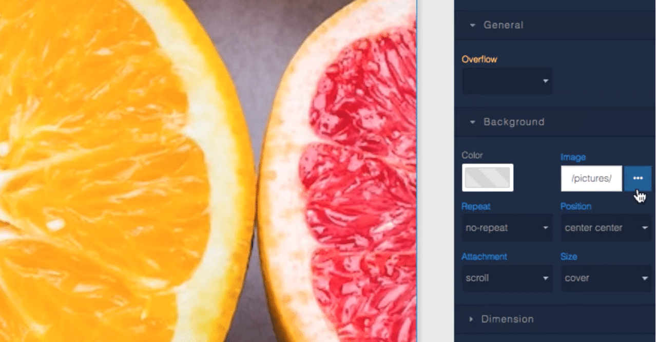
When selecting a background image, you can either enter an image URL from the web, or you can choose an image from the File Storage of your Backendless app. Clicking the three-dot button next to the image URL accesses your File Storage where you can choose or upload an image.
Background Image Options
Customize how your background image appears and responds to user actions.
Repeat
repeat – Your image will repeat both up-down and side-to-side.
repeat-x – Your image will repeat along the x-axis (side-to-side).
repeat-y – Your image will repeat along the y-axis (up-down).
no-repeat – Your image will not repeat.
Position
You can select where on the page or component the image will start. This can have a significant impact on which portions of the image get displayed on different screen sizes and types.
For example, let’s say you have a small image with no-repeat and Position set to bottom-right. It’s possible that the image looks great on mobile, but on a desktop, that image could be so low on the screen the user will never see it.
Attachment
scroll – Your background image will “move with” the component it is attached to when the page scrolls.
fixed – Your background image is fixed in place “behind” the component, creating the effect of the page appearing to move on top of the image.

local – Your background image is fixed to the component that it is attached to; if that component has a scrolling mechanism, the image scrolls with the component’s contents.
Size
auto – The image size will be determined automatically based on the image’s size relative to the container it is in.
cover – Your image will be enlarged to cover the entire container. You will want to be sure that your image has high enough resolution to be magnified on certain screens.
contain – Your image will be stretched or shrunken to fit into the container. You will likely need to repeat the image or have a background color selected to cover areas that your image does not cover with this option.
Web and Tablet App Friendly
Background images, unless subtle, can overwhelm the eye on mobile. But on desktop and tablet, background images are a crucial part of modern web design.
If you are building a web app, web-friendly mobile app, or website, background images in UI Builder will make your life easier and your page more visually appealing.
Thanks for reading and Happy Codeless Coding!