How to Install the Webcam Photo Component
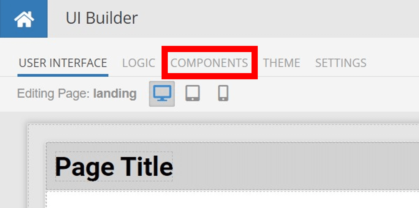
Installing custom components from Backendless Marketplace is super easy. First, in UI Builder, select the Components tab.

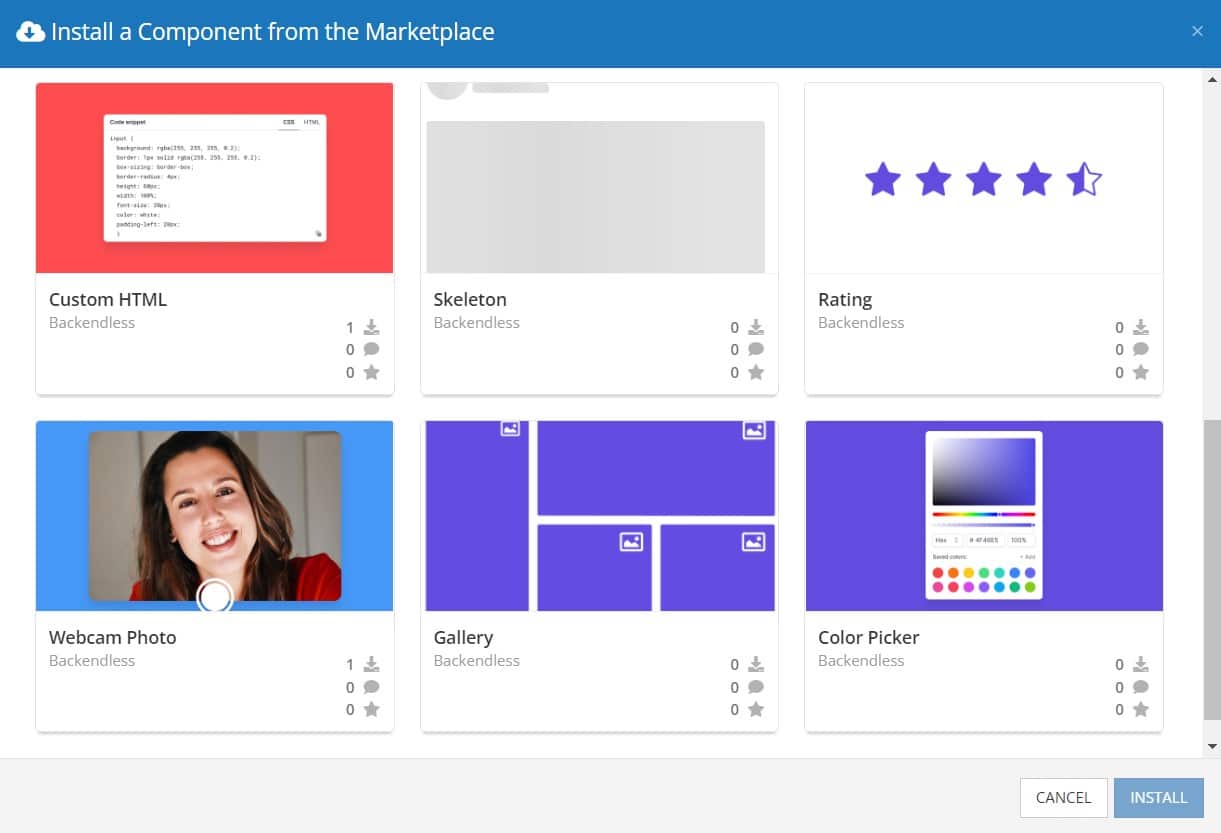
There, you will see a button labeled Install Component. This will take you to the library of components available in the Marketplace.
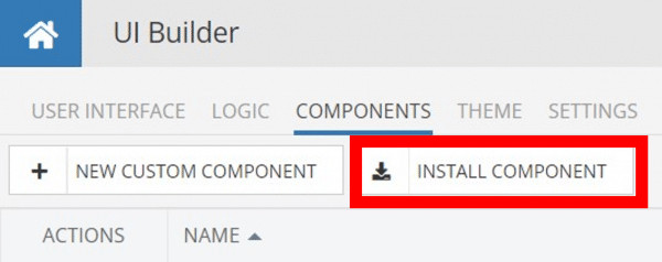
When you click Install Component, you will open a list of available UI Components to install.

Select the component you want and click Install.
When you return to the User Interface tab, you will see a new section added to your toolkit on the right-hand side called Custom Components.
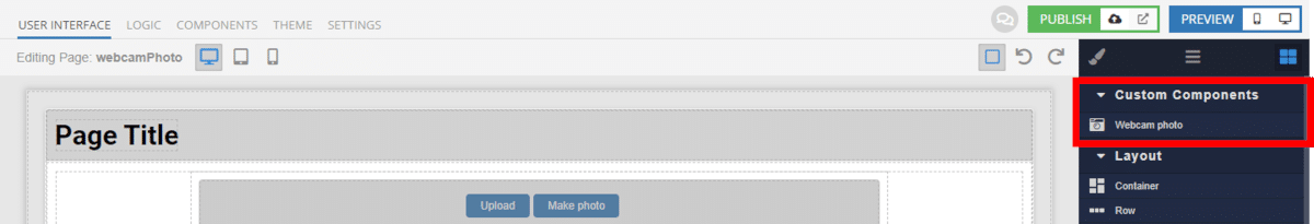
You can then simply drag the component onto your canvas just like any other UI Component.
How the Webcam Photo Component Works
When added to your app, the Webcam Photo component offers several basic functions out of the box.
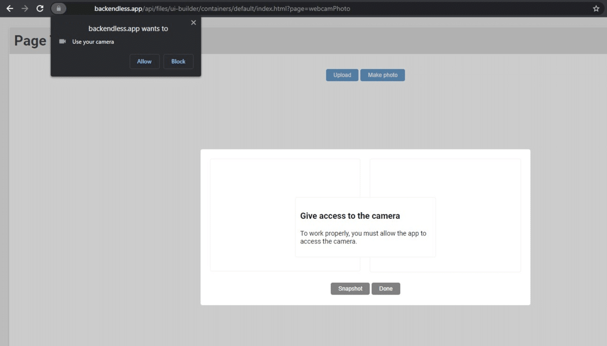
First and foremost, the component includes logic requesting that the user give the app permission to access their device’s camera. You have the option to customize the text used to make this request, and the text that will display if permission has not been granted.
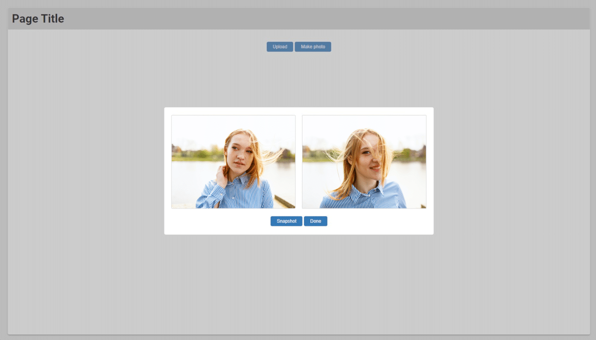
Next, the component includes two image blocks: one that shows the live camera, and one for the snapshot (you can rename “Snapshot” to match your app’s use case as well).
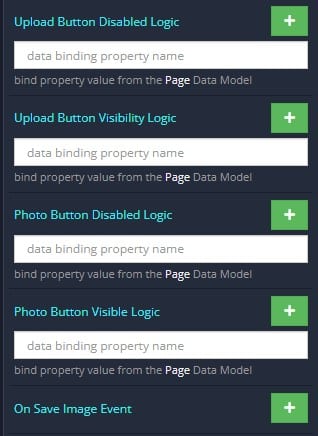
Alternately, the component includes an Upload button that allows the user to upload an image from their device. You can disable this button or choose not to display it at all if you prefer.
Finally, once the user has taken their snapshot, they will be able to click the Done button, which triggers the On Save Image event, which you can customize with your own logic.
Available Options and What They Mean
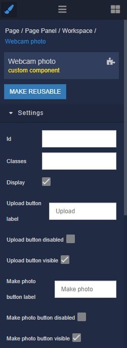
Once you have placed your component, when you select it, you will see all of the available options (properties) for the component in the toolkit area. These are the default settings for the component that you can easily adjust.
Each of the available properties are described in the table below. For more information, such as Theme styles and event handlers, visit the Webcam Photo GitHub repo.
| Property |
Type |
Default value |
Logic |
Data Binding |
UI Setting |
Description |
| uploadButtonLabel |
text |
“Upload” |
|
NO |
YES |
Controls label on the Upload button. |
| uploadButtonDisabled |
checkbox |
false |
Upload Button Disabled Logic |
YES |
YES |
Controls if the upload button is disabled. |
| uploadButtonVisible |
checkbox |
true |
Upload Button Visible Logic |
YES |
YES |
Controls if the upload button is visible. |
| makePhotoButtonLabel |
text |
“Make photo” |
|
NO |
YES |
Controls label on the Make photo button. |
makePhoto
ButtonDisabled |
checkbox |
false |
Photo Button Disabled Logic |
YES |
YES |
Controls if the photo button is disabled. |
| makePhotoButtonVisible |
checkbox |
true |
Photo Button Visible Logic |
YES |
YES |
Controls if the photo button is visible. |
makeSnapshot
ButtonLabel |
text |
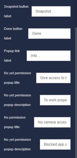
“Snapshot” |
|
NO |
YES |
Controls label on the Make snapshot button. |
| doneButtonLabel |
text |
“Done” |
|
NO |
YES |
Controls label on the Done button. |
| popupLinkLabel |
text |
“Info…” |
|
NO |
YES |
Controls link label in popup. |
noYetPermission
PopupTitle |
text |
“Give access to the camera” |
|
NO |
YES |
Controls title in popup when the user has not yet allowed the use of the camera. |
noYetPermission
PopupDescription |
text |
“To work properly, you must allow the app to access the camera.” |
|
NO |
YES |
Controls description in popup when the user has not yet allowed the use of the camera. |
| noPermissionPopupTitle |
text |
“No camera access” |
|
NO |
YES |
Controls title in popup when the user did not allow the use of the camera. |
noPermission
PopupDescription |
text |
“Blocked app access to the camera. Follow the link for detailed information on how to grant access.” |
|
NO |
YES |
Controls description in popup when the user did not allow the use of the camera. |
When you click on the Logic icon or tab for the component, you will see the modifiable event handlers, just as you would with a standard component. However, the main logic for the component – the logic that makes it work – is hidden to protect it from accidentally being broken.
Additionally, in the Logic area, you will also find all available data binding properties.
That’s it! Ready to try it for yourself?
The Webcam Photo component is one of many custom components available now in Backendless Marketplace, completely free!


Sadly, this component doesn’t seem to work — the snapshot and live camera images, along with the “done” button do not actually appear. Must be some bug in there somewhere — anyone else got this component working?