UI Themes Are Coming – Sneak Preview
The first BIG update to our UI Builder is coming soon and with it come UI Themes – an easy way to style your entire app all at once.
It is common to use a wireframe platform like Figma or Adobe XD to design the user interface (UI) for your app before implementing the design in your app builder. The problem is that this can mean having to edit the look of every component on every page when the time comes for implementation.
UI Themes for Backendless’ UI Builder are designed to make the app building process even faster and easier than ever before. With this feature, we offer a system where you can customize the look and feel of your application globally to match the original designs.
Themes provide a high degree of control over visualization of all aspects for every single component supported by UI Builder. This includes – but is not limited to – colors, borders, shared, margins, paddings, CSS effects, etc.
UI Themes will launch with a library of pre-built theme choices. Just like our pre-built APIs, every theme is 100% customizable. Whether you want an out-of-the-box solution that you just tweak around the edges, or your own custom look, Themes give you that flexibility.
The UI Theme library will start small but will quickly grow with contributions from community members like you. You can share your own custom Theme with the community by publishing it back to the library.
With the addition of Themes, you will be able to easily set the color and style of all of your app’s components with just a few tweaks. You can use Themes to change anything CSS supports, not just colors!
Backendless UI Themes are based on Less (http://lesscss.org/) which provides support for variables, mixins, operations, and functions. These elements give you incredible versatility for making your app look and feel totally unique.
UI Themes In Action
Let’s look at some examples to see how easy it is. In these screenshots, we simply swap out the RGB or hex color codes and the change is applied instantly.

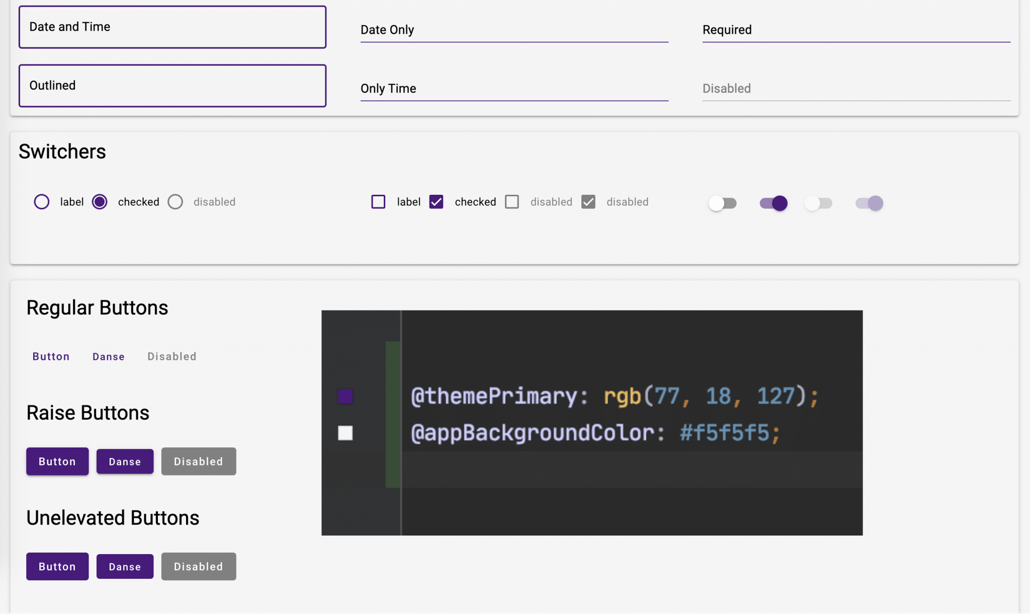
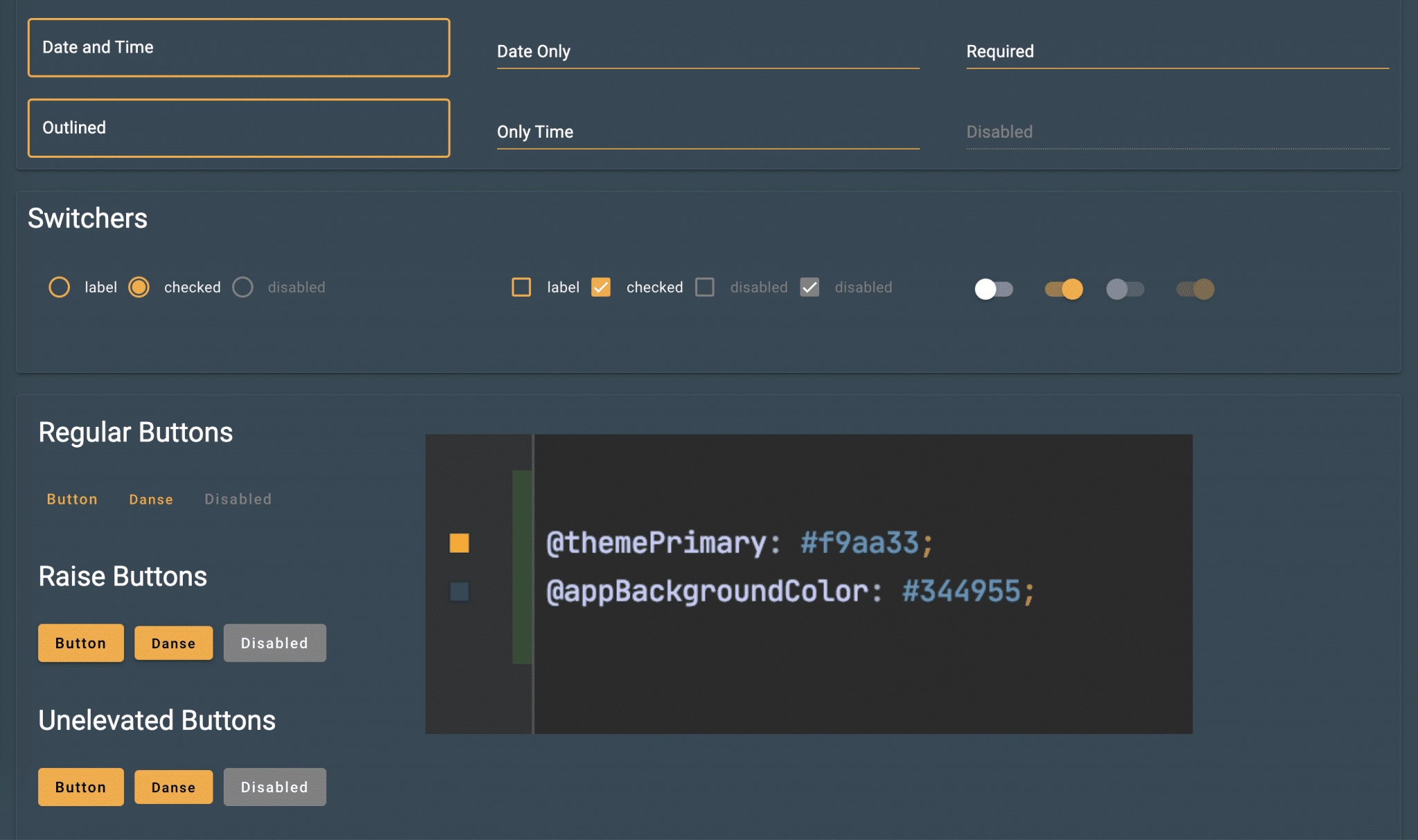
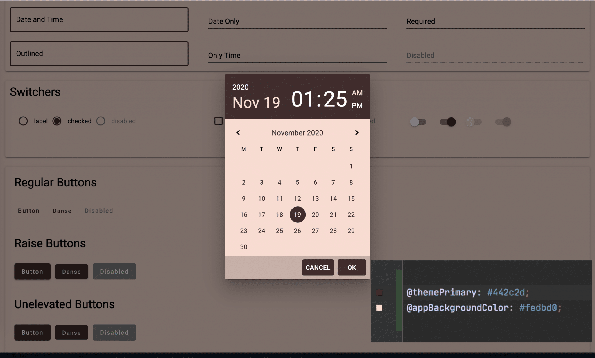
These examples showcase color changes, but Themes can change many other elements. Just a small number of examples include:
- Image border colors, thickness, style;
- Button corner radius, borders, hover colors;
- Font type and style;
- Adjust padding and margins around elements;
- Scale and position images;
- CSS-based effects and animations;
- and much more.
Anything you can do with CSS, you’ll be able to do in Themes.
Is This Still No-Code?
Yes!
It’s important not to confuse “no-code” with “rigid” or “cookie-cutter”. As we said above, if you want a simple, plug-n-play solution, you can apply one of the beautiful Themes from the library and you’re all set.
If, however, you’re looking to really customize the look and feel of your app, you can easily do that, too, without having to write lines upon lines of code. You will be able to easily adjust your Theme’s CSS and see the results instantly!
If you haven’t tried UI Builder yet, you can try it out with our free Udemy course. When you’re ready, we have an in-depth Masterclass with almost seven hours of video tutorials – also free!
We will have much more on this new feature – including detailed explanations of how to make the above examples work for you – upon release.
Themes will be available in UI Builder very soon. Keep an eye out here and in your email for the big announcement.
Happy Codeless Coding!