How To Add Customized Styles To Your App
UI Themes in Backendless give you virtually unlimited flexibility when designing your user interface. This article will break down exactly how to implement your own custom styles.
UI Themes provide you with the ability to add CSS and LESS to your UI Builder frontend. With Themes, you have the ability to set colors, margins, paddings, add animations, and much more.
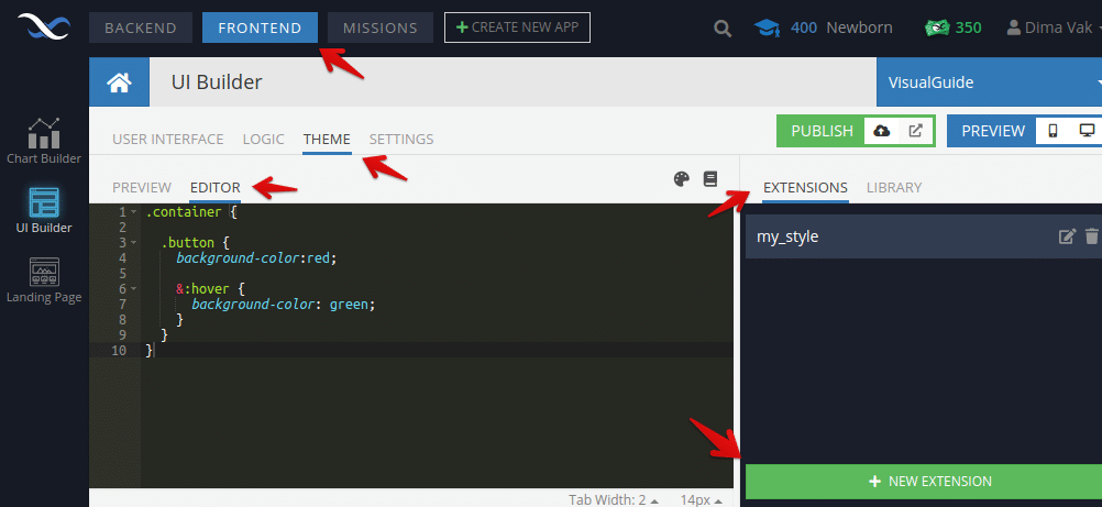
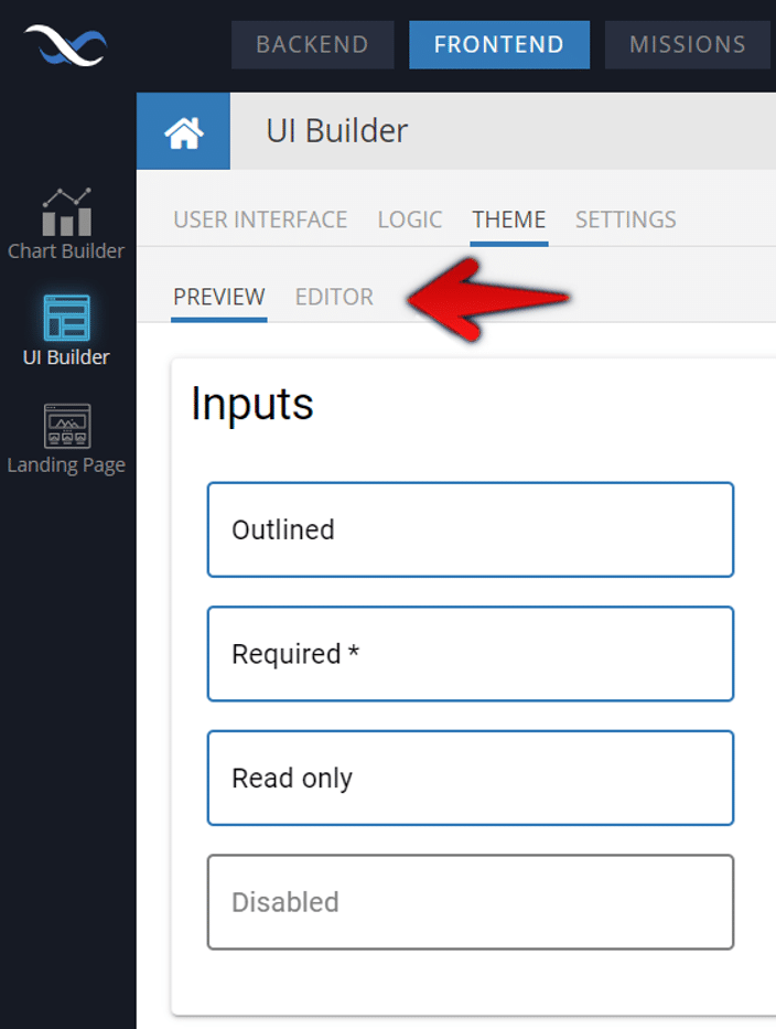
To begin working with your theme, open Backendless Console, select the FRONTEND, then click on the THEME tab. On the right-hand side, you will see the library of existing themes, and on the left you will see a preview of the selected theme.
If you haven’t selected and installed a theme from the Theme Library, you will only be able to create custom styles by adding an extension. If you have installed a theme, then you have the choice to edit the theme itself or add an extension, which will take precedence over the theme.
Let’s click on the EDITOR tab in the left-hand panel, and the EXTENSIONS tab in the right-hand panel. We can then add a new extension:
It is important to remember: If you defined the styles for the component using the constructor (the main UI Builder interface), then custom styles cannot be applied since the styles from the constructor are “inline”.
What can you do to fix this? Simply reset the desired style in the constructor:
There is a simple hierarchy in place that allows Backendless to determine which styles should be shown to the user. Manually set styles in the constructor (as illustrated above) take top priority, followed by your custom styles (extension-level then theme-level) and then the default styles.

Custom styles are based on the LESS, but all CSS properties will be valid.
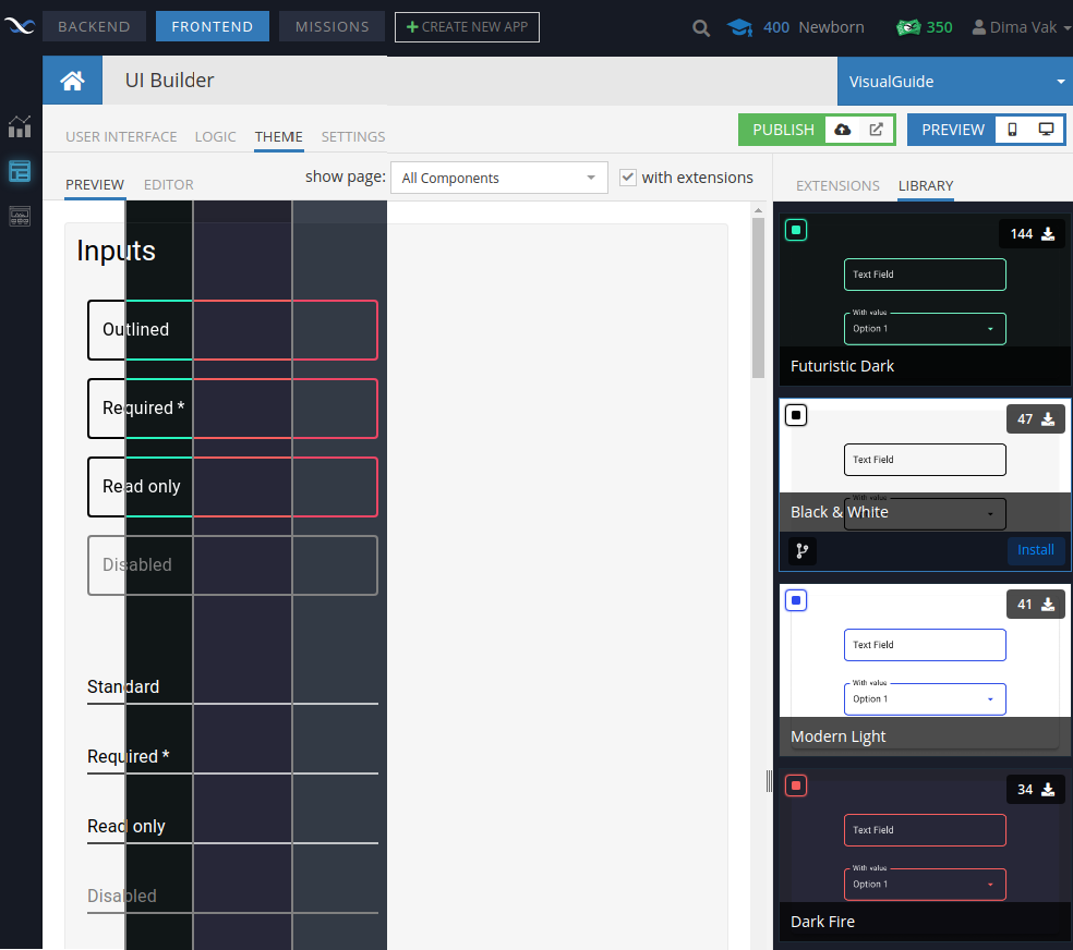
UI Themes Library
We have created a number of pre-built UI Themes that are available in the Theme Library. You can choose a theme that you like at Frontend -> Theme -> Library.
Just click on a theme (right column) to get a preview with this theme. You can change the page to see how the theme will look on any page of your app before committing to install it.
When you make your choice, click on Install.
Our themes are based on LESS variables. That means you can manage the theme and choose the needed colors/sizes of all components and elements.
To edit a theme, change the tab from PREVIEW to EDITOR, and edit the properties of the theme.
Clicking on the “book” icon opens the default SDK styles. This is a non-editable file that shows you all of the defaults. This is a valuable resource for identifying the class names of existing elements in the theme in order to customize them.
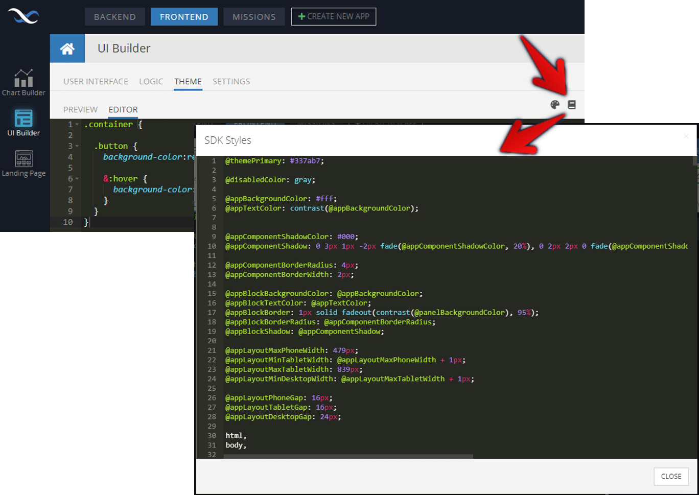
Back to the editor, we can add custom styles to the theme or extension. The custom styles will override any styles for that class in the theme defaults.
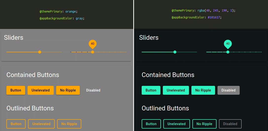
In the above examples, the classes below are changed to change the color of certain elements of the theme.
@themePrimary: orange;
@appBackgroundColor: gray;
@themePrimary: rgba(40, 245, 190, 1);
@appBackgroundColor: #101617;
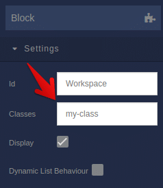
Not all classes have to override the defaults. You can create brand new classes as well. To apply your custom style to the UI, those new classes that you created using CSS need to be added to the component in the constructor.
Extensions
Extensions are like individual CSS files added to your app. They allow you to add classes that will take precedence over the theme classes (although they will still be overwritten by any styles in the constructor).
Extensions can be preferable to editing the theme in a number of situations:
- For theme publication purposes. Let’s say you plan to submit your custom theme to the Theme Library but you want to add a style that would not be part of the default package. An extension can be used to test new styles or add elements to your theme that you don’t plan to share.
- For organizational purposes. You may want to add a large chunk of custom CSS/LESS that serves a particular purpose and you’d like to make it easily accessible separate from other custom styles.
- For repurposing purposes. If you build a lot of apps, you may want to have a primary base theme that you can use for multiple projects. You can then add extensions to customize each project individually.
Learn more about using themes in our UI Themes video: