How To Add A “Show Password” Option In UI Builder
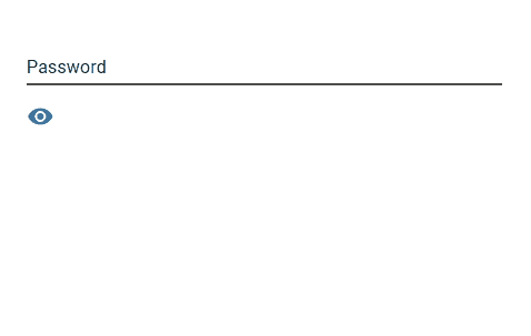
It is quite common in UIs to include an “eye” icon right next to the password input field (which has masked input by default) to display the entered password. This recipe describes how to implement it in UI Builder.
As passwords become more complicated – and more prevalent – for security purposes, it’s easier for typos and errors to occur. Giving your users the option to view what they’ve typed can help alleviate this common irritation.
Fortunately, implementing a “show password” option without code is very simple in UI Builder!
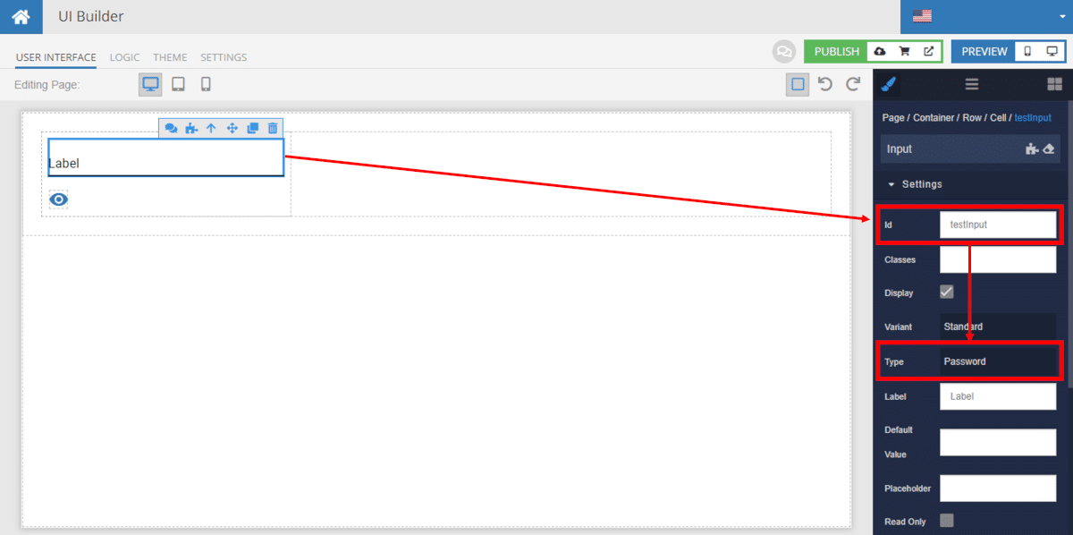
To start, add an input component and icon component. For this demo, we will give the input component the Id testInput. Set the input type to Password. We will also select the “eye” icon.
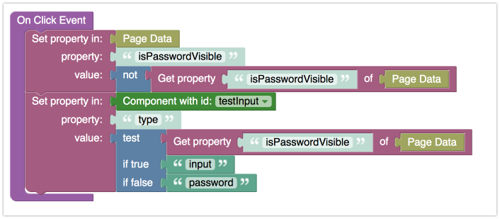
Next, implement the onlick event for the “eye” icon. The testInput component is the password input field. Below is the Codeless code, which we explain further later in this article.
Let’s walk through what the above code block is doing, in plain English.
- Set the property stored in Page Data (only applicable to this page) called
isPasswordVisible.- If the property does not exist, it will be created automatically with a value of
null, treated likefalsein the next step - The
notblock checks the property value; if the value isfalse, thenotblock changes the value ofisPasswordVisibletotrue, and vice versa
- If the property does not exist, it will be created automatically with a value of
- Set the property
typeof the componenttestInputbased on the following test:- First, check the value of
isPasswordVisible - If the value is
true, then thetypeproperty (which we set topasswordusing the component dropdown) changes toinput - If the value is
false, then thetypeproperty changes topassword
- First, check the value of
That’s all there is to it! Be sure to check out all of our UI Builder recipes.
Happy Codeless Building!