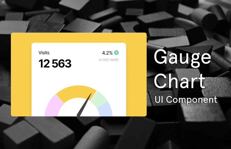
How to Install the Gauge Chart Component
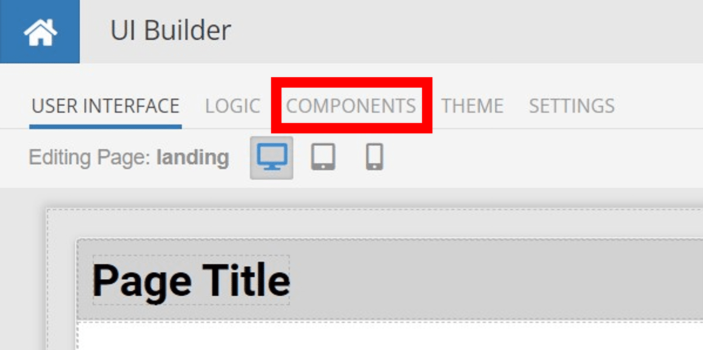
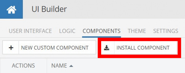
Installing custom components from Backendless Marketplace is super easy. First, in UI Builder, select the Components tab.

There, you will see a button labeled Install Component. This will take you to the library of components available in the Marketplace.
When you click Install Component, you will open a list of available UI Components to install.
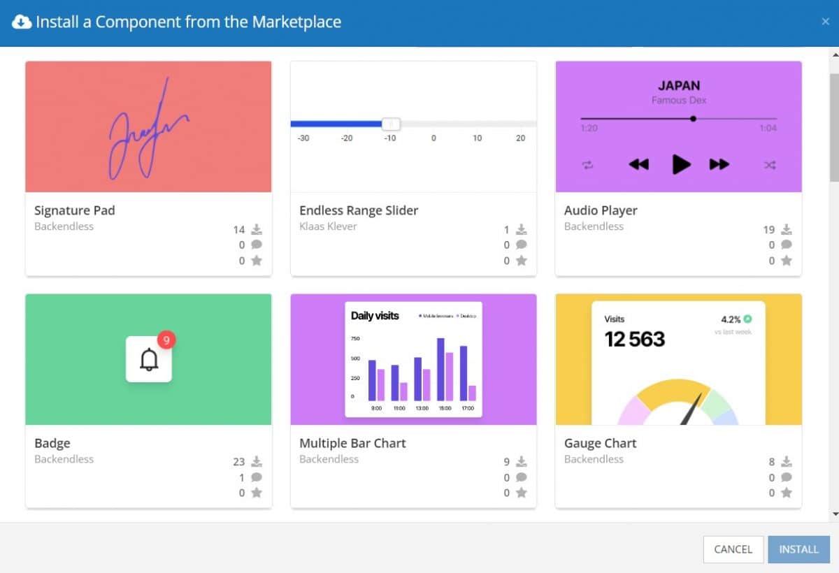
Select the component you want and click Install.
When you return to the User Interface tab, you will see a new section added to your toolkit on the right-hand side called Custom Components.
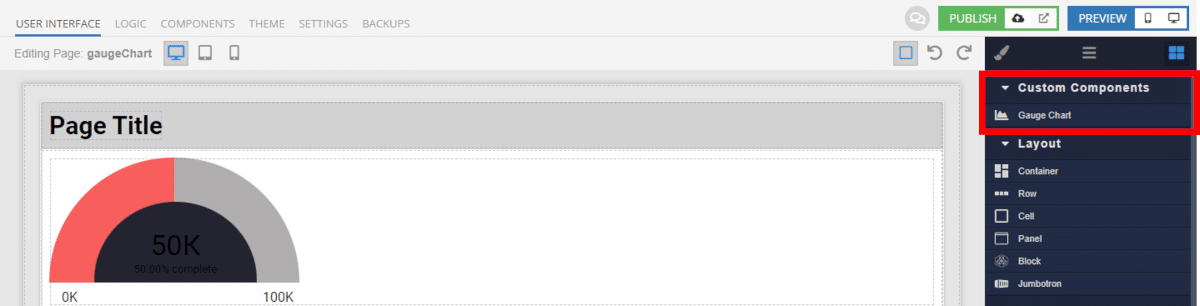
You can then simply drag the component onto your canvas just like any other UI Component.
How the Gauge Chart Component Works
When added to your app, the Gauge Chart component is simple to setup.
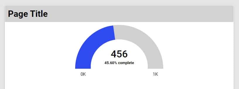
You have the option to input a fixed goal and progress value, which will then be displayed on the chart. The component will automatically calculate the percentage value toward the goal (including if the percentage exceeds 100%).
Alternately, you can use logic and data binding to set the goal and/or progress values. This allows you to dynamically set the values displayed on the chart based on data from your database or elsewhere, such as third parties or user actions.
Available Options and What They Mean
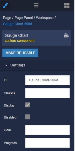
Once you have placed your component, when you select it, you will see all of the available options (properties) for the component in the toolkit area. These are the default settings for the component that you can easily adjust.
Each of the available properties are described in the table below. For more information, such as Theme styles and event handlers, visit the Gauge Chart GitHub repo.
| Property |
Type |
Default value |
Logic |
Data Binding |
UI Setting |
Description |
| Disabled |
Checkbox |
false |
Disabled Logic |
YES |
YES |
This handler allows you to disable a component. |
| Goal |
Number |
|
Goal Logic |
YES |
YES |
This handler allows you to specify a goal. |
| Progress |
Number |
|
Progress Logic |
YES |
YES |
This handler allows you to specify a progress. |
When you click on the Logic icon or tab for the component, you will see the modifiable event handlers, just as you would with a standard component. However, the main logic for the component – the logic that makes it work – is hidden to protect it from accidentally being broken.
Additionally, in the Logic area, you will also find all available data binding properties.
That’s it! Ready to try it for yourself?
The Gauge Chart component is one of many custom components available now in Backendless Marketplace, completely free!