How to Install the Gallery Component
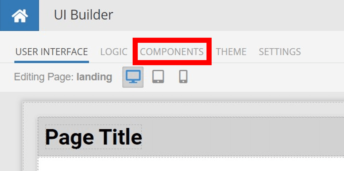
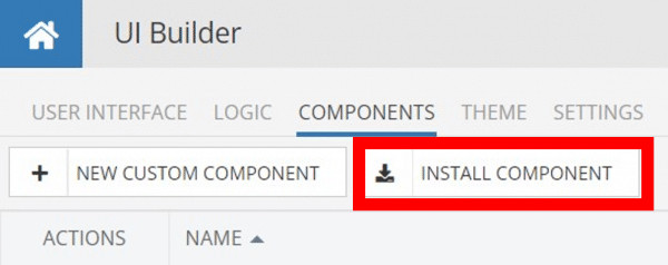
Installing custom components from Backendless Marketplace is super easy. First, in UI Builder, select the Components tab.

There, you will see a button labeled Install Component. This will take you to the library of components available in the Marketplace.
When you click Install Component, you will open a list of available UI Components to install.
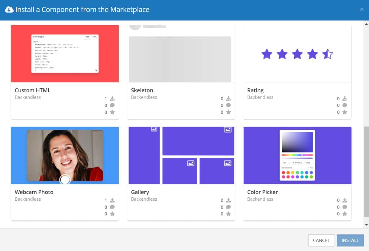
Select the component you want and click Install.
When you return to the User Interface tab, you will see a new section added to your toolkit on the right-hand side called Custom Components.
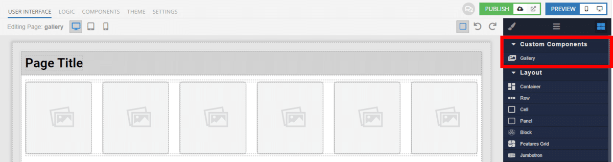
You can then simply drag the component onto your canvas just like any other UI Component.
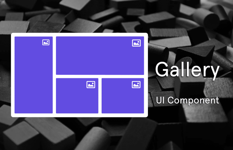
How the Gallery Component Works
When added to your app, the Gallery component offers several basic functions out of the box.
First, you can set the images in the gallery manually by including URLs of the images to include. These URLs can be on external sites, or images stored in your Backendless File Storage.
Alternately, you can use Codeless logic to set the images to display, making it easy to dynamically set the content included in the Gallery.
Next, you can choose whether or not the gallery will “end” using the Wrap Around property. When checked, upon reaching the end of the gallery, if the user clicks onto the next image, it will return them to the start of the gallery.
You can enable or disable navigation on mobile. If you don’t want mobile users to be able to navigate between images on mobile, that capability can easily be switched off.
Disable scrolling allows you to prevent the page behind the Lightbox from scrolling while an image is open. This can help ensure that user’s don’t accidently lose their place on a page, especially if there are multiple galleries on the page.
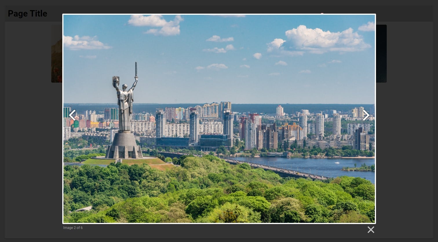
Next, you can choose whether or not to have the images in the gallery numbered, as well as adjusting the labels for this numbering.
Finally, you have control over the duration it takes for the Lightbox and image to fade in on the screen. You can also adjust the time it takes for the Lightbox to resize when transitioning between images with different dimensions.
Available Options and What They Mean
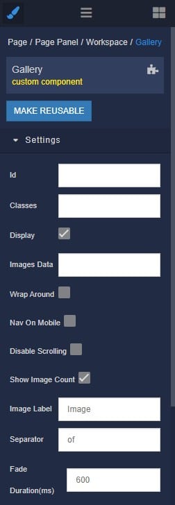
Once you have placed your component, when you select it, you will see all of the available options (properties) for the component in the toolkit area. These are the default settings for the component that you can easily adjust.
Each of the available properties are described in the table below. For more information, such as Theme styles and event handlers, visit the Gallery GitHub repo.
| Name |
Default value |
Description |
| Wrap Around |
false |
This checkbox toggles the ability to make the gallery infinite. If checked, when a user reaches the last image in a set, the right navigation arrow will appear and they will be to continue moving forward, which will take them back to the first image in the set. |
| Nav On Mobile |
false |
This checkbox toggles the visibility of the navigation on touchscreen devices. If true, the left and right navigation arrows which appear on mouse hover when viewing image sets will always be visible on devices which support touch. |
| Disable Scrolling |
false |
This checkbox toggles scroll possibility. If true, prevent the page from scrolling while Lightbox is open. This works by setting overflow hidden on the body. |
| Show Image Number Label |
false |
This checkbox toggles the visibility of the number of images. If unchecked, the text indicating the current image number and the total number of images in the set (Ex. “image 2 of 4”) will be hidden. |
| Image Label |
“Image” |
This option is to set the text in indicator of images. It works if “Show Image Number Label” is true. |
| Separator |
“of” |
This option is to set separator in indicator of images. It works if “Show Image Number Label” is true. |
| Fade Duration |
600 |
This option is to set the time of fade duration. The time it takes for the Lightbox container and overlay to fade in and out, in milliseconds. |
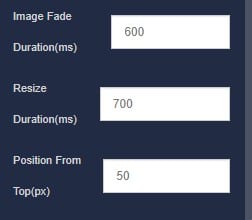
| Image Fade Duration |
600 |
This option is to set the time of image fade duration. The time it takes for the image to fade in once loaded, in milliseconds. |
| Resize Duration |
700 |
This option is to set the time it takes for the Lightbox container to animate its width and height when transition between different size images, in milliseconds. |
| Position From Top |
50 |
This option is to set the distance from top of the viewport that the Lightbox container will appear, in pixels. |
When you click on the Logic icon or tab for the component, you will see the modifiable event handlers, just as you would with a standard component. However, the main logic for the component – the logic that makes it work – is hidden to protect it from accidentally being broken.
Additionally, in the Logic area, you will also find all available data binding properties.
That’s it! Ready to try it for yourself?
The Gallery component is one of many custom components available now in Backendless Marketplace, completely free!