Create An Online Training Course App For Free
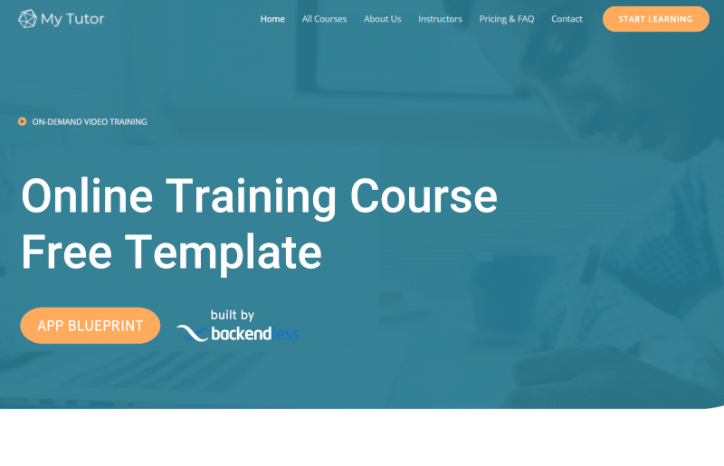
If you’re looking to create an online training course, this free app template can be your starting point. Use this blueprint for a highly professional and smoothly functional website that can turn a curious website visitor into a loyal student.
App Blueprints are more than just templates from which to build a specific type of application. We design all of our free App Blueprints to provide one or more key functions that a developer would want to add to their application, regardless of the app’s business use.
The Online Training App showcases how to build a beautiful, functional and professional online service website. You can use the functionality highlighted in this template to customize your own website, or modify the template to fit your business needs.
As with all of our App Blueprints, the entirety of this app blueprint was built without code using Backendless’ UI Builder.
The Online Training App Blueprint is a mixture of form and function. The app is elegantly designed to appeal to website visitors from a wide range of backgrounds while also being feature-rich and functionally smooth. You can use the blueprint to educate yourself on Backendless functionality, or customize it to build your own online training course.
In this article, we will explore the basics of this app’s functionality (click the link to jump to the appropriate section):
- Create an online training course
- Deliver database-driven content
- Display content from .txt files
- Implement a mobile hamburger menu
Additionally, all App Blueprints include thorough instructions to guide you through how to make your own modifications and customizations.
The web app, which functions identically to a website, can be purchased for free when creating a new app in Backendless Console. It features a beautiful, responsive design that will look great on any size screen.
Click here to view the live demo and follow along (opens in a new tab).
Create an online training course
The Online Training App Blueprint can be a perfect template for creating your own elearning course. The app instructions, available in Backendless Console when you create an app from any App Blueprint, lays out how to create your own course.
The learning system of the app with training content has the following structure:
Course page
The Course page contains a general description of the course and the name of the lessons and topics of the course. By clicking on a lesson or topic, you navigate directly to that lesson or topic. You can go to the Course page by selecting the chosen course in the “Popular Courses” section of the Home page (the “See more…” button). The course also can be selected on the All Courses page. The content of the Course page is stored in the Course table.
Lesson page
The Lesson page dynamically loads the content of the lesson with the names of its topics or the topic of the lesson with its content, depending on what you chose on the Course page. Information on this page, as well as links to files with content are stored in the Lesson and Topic tables.
Deliver database-driven content
In all App Blueprints, a large portion of the content displayed on the page is pulled from the database. The primary reason for this approach is that it makes it very easy to update or modify your site’s content (and course structure) without having to republish the site/app.
This is even more important for an ecourse website. Course content, particularly related to technology, is likely to change frequently. New topics, new examples, and new technologies will need to be added regularly. The last thing you want is to have to jump through additional hoops to get this content to your students.
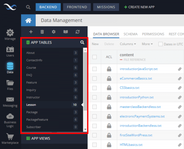
Sections on the home page and pages throughout the app utilize database-driven content. The tables in the blueprint’s database are named to make it easy to identify where the content is derived from.
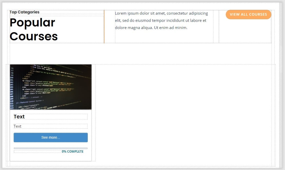
For example, let’s look at the popular course section of the site. Given the nature of this section, you will want to have total control over which courses are shown here, whether it’s to promote new courses, attract users to your best sellers, or give more attention to your less-viewed courses.
As you can see in the above screenshot, only one course block is visible. Using Dynamic List Behaviour, this block is tied to a data source and automatically replicates itself to show all items that you want displayed. The dynamic list will populate an image, header text, description text, and even a link to each course using the “See more…” button component.
Display content from .txt files
In addition to populating the page content, the blueprint pulls the actual course content from a .txt file. This way, you can easily build your course content in your favorite word processor, then save the file as .txt and upload it to your app’s File Storage.
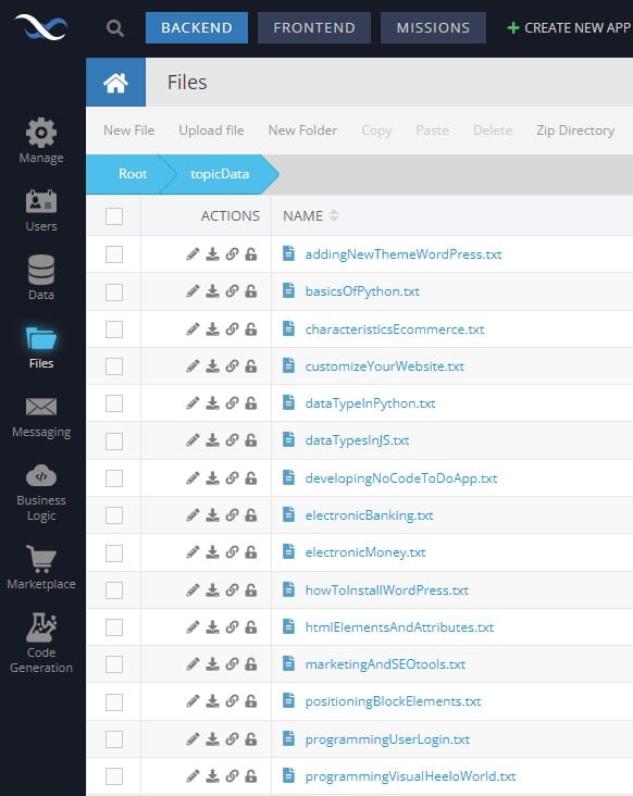
Let’s look at an example. Below is the course content .txt file for the HTML Elements and Attributes topic.
The file is found under the topicData folder in File Storage in the blueprint app:
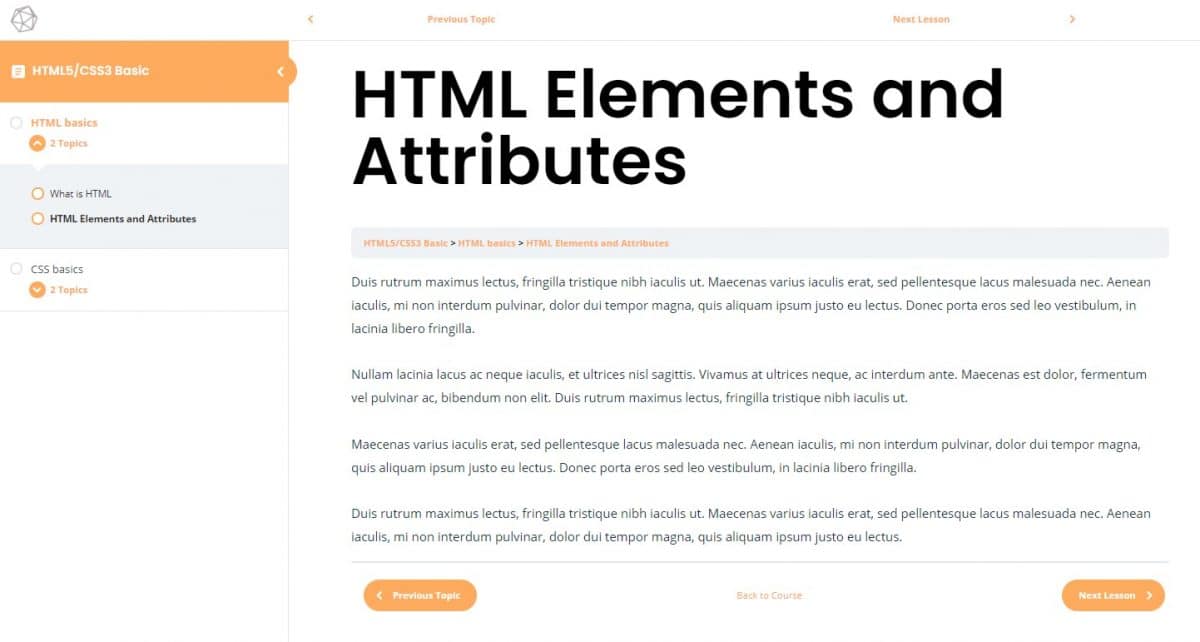
When a user visits the topic page, the app presents the content in a professional and easily readable form for the user.
Implement a mobile hamburger menu
Finally, the Online Training App Blueprint utilizes a “hamburger” menu for mobile devices and tablets. You can use this blueprint to experiment with implementation of such a menu on a variety of different pages.
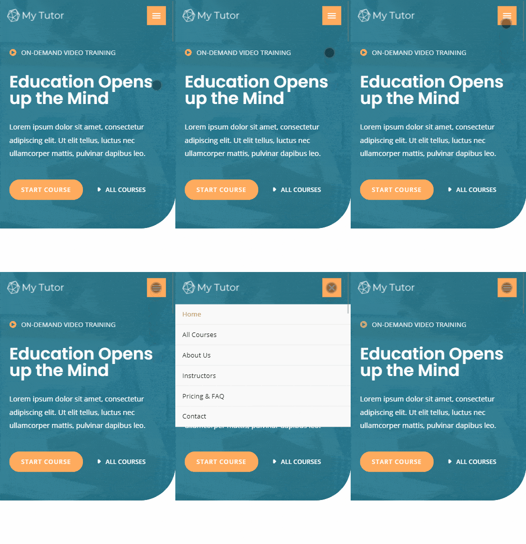
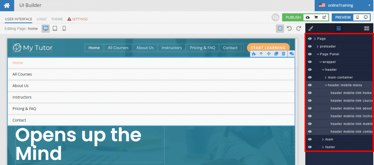
The best way to work with dropdown menus, modals, overlays, etc., is to explore the page elements using the page element view in UI Builder. You can click the eye icon to hide elements when you are not working with them.
Closing
The Online Training App showcases how to build an online course web app using UI Builder. It can be modified to produce your own online training course easily, allowing you to focus on course content instead of website design. Most importantly, it provides Backendless users with a template to follow for a variety of key Backendless functions.
Using this template, you can see first-hand how to:
- Create an online training course
- Deliver database-driven content
- Display content from .txt files
- Implement a mobile menu
Happy Codeless Coding!
