A modal is a common UI element used to grab the user’s attention by overlaying the page. In this step-by-step tutorial, we will show you how to implement, style, and interact with modals in UI Builder.
Also known as overlays or dialog windows, modals are an easy way to ensure your user receives information or takes an action you want them to take. In order to guarantee the user interacts with the modal, most modals prevent the user from interacting with the underlying page.
While this can be effective in small doses, the modal UI element should be used in moderation as it tends to disrupt the user experience.
Check out an example of the component in this demo.
In this tutorial, we will take you through the process of implementing a modal in Backendless’ built-in UI Builder. To follow along, simply login or create a free Backendless account.
Note from the author: The names for the classes and elements in this component are used for example. You can them to whatever you prefer.
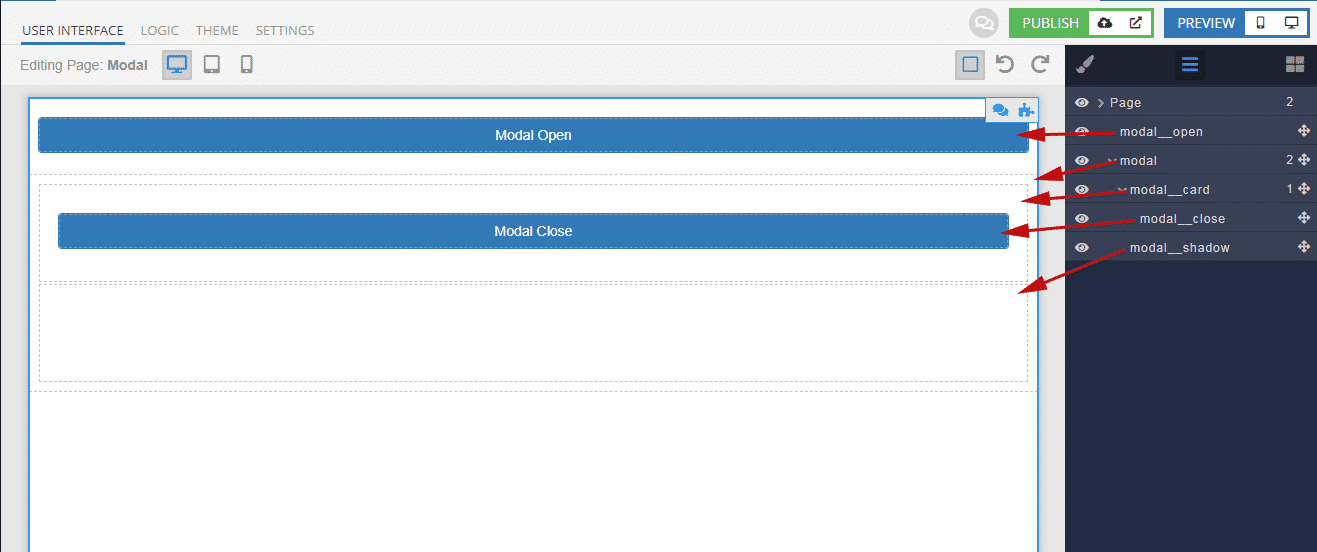
Modal Structure In UI Builder
Let’s start assembling the modal window by creating the component structure on the User interface tab.
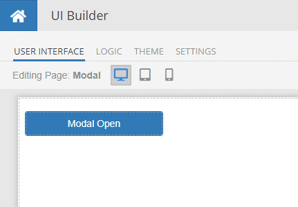
The general structure of the component is shown below. For clarity, element IDs are named the same as classes.
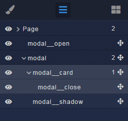
Descriptions
modal__open– button for opening a modal window (can be any of your custom solutions)modal– root element of the modal (required)modal__card– root block for your content; inside this element put what you need (required)modal__close– button to close the modal window (you can do as you need)
modal__shadow– shading curtain behind the modal window, restricts access to other elements of the page (required)
All elements of the component, except buttons, use the Block component.
For the buttons, we will use the Button element but you can use whatever you want.

When creating elements, immediately assign ID and Classes according to this structure:

As a result, you should get something similar to this:
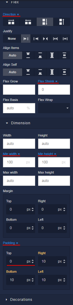
After you create the entire structure of the component, you need to reset all settings for the Block elements. To do this, you need to delete all the selected properties. Later, we will indicate the necessary ones through the styles. The Padding property is set to 0 and then reset in the same way.
Styles
To create styles, switch to the Theme tab. Inside the page, select the Editor tab and then Extensions.
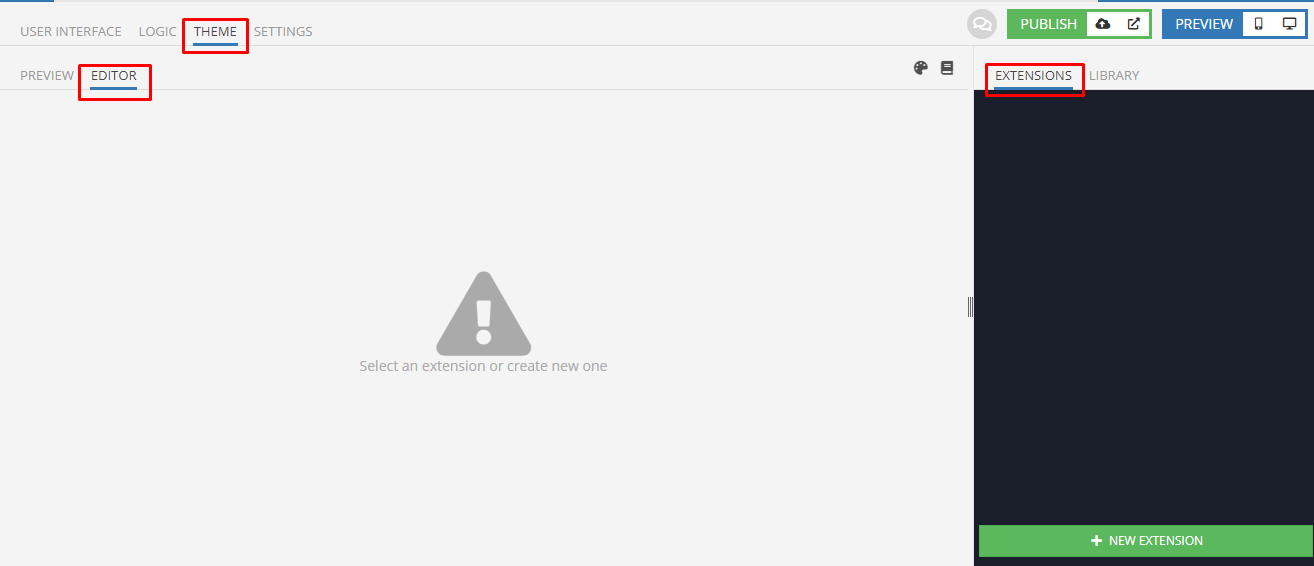
Now we’ll create Extensions. You can change the names as you like.
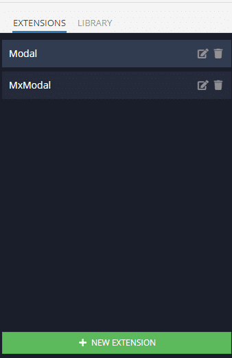
Extension MxModal is a LESS-mixin in which the basic styles of the component are taken out for ease of multiple use. Edit only if you know what you are doing!
Learn more about CSS LESS in UI Themes.
.mx-modal {
    display: none !important;
    position: fixed !important;
    top: 0 !important;
    bottom: 0 !important;
    left: 0 !important;
    right: 0 !important;
    z-index: 1000 !important;
    flex-direction: column !important;
    justify-content: center !important;
    align-items: center !important;
    width: 100% !important;
    height: 100% !important;
    padding: 0 15px !important;

    &.open {
        display: flex !important;
    }

    @media (min-width: 768px) {
        padding: 0 !important;
    }
}

.mx-modal__curtain {
    position: fixed !important;
    top: 0 !important;
    bottom: 0 !important;
    left: 0 !important;
    right: 0 !important;
    z-index: -1 !important;
    background-color: rgba(0, 0, 0, 0.7);
    width: 100% !important;
    height: 100% !important;
}
.mx-modal__card {
    width: 100% !important;

    @media (min-width: 768px) {
        width: 600px !important;
    }
}
The Extension Modal contains the general styling of the component on the page according to your project. The most important thing is to import mixins; any other properties can be adjusted as you like.
.modal__open {
    width: 200px !important;
}
.modal {
    .mx-modal();
}
.modal__card {
    .mx-modal__card();

    flex-direction: column !important;
    justify-content: flex-end !important;
    align-items: flex-end !important;
    background-color: #fff;
    height: 300px !important;
    border-radius: 5px;
    box-shadow: 0px 3px 1px -2px rgba(0, 0, 0, 0.20),
                0px 2px 2px 0px rgba(0, 0, 0, 0.14),
                0px 1px 5px 0px rgba(0, 0, 0, 0.12);
}
.modal__close {
    width: 200px !important;
}
.modal__shadow {
    .mx-modal__curtain();
}
Logic
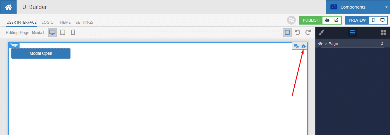
Let’s start adding Codeless logic from the root Page element. To do this, we return to the User interface tab, select the Page element and click on the puzzle icon as in the screenshot.
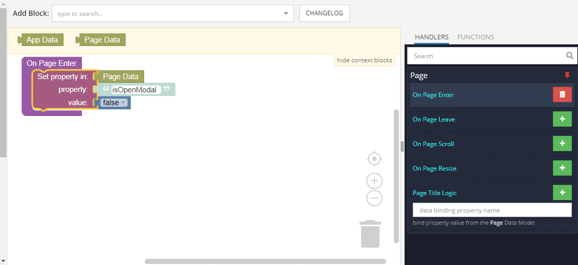
In the Logic tab that opens for the Page element, we hang the logic on the On Page Enter event as in the screenshot. This will create a global modal state variable isOpenModal for the entire page. We set the value to false, which in our logic will define a closed modal window.
If you want to use several different modals, add a unique variable for each window.
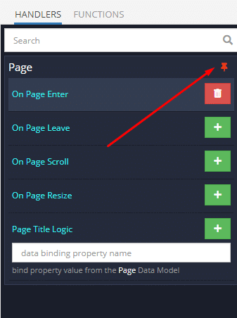
In order not to switch between tabs to select the following items, we will use the navigator. To do this, unpin the Page element by clicking on the button icon.
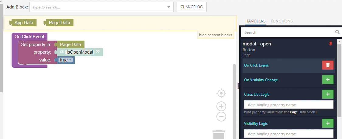
Now we add logic for the rest of the elements.
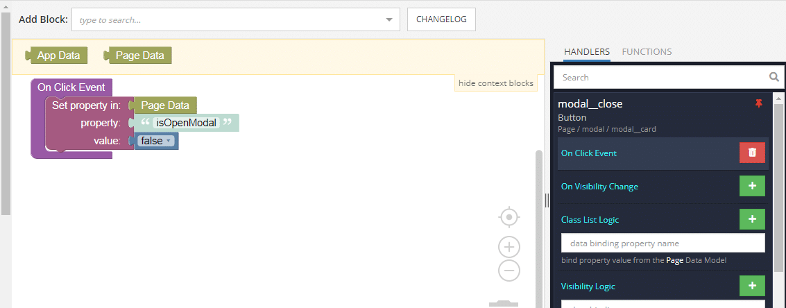
On the window open button, use the On Click Event. Set the isOpenModal variable to true.
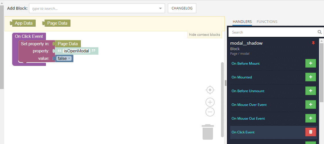
Similarly, add a handler for the On Click Event for the close button and shade curtain.
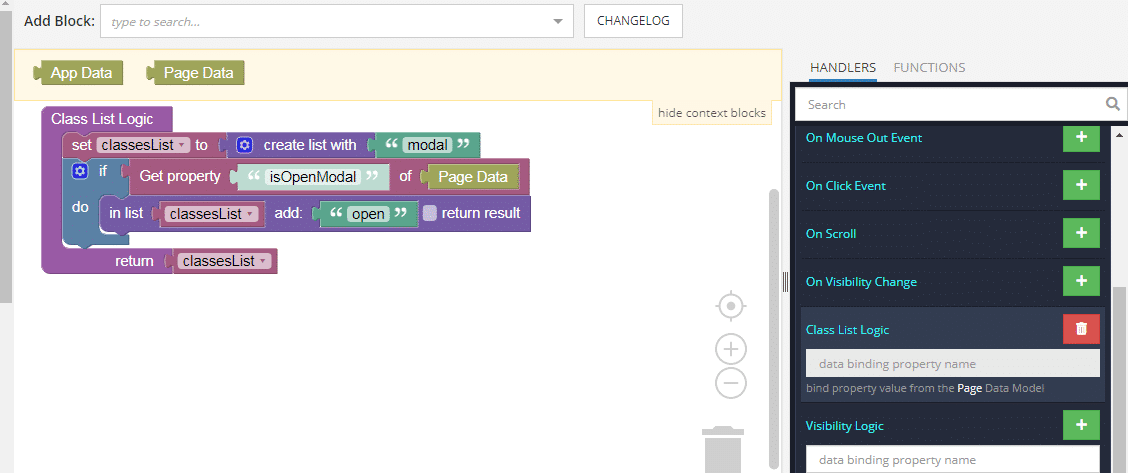
Now, all that remains is to add logic to the element with the modal class. For this, we use the Class List Logic event. Here, depending on the value of the isOpenModal variable, the open class is added or removed.
That’s all there is to it! We hope that you found this useful and, as always, happy codeless coding!
The Modal Close button seems unnecessary, in that clicking anywhere in the grayed-out area closes it.
Hi Jim,
While clicking off of the modal window to close is standard functionality for modals, it is best practice from a UI design standpoint to include a close button as well since plenty of users will be unaware of the close functionality tied to clicking in the gray area. This is particularly true for any kind of a general public-facing application.