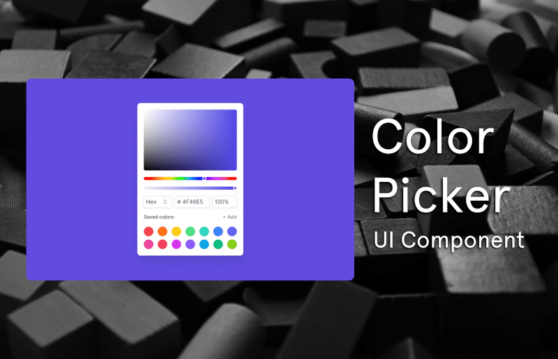
How to Install the Color Picker Component
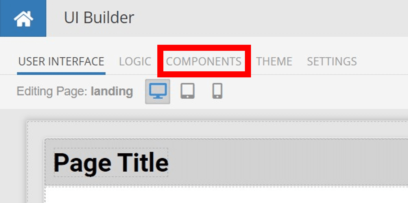
Installing custom components from Backendless Marketplace is super easy. First, in UI Builder, select the Components tab.

There, you will see a button labeled Install Component. This will take you to the library of components available in the Marketplace.
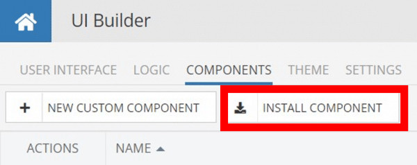
When you click Install Component, you will open a list of available UI Components to install.
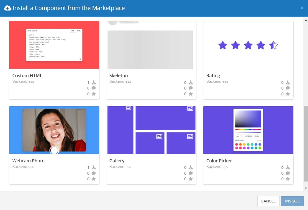
Select the component you want and click Install.
When you return to the User Interface tab, you will see a new section added to your toolkit on the right-hand side called Custom Components.
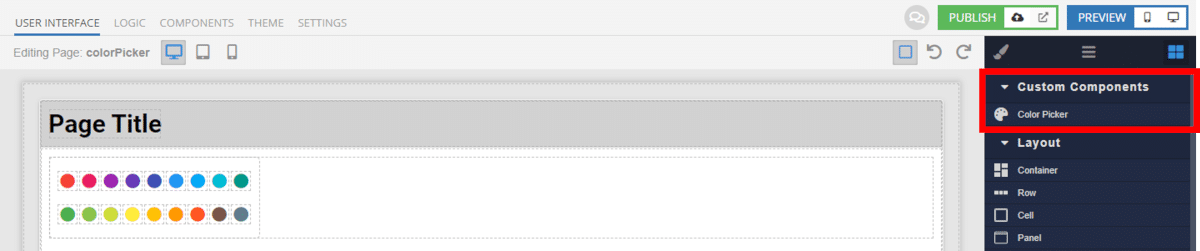
You can then simply drag the component onto your canvas just like any other UI Component.
How the Color Picker Component Works
When added to your app, the Color Picker component offers several basic functions out of the box.
First, you have four options for the appearance of the picker itself. You can choose between a circular or square color wheel, and you can choose between vertical and horizontal display of the picker box.
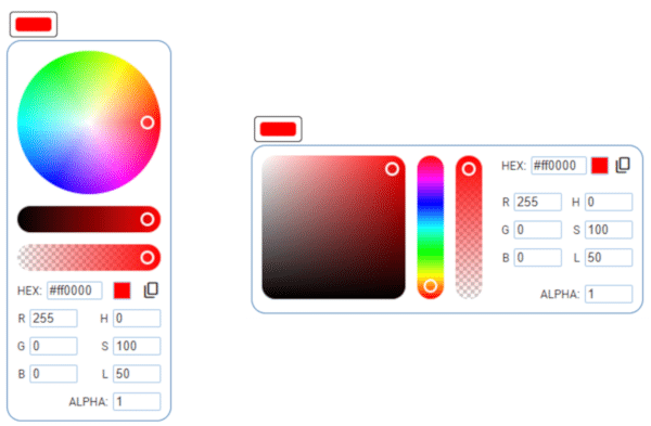
You also have the option to include or exclude the opacity slider, RGB format, and HSL format. If you need your users to choose their color in a specific format, you can easily control the format the is shown.
Available Options and What They Mean
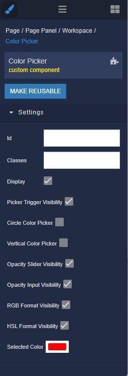
Once you have placed your component, when you select it, you will see all of the available options (properties) for the component in the toolkit area. These are the default settings for the component that you can easily adjust.
Each of the available properties are described in the table below. For more information, such as Theme styles and event handlers, visit the Color Picker GitHub repo.
| Property |
Type |
Default value |
Logic |
Data Binding |
UI Setting |
Description |
| Picker Trigger Visibility |
Checkbox |
true |
|
NO |
YES |
enables toggling visibility of the color picker by a button |
| Circle Color Picker |
Checkbox |
false |
|
NO |
YES |
enables wheel layout for the color picker |
| Vertical Color Picker |
Checkbox |
false |
|
NO |
YES |
enables vertical direction of the color picker ui components |
| Opacity Slider Visibility |
Checkbox |
true |
|
NO |
YES |
enables opacity slider in the color picker |
| Opacity Input Visibility |
Checkbox |
true |
|
NO |
YES |
enables opacity input in the color picker |
| RGB Format Visibility |
Checkbox |
true |
|
NO |
YES |
enables RGB color format in the color picker |
| HSL Format Visibility |
Checkbox |
true |
|
NO |
YES |
enables HSL color format in the color picker |
| Selected Color |
Color |
“#ff0000” |
Selected Color Logic |
YES |
YES |
controls selected color in the color picker |
When you click on the Logic icon or tab for the component, you will see the modifiable event handlers, just as you would with a standard component. However, the main logic for the component – the logic that makes it work – is hidden to protect it from accidentally being broken.
Additionally, in the Logic area, you will also find all available data binding properties.
That’s it! Ready to try it for yourself?
The Color Picker component is one of many custom components available now in Backendless Marketplace, completely free!