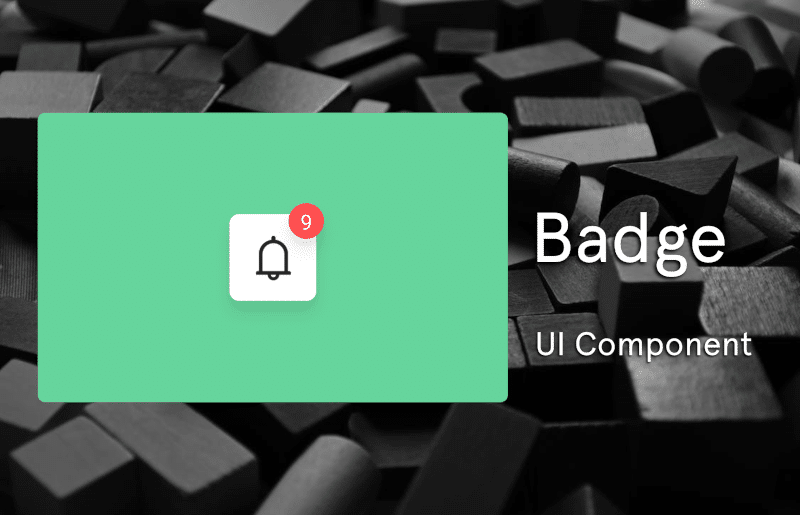
How to Install the Badge Component
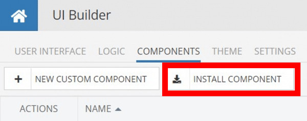
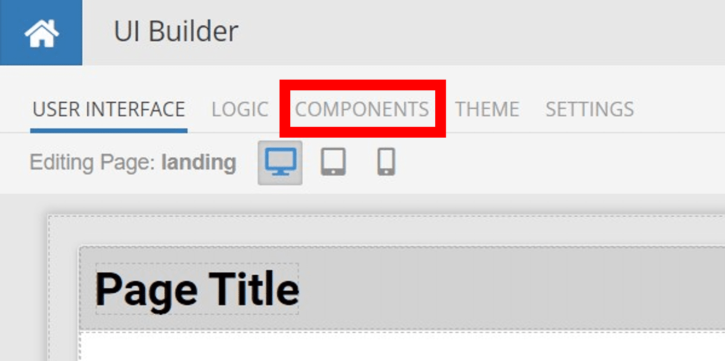
Installing custom components from Backendless Marketplace is super easy. First, in UI Builder, select the Components tab.

There, you will see a button labeled Install Component. This will take you to the library of components available in the Marketplace.
When you click Install Component, you will open a list of available UI Components to install.
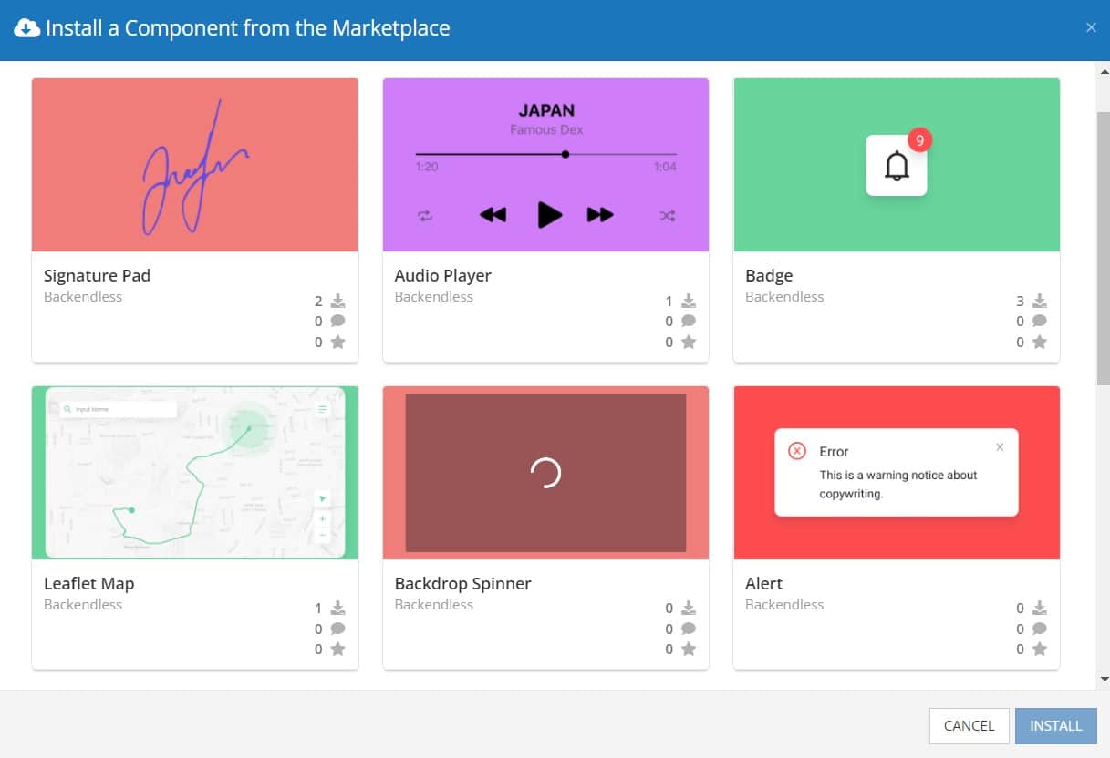
Select the component you want and click Install.
When you return to the User Interface tab, you will see a new section added to your toolkit on the right-hand side called Custom Components.
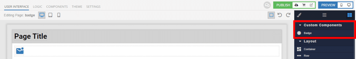
You can then simply drag the component onto your canvas just like any other UI Component.
How the Badge Component Works
When added to your app, the Badge component offers several basic functions out of the box. Most of the customization for this component is related to the component’s appearance – styling, size, label, etc.
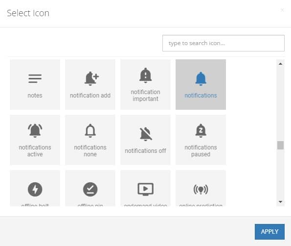
You have the option to choose the icon or image that underlies the badge itself. You can also change the size and color of the icon, as well as the icon’s background color, to fit your application’s look.
The Badge component can easily be connected to your data using data binding. You also have the option to set the on click logic for the Badge/icon, letting your users dig into the notifications as necessary.
More advanced developers can use extensions to implement CSS LESS styles and even animations to really make your Badges pop.
Available Options and What They Mean
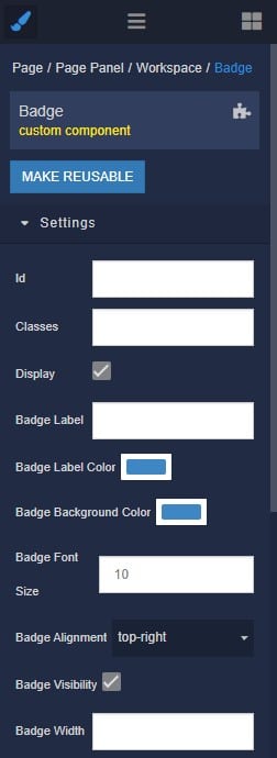
Once you have placed your component, when you select it, you will see all of the available options (properties) for the component in the toolkit area. These are the default settings for the component that you can easily adjust.
Each of the available properties are described in the table below. For more information, such as Theme styles and event handlers, visit the Badge GitHub repo.
| Property |
Type |
Default value |
Logic |
Data Binding |
UI Setting |
Description |
| Badge Label |
Text |
|
Badge Label Logic |
YES |
YES |
Controls the label of the badge |
| Badge Label Color |
Color |
|
|
NO |
YES |
Controls the color of the badge label |
| Badge Background Color |
Color |
|
|
NO |
YES |
Controls the background color of the badge |
| Badge Font Size |
Text |
|
|
NO |
YES |
Controls the font size of the badge label |
| Badge Alignment |
Select
“top-right” | “top-left” | “bottom-left” | “bottom-right” |
“top-right” |
|
NO |
YES |
Controls the position of the badge |
| Badge Visibility |
Checkbox |
true |
Badge Visibility Logic |
YES |
YES |
Enables the visibility of the badge |
| Badge Width |
Text |
|
|
NO |
YES |
Controls the width of the badge |
| Badge Height |
Text |
|
|
NO |
YES |
Controls the height of the badge |
| Badge Form |
Select
“rounded rectangle” | “circle” | “rectangle” |
“rounded rectangle” |
|
NO |
YES |
Controls the form of the badge |
| Icon |
MUI Icon |
|
|
NO |
YES |
Specifies the icon content of the component |
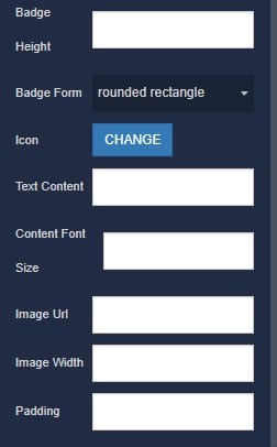
| Text Content |
Text |
|
|
NO |
YES |
Specifies the text content of the component |
| Content Font Size |
Text |
|
|
NO |
YES |
Controls the font size of the content |
| Image Url |
Text |
|
|
NO |
YES |
Specifies the image content of the component |
| Image Width |
Text |
|
|
NO |
YES |
Controls the width of the image content |
| Padding |
Text |
|
|
NO |
YES |
Controls the distance from the badge to the component content |
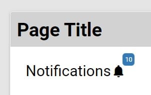
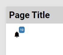
For clarity, the Badge Label is the text/number that will be displayed in the top-right corner (the number 10 in the image below). Conversely, Text Content is optional text that will appear next to the icon or image (the text Notifications below).
When you click on the Logic icon or tab for the component, you will see the modifiable event handlers, just as you would with a standard component. However, the main logic for the component – the logic that makes it work – is hidden to protect it from accidentally being broken.
Additionally, in the Logic area, you will also find all available data binding properties.
That’s it! Ready to try it for yourself?
The Badge component is one of many custom components available now in Backendless Marketplace, completely free!
