EU Data Center, UI Themes, And New Visualization Support – Backendless 6.2 Release
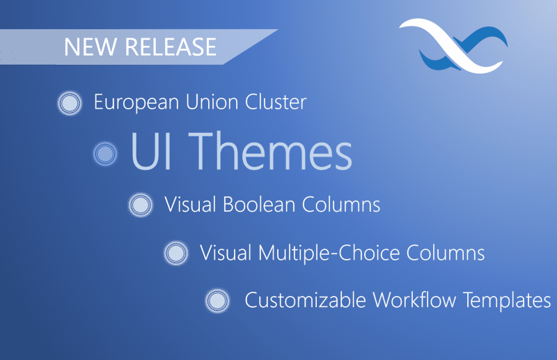
The European Union Cluster, UI Themes, and support for two new visualization data types in Backendless Database are all available now in Backendless.
Leading this latest update is a major upgrade for UI Builder called UI Themes. We previewed this feature earlier this month, and now that it has arrived, you can try it for yourself!
As the Backendless userbase has grown in Europe, we are often asked to add a hosting option in the European Union. For our users based in and around Europe, we’re excited to announce a new hosting cluster based out of the E.U.
While the servers are located in Europe, your app will be hosted in the cloud, meaning you can still develop from anywhere in the world. This new cluster can be selected when creating a new app and offers a faster cloud experience for those geographically located closer to the E.U. than the U.S.
Below are the major new features out today. Click or scroll down to learn more about each.
- UI Themes in UI builder
- European Union app/server hosting data center
- Support for checkbox/toggle visualization of the boolean values in Backendless Console
- Support for multiple-choice visualization in Backendless Console
- Support for customization of workflow templates
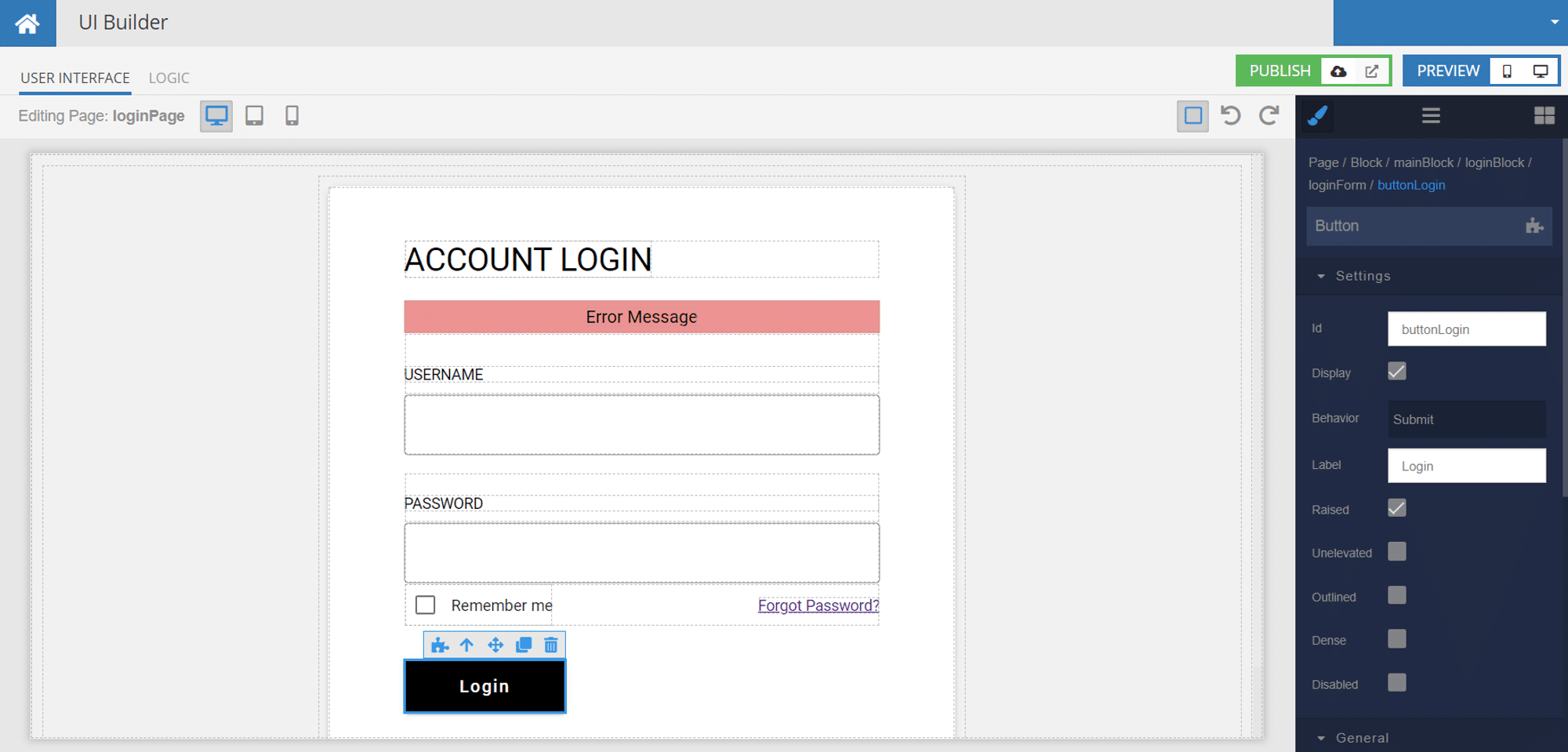
UI Themes In UI Builder
It is common to use a wireframe platform like Figma or Adobe XD to design the user interface (UI) for your app before implementing the design in your app builder. Unfortunately, this can mean having to manually modify the look of every component on every page.
UI Themes for Backendless’ UI Builder are designed to enable seamless UI customization for every element of your app. With this feature, we offer a system where you can customize the look and feel of your application globally to match the original designs.
Themes provide a high degree of control over visualization of all aspects for every single component supported by UI Builder. This includes – but is not limited to – colors, borders, shared, margins, paddings, CSS effects, etc.
UI Themes will launch with a library of pre-built theme choices. Just like our pre-built APIs, every theme is 100% customizable. Whether you want an out-of-the-box solution that you just tweak around the edges or your own custom look, Themes give you that flexibility.
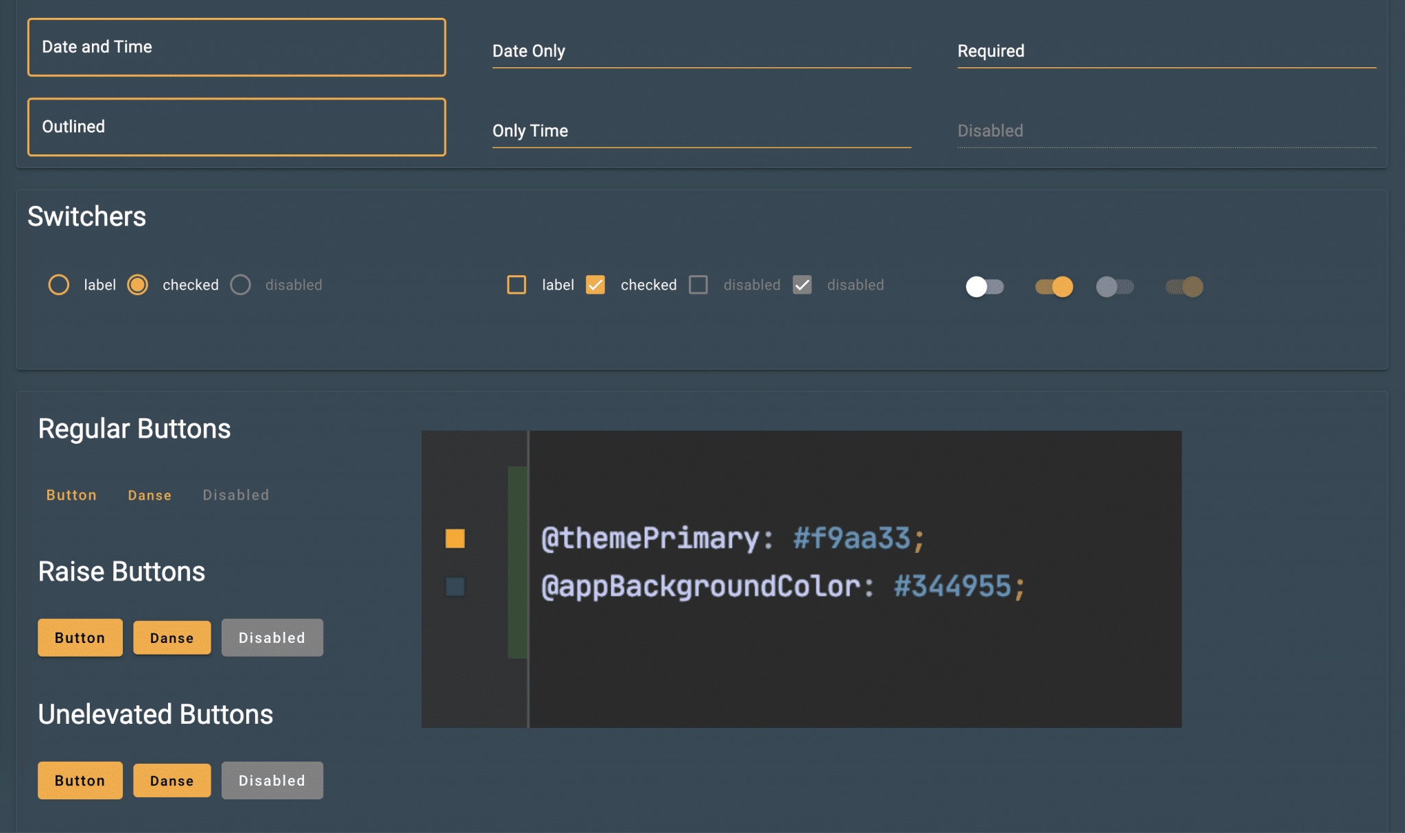
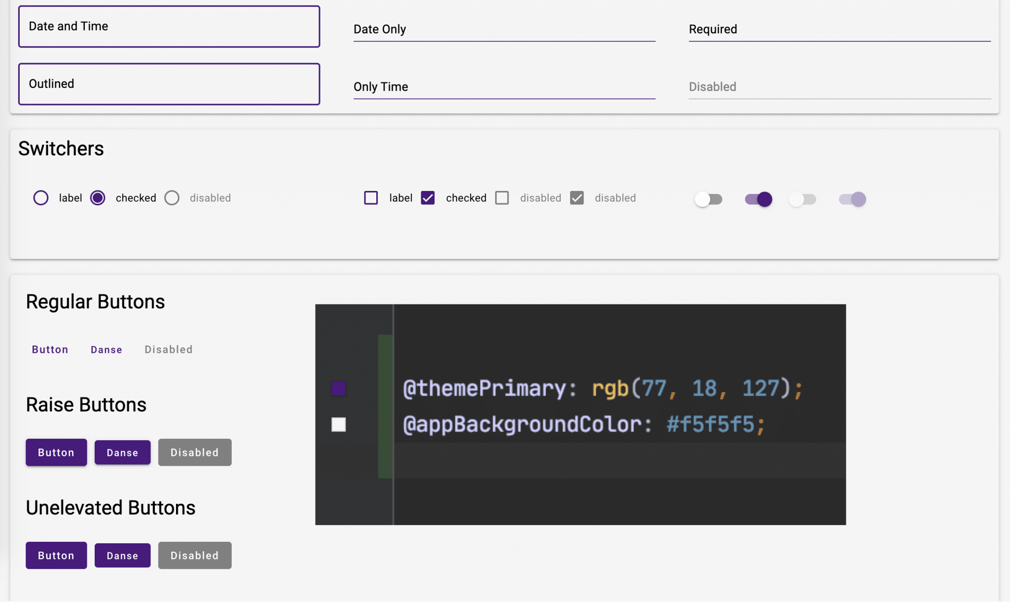

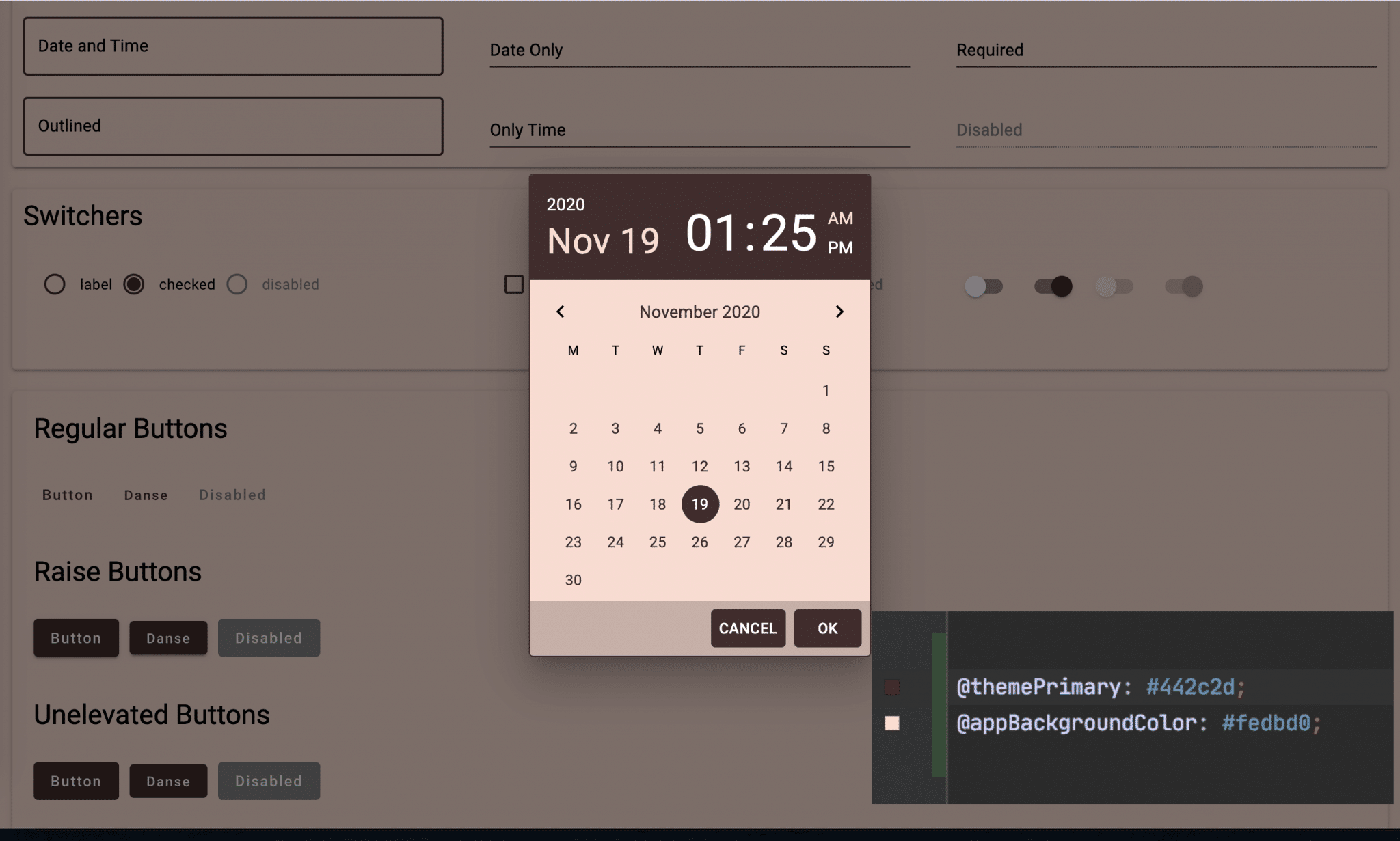
The UI Theme library starts small but will quickly grow with contributions from community members like you. You can share your own custom Theme with the community by publishing it back to the library.
With the addition of Themes, you will be able to easily set the color and style of all of your app’s components with just a little CSS. You can use Themes to change anything CSS supports, not just colors!
Backendless UI Themes are based on Less (http://lesscss.org/) which provides support for variables, mixins, operations, and functions. These elements give you incredible versatility for making your app look and feel totally unique.
European Union Cluster
Since the General Data Protection Regulation (GDPR) took effect in May 2018, it has been mandated by the European Union that all EU user data be stored on a server that runs in the EU.
The EU cluster is the perfect solution for those planning to make their app available in the EU or that have a regional customer base that would benefit from the reduced latency.
All of the data, users, files, etc., that you store in your Backendless application will be hosted in the zone that you choose. Previously, Backendless Cloud had been limited a U.S.-based server location.
Read the full feature announcement here for Frequently Asked Questions, or you may contact us if you have additional questions.
Not only is server location important for data storage, it can also impact your app’s speed. The speed at which your backend data and logic communicates with the client’s device can be the difference between a lifelong fan of your app and a 1-star review.
Since all servers were previously hosted in the U.S., all Backendless Cloud users had to host their app from the States. This meant that app speeds may have been slower for developers and users on the other side of the world.
The European Union Hosting Zone for Backendless Cloud gives you the ability to locate your servers closer to your team or your end users. Depending on where you and your user base are located, the result may be a demonstrable speed increase for your app.
Checkbox/Toggle Boolean Data Visualization
In programming, Boolean values represent data that can be only contain one of two values, commonly TRUE or FALSE, often with a third NULL (or no response) option.
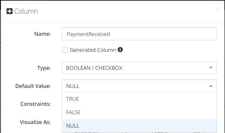
Visually, Boolean values are often manipulated using UI components such as checkboxes and on/off toggles. Virtually every app has at least one such checkbox (Remember Login).
With the latest release, you can customize how you visualize Boolean values that the user sets on the frontend. For example, rather than having a database entry for rememberLogin that reads TRUE, you can instead visually see a completed checkbox:
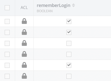
This visual representation makes it much easier for you or anyone else looking at your data in Backendless Console to quickly interpret the data.
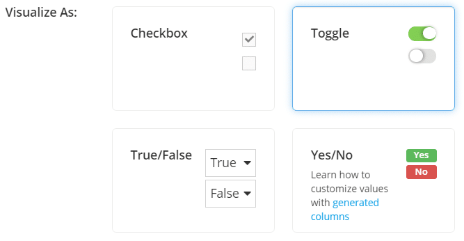
We’ve also included a customizable option based on our Generate Column data type. With this, you can set the display values to be anything you want, from YES/NO to AGREE/DISAGREE to SHIPPED/NOT SHIPPED.
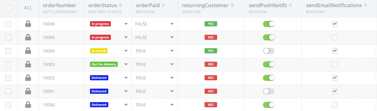
Below, you can see an example with each of the four Boolean types in use, as well as a Multiple Choice column, as described in the next section.
Multiple-Choice Data Visualization
Multiple choice questions are a great way to collect standardized data from your users. The responses present excellent opportunities for you to sort and segment your data.
The new Multiple Choice column type in Backendless Database makes it incredibly easy to store responses for multiple choice questions in your data table.
The new column type enables you to customize how the multiple choice data is presented in Backendless Console, both in terms of display color and text label.
First, you can select a custom color for each answer option, making it easy to quickly identify the object’s value. This can be useful for visually skimming orders by status (i.e. IN PROGRESS, IN TRANSIT, OUT FOR DELIVERY, DELIVERED), identifying tasks by status (i.e. TO DO, IN PROGRESS, COMPLETE), identifying users by region (i.e. NORTH AMERICA, SOUTH AMERICA, EUROPE,…), and so on.
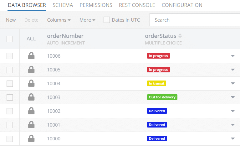
In the image above, you can see how much easier this column type is to read than plain text. You can quickly see exactly how many orders are yet to be delivered, how many still need progress to complete, etc.
Second, when you select the Use values/labels option, you can give each answer option a text label for visual display in the Console. This label can differ from the value stored in the table; the stored value will be unchanged.
For example, let’s say we want to get a number rating from our users: 1, 2, 3, 4, 5. Even with a colored background, a single digit can be hard for us to read. Thus, with the values/labels option, we could set display labels as one, two, three, four, five.
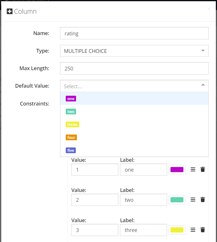
As you can see, selecting the Default Value dropdown gives you a preview of what each item will look like in the Console.
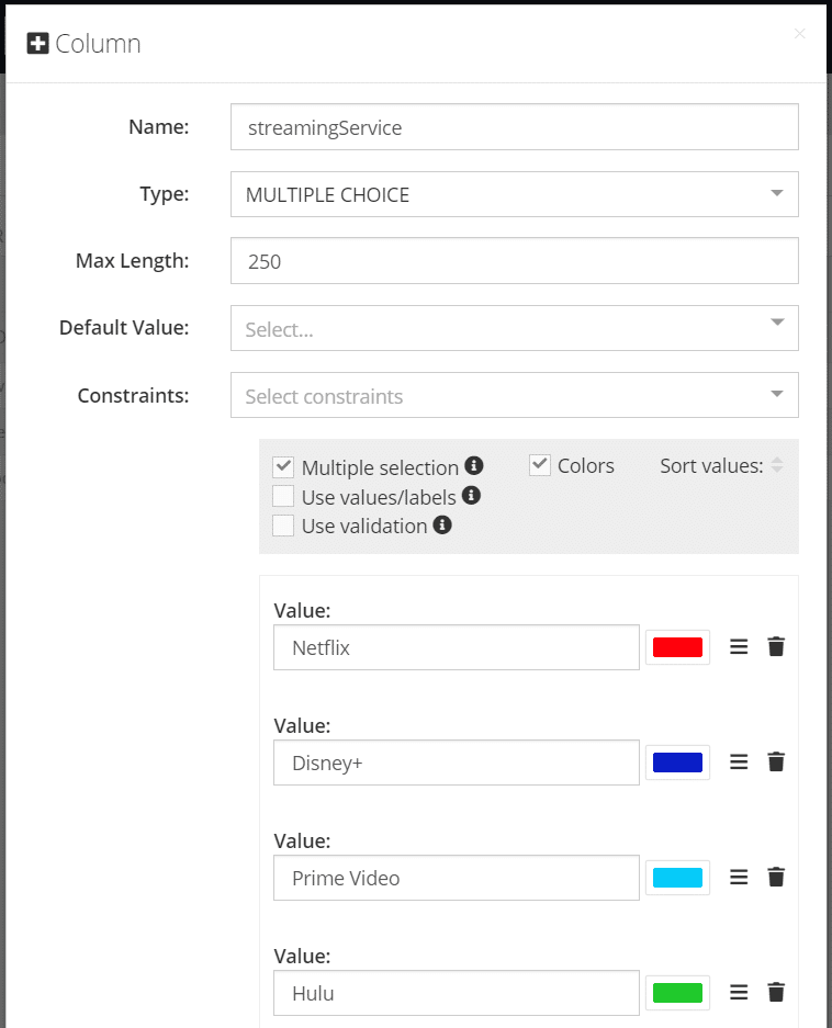
Finally, the Multiple Choice column type can be set to allow multiple items to be selected. With the Multiple selection option checked, each object can store any number of the values; all selected values will be returned as a comma-separated string.
For example, let’s say you are asking your users which streaming services they subscribe to. In this case, you certainly want them to be able to select more than one given that many consumers use more than one such service.
We can set up a data column using the Multiple Choice column type and the select the Multiple selection option. Then, we add each value we want to offer to users.
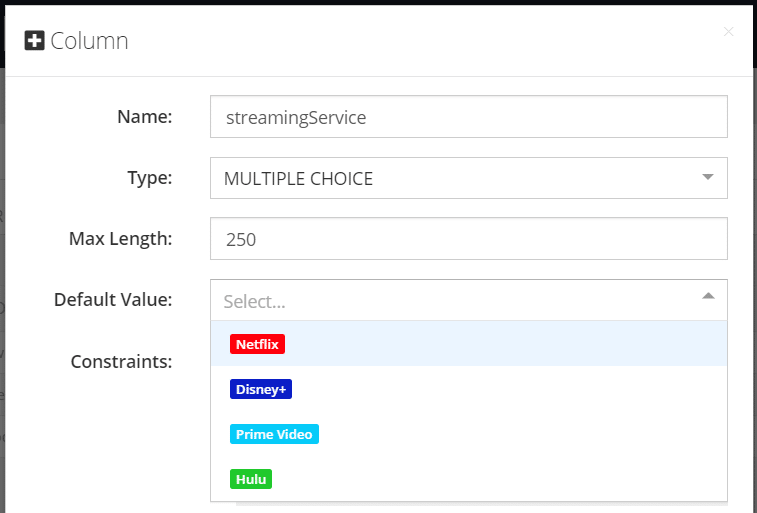
Now, users will be able to select any number of items from the list when giving their response.
Customizable Workflow Templates
UI Builder provides a number of pre-built page templates for common app tasks. These include Login, Password Recovery, Landing, Not Found (404) and several more.
You are now able to customize each of these pages to easily match your app’s appearance. This provides you with control over the appearance of every element and page in your app.
Out of the box, these pages will look very ordinary. But with just a few tweaks to your app theme, you can make them pop!
Additionally, these pages will also now be impacted by any global themes that you implement, so your user experience will be clean and consistent throughout your app.
These new features are available as of December 29th, 2020. If you have further questions about how any of them work, visit our support forum or Slack channel and we’ll be happy to help.
Thanks for reading and Happy Codeless Coding!